The WooCommerce checkout page is where everything comes together—the final step before a customer places their order. If this page is hard to use, especially on a phone, it can turn people away. If you are a store owner and thinking about how to make your WooCommerce checkout page mobile-friendly, then you are in the right place.
To make your WooCommerce checkout page mobile-friendly, use a clean layout, big buttons, and short form fields. Choose a responsive design that fits all screens. Keep load time fast with small images and a light theme. Let users check out as guests, show clear error messages, and test the page often on real mobile devices.
Want to know more about fixing your checkout page for mobile users? Check out this article to learn how to make a mobile-friendly checkout page.
How to Make Your WooCommerce Checkout Page Mobile-Friendly?
When people shop on their phones, they want everything to be quick and easy. A checkout page that’s hard to use on mobile can make them leave. That’s why having a mobile-friendly checkout page is so important. It helps keep your customers happy and your sales strong. Let’s look at some simple tips to help make that happen.

Clean Page Layout
A clean layout makes everything easier to find. Keep the checkout page simple, with only the most important details. Remove anything that’s not needed so the page loads faster. Use plenty of white space to make it look less crowded. This helps people focus and complete their purchase without confusion.
Mobile-Friendly Buttons
Buttons should be easy to tap with a finger, not just a mouse. Make sure the “Place Order” or “Continue” buttons are big enough and spaced out. If buttons are too small or close together, users might tap the wrong one. Keep button text clear and short. A good button can really improve the whole checkout experience.
Easy Form Fields
Nobody likes typing a lot on their phone. So, keep your form fields short and simple. Using One Page Checkout for WooCommerce helps reduce the number of clicks and steps. It puts all the needed info on one screen, which makes checkout feel faster. This makes the whole process smooth and stress-free.
Responsive Design
Your page should look good on all screen sizes. Whether it’s a small phone or a big tablet, the page should adjust itself. Use a responsive theme for your store if you haven’t already. This helps all parts of the page fit nicely on the screen. A good design keeps customers from zooming in and out.
Fast Loading Time
Slow pages make people leave. Make sure your images are not too big and use a lightweight theme. Cut down on any extra stuff that makes the page slow. You can also use tools that test your site speed and suggest fixes. A faster page keeps users happy and ready to buy.

Guest Checkout Option
Not everyone wants to create an account just to buy something. Give them the option to check out as a guest. This saves time and makes the process easier. You can always offer account creation after they finish buying. The simpler it is, the better the results.
Clear Error Messages
If someone fills out something wrong, let them know right away. Show error messages clearly and right next to the problem. Use simple language so they know exactly what went wrong. Don’t make them guess or start over from the beginning. Helping them fix it fast keeps them from giving up.
Test on Real Devices
Try your checkout page on real phones and tablets. See what works and what doesn’t. Don’t just check it on a computer screen. This helps you find problems that only show up on smaller screens. Regular testing helps you keep things running smoothly.
Why Mobile Optimization Matters for WooCommerce Checkout?
Most people shop on their phones now, not just on computers. If a checkout page doesn’t work well on mobile, they might leave without buying. It’s not just about looks—it’s about how it feels to use. That’s why mobile optimization is something every store owner should think about. Keep reading to see why this matters so much.
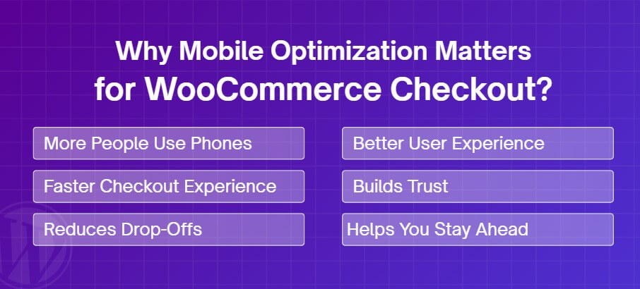
More People Use Phones
Today, many people browse and shop using their phones. They scroll, add items to the cart, and expect everything to work smoothly. If your checkout page isn’t mobile-friendly, they may get annoyed and leave. A phone screen is small, so everything must fit and work well. A smooth mobile checkout means more happy shoppers.
Faster Checkout Experience
On phones, people want to move fast. They don’t have time to deal with slow-loading pages or long forms. A great way to speed things up is to enable checkout without page refresh in WooCommerce, so everything updates instantly without reloading. It removes extra steps and keeps things simple. This makes shopping quick and easy.
Reduces Drop-Offs
If a checkout page is hard to use, people may quit before finishing their order. This is called a “drop-off.” A page that’s slow, confusing, or not mobile-friendly causes this to happen. By making your checkout smooth and easy on phones, fewer people give up. That means more orders and fewer abandoned carts.
Better User Experience
When a page works well on mobile, it feels good to use. Buttons are easy to tap, text is easy to read, and nothing feels out of place. Shoppers can move from cart to payment without problems. A better experience keeps people coming back. It also makes your store look more professional.
Builds Trust
A clean and working mobile checkout page helps people trust your store. If something looks broken or messy on their phone, they might worry. But when everything works well, they feel safe sharing payment details. Trust leads to more completed orders. A working page builds confidence without saying a word.
Helps You Stay Ahead
Many online stores still don’t focus on mobile checkout. If yours does, you already stand out. A good mobile experience gives your store an edge over others. It shows you care about your shoppers’ time and comfort. Staying ahead means better chances of getting more sales.
Things to Avoid in Mobile Checkout Page Design
Designing a smooth mobile checkout page takes real attention to detail. Even small design choices can lead to big drop-offs. Avoiding common mistakes makes a big difference in conversions.
- No Progress Indicator: Without a clear progress bar, users don’t know how many steps are left. This can cause confusion and early exits.
- Hidden Costs Late: Surprise fees shown at the end make people leave. Always show full pricing early to build trust and avoid frustration.
- Hard-to-Read Text: Tiny or light-colored text strains the eyes on small screens. Make fonts clear, dark, and large enough to read comfortably.
- Unclear Call to Action: Buttons like “Continue” don’t say what’s next. Use clear words like “Pay Now” or “Place Order” to guide the user.
- Forced Signups for Coupons: Requiring a login just to apply a discount wastes time. Let users enter coupon codes without creating an account or logging in.
- Unsecured Checkout Feel: If the page doesn’t feel safe, users won’t continue. Show trust badges or lock icons to make security visible and clear.
- Auto Zoom Triggers: Poor field spacing causes mobile browsers to zoom. This breaks the layout and makes users pinch and scroll constantly.
- Missing Back Button Function: If the phone’s back button exits the site, users can’t go back. Make sure it returns to the previous step instead.
What Fields Should You Remove for Faster Checkout?
Long checkout forms can slow people down and make them leave before buying. Some fields aren’t always needed and only make things more confusing. By cutting out the extras, you can make checkout quicker and simpler. Here are some fields you can remove to speed things up:
Company Name Field
Most shoppers don’t need to fill in a company name, especially for personal orders. This field just takes up space and time. Unless you only sell to businesses, it’s safe to remove it. Skipping it won’t affect the order process. Less typing means a faster checkout.
Second Address Line
Many people don’t use the second line for their address. It’s often left blank. Keeping it can make the form look longer than it needs to be. You can safely take it out to make the form cleaner. If someone really needs it, they can still fit it all in the first line.
Order Notes Section
The order notes box is usually not needed for simple products. Most customers won’t write anything there. It just makes the page longer and adds one more thing to scroll past. If you’re not selling custom items, you probably don’t need it. Removing it helps speed up the checkout.
Phone Number Field
Unless you really need to call the customer, this field can be optional or removed. Most people prefer to give less personal info. You can still keep email for updates and contact. If a phone isn’t required for shipping, cutting it saves time. It also helps build trust.
Account Username Field
Making an account can feel like extra work when you ask for a username. Most stores let users log in with their email anyway. You can auto-generate a username based on the email to save time. This way, people can focus on checking out quickly. It’s one less field to fill in.
Top Plugins That Can Help Optimize Mobile Checkout in WooCommerce
A good mobile checkout page can make a big difference in how many people finish their orders. If your page is slow or confusing, customers might leave. That’s where helpful plugins come in to fix the small problems. They save time and improve how the checkout works on phones. Let’s take a look at some top plugins that can help.
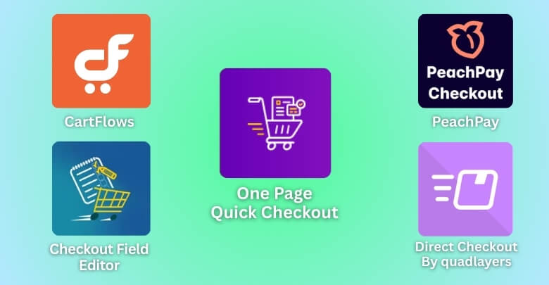
One Page Quick Checkout for WooCommerce
This plugin puts the whole checkout process on a single page. Users can select products and pay without moving to another screen. It’s great for mobile users who want fewer clicks. The layout is simple and easy to scroll. This makes the checkout faster and smoother.
Checkout Field Editor
This plugin lets you easily add, remove, or change fields on your checkout page. You can use field customization for better mobile checkout by keeping the form short and simple. Less typing means faster checkout on phones. It helps you keep only the important fields. That makes the page easier to use.
CartFlows
CartFlows helps you build a smooth and simple checkout page. It gives ready-made designs that are mobile-friendly. You can also add things like order bumps without slowing the page. Everything fits nicely on a phone screen. That means fewer people drop off while checking out.
Direct Checkout for WooCommerce
This plugin skips the cart page and sends users straight to checkout. It’s a small change, but it makes shopping much quicker. People don’t have to click around too much. It’s great for mobile users who want to finish fast. Fewer clicks mean more orders.
PeachPay
PeachPay adds a fast and secure checkout button to your store. It saves customer info for future purchases. That way, repeat buyers can check out in seconds. It looks clean and works smoothly on mobile. It also supports many payment options in one place.
Bolt Checkout
Bolt is made to make checkout fast and trusted. It keeps users on the same page while everything loads quickly. It also handles payments and safety, all in one tool. This helps you worry less about setup. Your customers get a better experience, especially on phones.
Tips to Test the Mobile-Friendliness of the Checkout Page
Your checkout page might look fine on a computer, but things can feel very different on a phone. Small screens, touch taps, and slow loading can all affect how well it works. That’s why testing it on mobile is super important. Let’s go over some helpful ways to do that and make sure your page works great.

Use Real Devices
Always test your checkout on actual phones and tablets, not just computer previews. Real devices show how the page really feels to use. Try different screen sizes, like small phones and big ones. Check how easy it is to scroll and tap buttons. Doing this helps you spot problems quickly.
Try Different Browsers
People use different browsers like Chrome, Safari, and Firefox. Your page may work well on one but break on another. Always test your checkout on at least two or three popular browsers. Look for broken layouts or buttons that don’t work. Make sure everything loads the same way.
Check Loading Speed
Slow pages make people leave before buying. Use free tools like Google PageSpeed Insights to see how fast your checkout loads. These tools also tell you what’s slowing things down. Fixing even small things can make a big difference. A fast page keeps users happy and ready to buy.
Test With Slow Internet
Not everyone has fast Wi-Fi all the time. Try using your mobile data or a slower network to test the page. This shows if the checkout still works under bad conditions. See if images or forms load properly. You want the process to stay smooth even with slow speed.
Tap and Type Check
Try to tap every button and fill every field using just your thumbs. If anything feels hard to press or see, fix it. Make sure form fields fit the screen and text isn’t too small. Check that the keyboard doesn’t block important parts of the screen. Every tap should feel easy.
Watch for Pop-Ups
Sometimes, pop-ups or banners cover up the checkout form on small screens. This can confuse or annoy people trying to pay. Turn off any extra messages during testing. Only show what’s truly needed to complete the order. Less clutter means a better mobile experience.
Frequently Asked Questions
There are many small details that affect how well your checkout works on a phone. These frequently asked questions will help you understand extra steps you can take. From small fixes to smart features, here are helpful answers you might not have thought about yet.
Why Is Scroll Length Important in Mobile Checkout?
Long pages on mobile can feel never-ending. If users have to scroll too much, they might miss important parts or get tired of the process. Keeping content tight and easy to follow can reduce friction and keep shoppers focused until they place the order.
Should I Use Sticky Buttons on Checkout Pages?
Yes, sticky buttons can improve usability on mobile. A “Place Order” or “Next” button that stays visible makes it easier to proceed. It reduces the need to scroll just to tap a button, which improves speed and convenience during the process.
How Do Collapsible Sections Help Checkout?
Using collapsible sections on mobile checkout helps make the page look shorter and cleaner. It allows users to focus on one part at a time. This makes the whole experience less overwhelming and helps prevent them from missing fields or steps.
What Role Does Font Size Play in Mobile Checkout?
Fonts that are too small can make reading and filling forms difficult. Always use a size that’s easy to read without zooming. A good font size keeps the checkout smooth and prevents users from making errors because they can’t read the text properly.
Can I Hide Header and Footer During Checkout?
Yes, hiding the header and footer on mobile checkout pages keeps the user focused. It removes distractions and keeps them from clicking away by mistake. A cleaner page helps guide users toward finishing the checkout without leaving or getting lost.
Is Auto-Fill Safe to Use in Checkout Fields?
Auto-fill is safe when used correctly with secure forms. It helps users fill out fields faster and reduces typing on small screens. Be sure to mark fields properly so browsers recognize them. This can help speed things up without affecting security.
How Do I Make Coupon Fields Mobile-Friendly?
Instead of showing the coupon field by default, hide it under a simple link that says “Have a coupon?” This keeps the layout clean and avoids confusion. Mobile users won’t get distracted by extra fields they may not even use.
Why Should I Avoid Too Many Icons?
Too many icons or symbols can clutter the page and confuse users. On mobile, every bit of space matters. Stick to only helpful icons, like a lock for secure checkout. Remove anything that doesn’t serve a clear purpose or action.
Final thoughts
A smooth and quick checkout experience isn’t just a nice bonus—it’s something shoppers expect, especially on their phones. One small delay or a hard-to-tap button can push them away before they hit “Place Order.” That’s why paying attention to your mobile checkout is such a smart move.
When you take time to clean up your layout, remove extra fields, and test on real devices, you’re not just improving a page—you’re making life easier for your customers. And when shopping feels easy, people are more likely to come back again and again.
If you’ve been wondering how to make your WooCommerce checkout page mobile-friendly, now you’ve got everything you need to start. The tips and tools shared here will help you build a checkout that works beautifully on any screen.