Dynamic Ajax Product Filter provides four mobile-responsive styles to ensure your filters look great on all devices.
You can apply these styles using the Block Editor, Elementor, or Shortcode.
Available Mobile Styles
- Style 1
- Style 2
- Style 3
- Style 4

Style 1
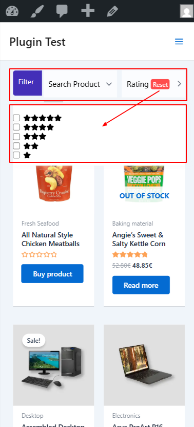
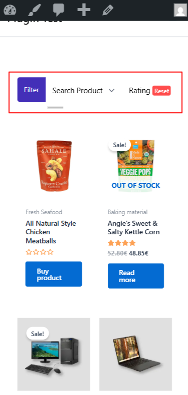
Mobile Responsive Style 1 displays filters in a horizontal top bar layout on mobile devices. This style keeps filters easily accessible without taking too much screen space, ensuring a smooth shopping experience on smaller screens.
This style is ideal for stores that want quick filtering, minimal UI, and better product visibility on mobile.
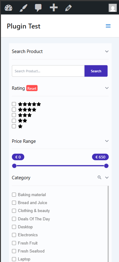
Style 2
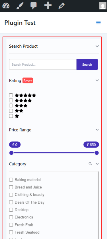
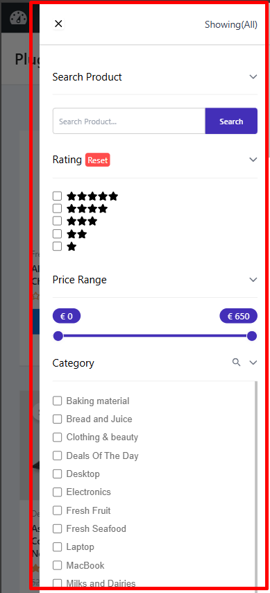
Mobile Responsive Style 2 displays filters in a full-width vertical layout on mobile devices. All filter sections are stacked one below another, making it easy for users to browse and apply multiple filters without opening separate panels.
This style is best for stores with multiple filter types, such as search, rating, price range, and categories.
Style 3
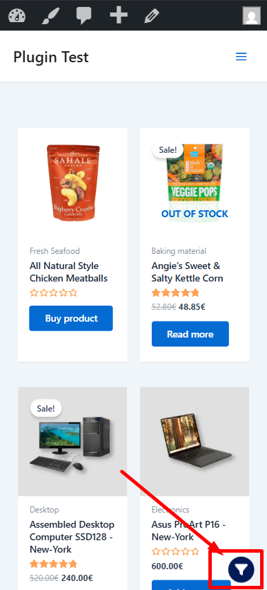
Mobile Responsive Style 3 displays a floating filter icon at the bottom of the product listing on mobile devices. When tapped, it opens an off-canvas filter panel with options such as product search, rating, price range, and category filters.
All selections are applied instantly using AJAX, allowing shoppers to refine results without page reloads and continue browsing smoothly.
Style 4
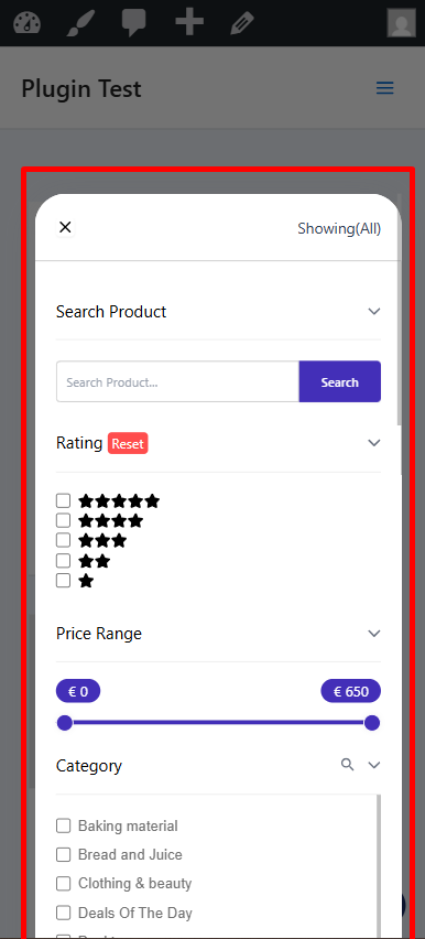
Mobile Responsive Style 4 uses a floating filter button that stays accessible while users browse products on mobile. Tapping the button opens a full-height off-canvas panel from the side, displaying filters such as product search, rating, price range, and categories. All filter selections are applied instantly using AJAX, allowing shoppers to narrow results without page reloads and continue browsing without losing context.
All selections are applied instantly using AJAX, allowing shoppers to refine results without page reloads and continue browsing smoothly.
How to configure:
You can apply these mobile styles using:
- Block Editor (Gutenberg)
- Elementor
- Shortcode
Mobile Responsive Style with Block Editor
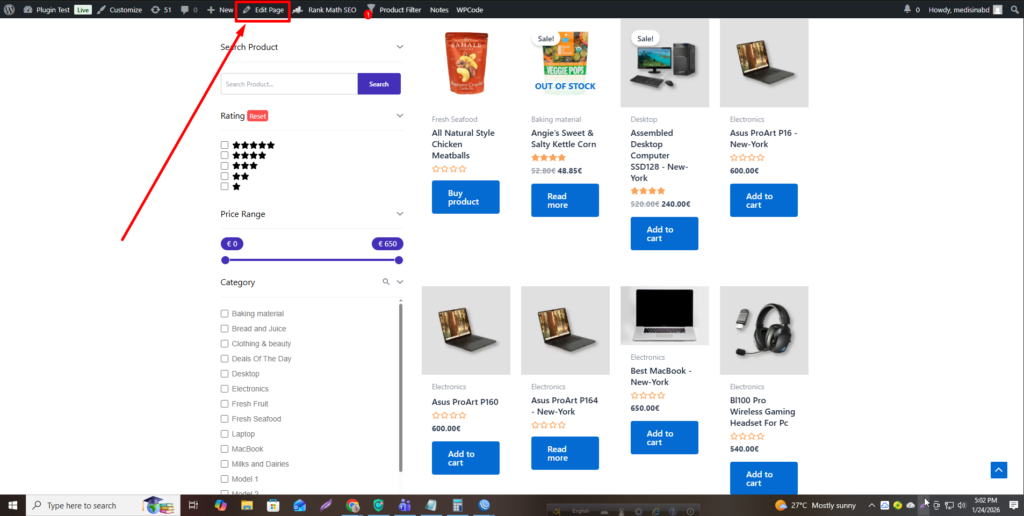
Step 1: Open the Page
- Go to Pages → All Pages
- Select the page where the product filter is added
- Click Edit Page
Step 2: Select the Filter Block
- Click on the Product Filter block inside the editor
- Make sure the filter block is selected
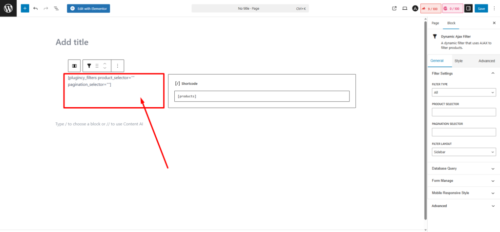
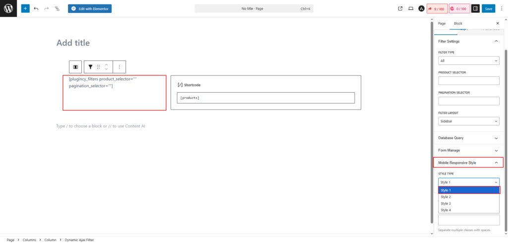
Step 3: Open Filter Settings
- On the right sidebar, locate Filter Settings
- Scroll down to find Mobile Responsive Style
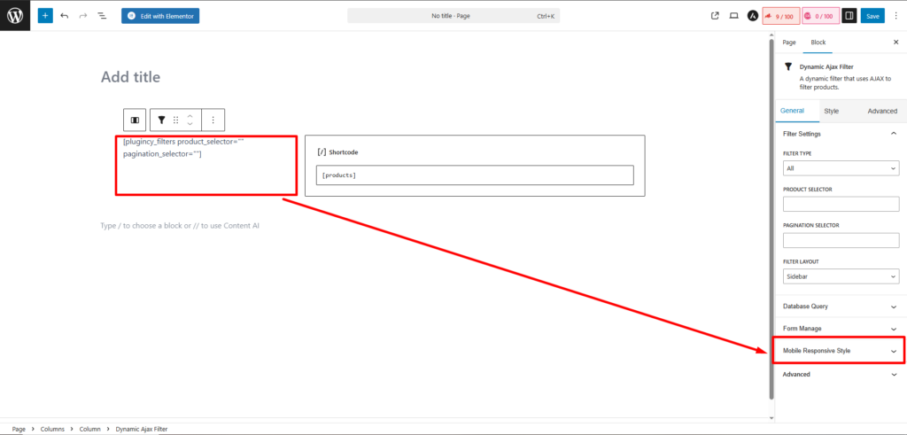
Step 4: Choose Mobile Style
- Select any style from Style 1 to Style 4
- Click Save / Update
Step 5: Preview Mobile View
- Switch to Mobile View to see the applied responsive design
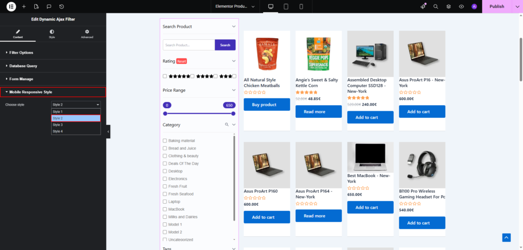
Mobile Responsive Style with Elementor
Step 1: Open Page in Elementor
- Go to Pages → All Pages
- Click Edit with Elementor on the page containing the filter

Step 2: Select the Filter Widget
- Click on the Product Filter widget inside Elementor
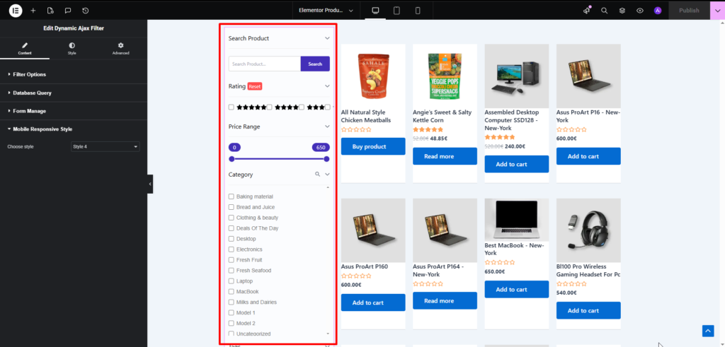
Step 3: Open Filter Settings
- In the left Elementor panel, find Edit Dynamic Ajax Filter
- Scroll to Mobile Responsive Style
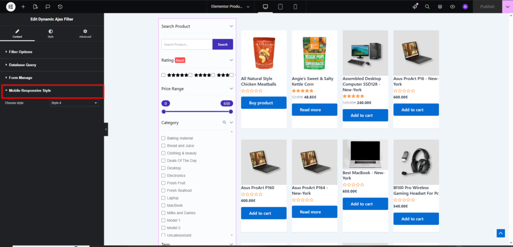
Step 4: Choose Mobile Style
- Select Style 1, Style 2, Style 3, or Style 4
- Click Publish / Update
Step 5: Preview Mobile View
- Use Elementor’s Responsive Mode
- Switch to Mobile to preview the layout
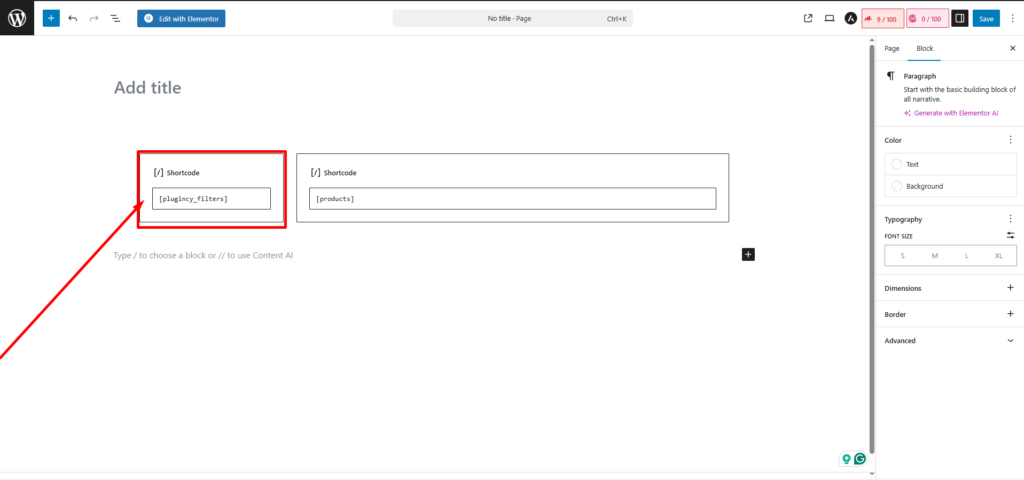
Mobile Responsive Style with Shortcode
Step 1: Add Filter Using Shortcode
- You can insert the filter anywhere using a shortcode
- Add the mobile responsive style parameter directly in the shortcode
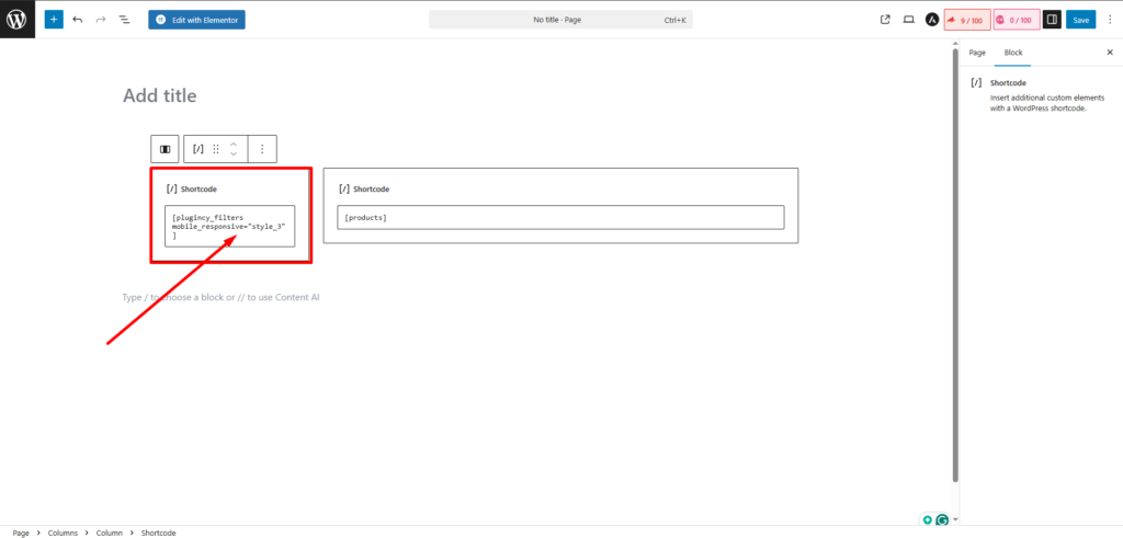
Step 2: Define Mobile Style in Shortcode
- Add mobile responsive parameter style_1 to style_4 in the shortcode parameter
- Save or update the page
Step 3: Check Mobile Output
- Open the page on a mobile device or use browser mobile preview
- Confirm the selected mobile style is applied correctly