Product filters can change how people shop, without them even realizing it. When done right, they help users find what they need in just a few clicks. But when filters are messy or slow, shoppers get frustrated and leave. That’s why many store owners often look for the best practices for optimizing product filters to improve how their site works.
The best way to optimize product filters is to keep them simple, clear, and fast. Use popular filters like size, price, and color. Group filters by product type, show real-time results, and place filters smartly on desktop and mobile. Make sure filters don’t slow down the page, and always add an easy “Clear All” button. Testing and updates based on real user behavior are also important.
Want to know what makes a filter system helpful or annoying for shoppers? If you’re curious about how to make your store easier to use and better at getting sales, this article covers everything you need to know about product filters in one place.
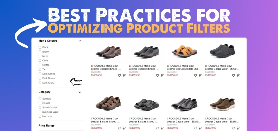
Best Practices for Optimizing Product Filters
Product filters can make or break your online store. If they’re too complicated or not useful, people might leave without buying anything. But with the right setup, filters can actually boost your sales. Let’s look at what really works.
Keep it Relevant
Most shoppers just want quick, useful options. If there are too many filters, it gets confusing. It’s better to stick to the basics like price, color, size, brand, and rating. And remember, not every product category needs the same filters. For example, jackets might need a “waterproof” option, but not headphones. Only show filters that actually help people find what they want faster.
Focus on Popular Filters
Many stores see the best results when they highlight five main filters—price, brand, color, size, and rating. These are the ones shoppers usually look for first. If your store sells clothing, for example, “size” and “color” are super important. A filter for “brand” can also help when people already know what they like. These few options cover most of what buyers really care about.
Make It Easy
It helps a lot when filters look and feel simple. Things like checkboxes, dropdowns, sliders, and color swatches are easy to understand. Users shouldn’t have to click around too much. And here’s something smart: when filters are clicked, keep the panel open and just disable the options that show no results. Don’t hide them—it’s less annoying that way. That’s where tools like AJAX product filters for WooCommerce can really help without making things complicated.
Show Live Results
Shoppers love to know what’s working. When filters update the product list right away, it feels quick and smooth. Show the number of matching products next to each filter so people know what to expect. Also, once filters are added, make it super clear which ones are active. Add a “Clear All” button too—it saves people from hunting down every filter one by one.
Choose Smart Placement
Where filters go on your website matters a lot. On a desktop screen, filters in a sidebar work best for big catalogs. For smaller shops, filters across the top in a dropdown can be enough. But for mobile screens, a slide-out or collapsible filter menu works better. It keeps the page clean and lets people shop without too much scrolling or tapping.
Avoid Dead Ends
Nobody likes seeing “0 results.” If a filter combo shows no products, either disable that option or give a heads-up message. This helps shoppers avoid wasting time. Plus, it keeps them from thinking your store has nothing useful. A small change like this can actually keep people on your site longer and make them more likely to buy something.
Test What Works
No store gets it perfect right away. That’s why it’s a good idea to test different filter setups. You might find out that changing the filter order or layout makes people stay longer. Use A/B testing to see what works best. Then check how often filters are used and whether they lead to more sales. Keep making small changes based on what you learn.
Match the Category
Filters should always match what you’re selling. You don’t need a “size” filter for cameras or a “megapixel” filter for shoes. Think about what’s useful for each category. Sports gear might need “weight” or “durability” filters, while skincare products might use “skin type” or “SPF level.” Show only the filters that help people make quick choices.
Keep Things Fast
People don’t like waiting. Filters should load fast and update smoothly. When filters take too long, shoppers might give up. Lightweight designs and real-time results make the whole process feel better. And make sure filters work well on all devices, especially phones. If things break on mobile, you’ll lose a lot of buyers.
A simple and helpful filter system makes shopping much easier for everyone. When people find what they want quickly, they’re more likely to stay and buy. Keep your filters clear, fast, and matched to your products. Always check how they’re working and keep improving over time.
Why You Should Limit the Number of Filters Per Page?
Too many filter options can turn a good shopping experience into a confusing one. People want to make choices quickly, not feel lost in endless menus. Keeping things simple can actually help them find what they need faster. Let’s look at why that matters.

Too Many Choices
When shoppers see a long list of filters, it can feel like too much. They might not know where to start or what’s important. Instead of helping, it slows them down or even pushes them to leave the site. It’s better to offer fewer, more helpful filters that actually make choosing easier, not harder. Too many choices can do more harm than good.
Confusing Layouts
If filters are all over the place, users won’t know what to click. A messy layout can make people feel frustrated or unsure. Grouping filters in a smart way—like putting size, color, and price together—makes things feel clear and simple. That way, users can find what they need without getting lost or tired from searching through every single option.
Slow Page Loading
The more filters you add, the slower the page can get. That means people have to wait longer every time they change a filter. And let’s be honest, nobody likes waiting. If a site feels slow, most people just leave. By limiting filters, pages stay fast and smooth, and shoppers stay happy. A better experience usually means more sales.
Smarter Filter Groups
Not every product needs the same filters. Grouping them based on what you’re selling makes a big difference. For example, electronics might need filters like “battery life” or “screen size,” while shoes might need “shoe size” or “material.” Showing only the right filters keeps things clean and useful. It also saves space and avoids confusing the user.
Better Decision Making
Too many options can make decisions harder, not easier. People may second-guess their choices or give up completely. When filters are limited and grouped well, shoppers feel more confident. They can compare products quickly and make better decisions. It’s about helping them focus on what really matters instead of overwhelming them with everything at once.
Less is often more when it comes to product filters. Keeping things simple helps people shop faster without feeling confused. When filters are grouped well and not too many, it leads to better decisions. A clean setup can turn more visitors into happy buyers.
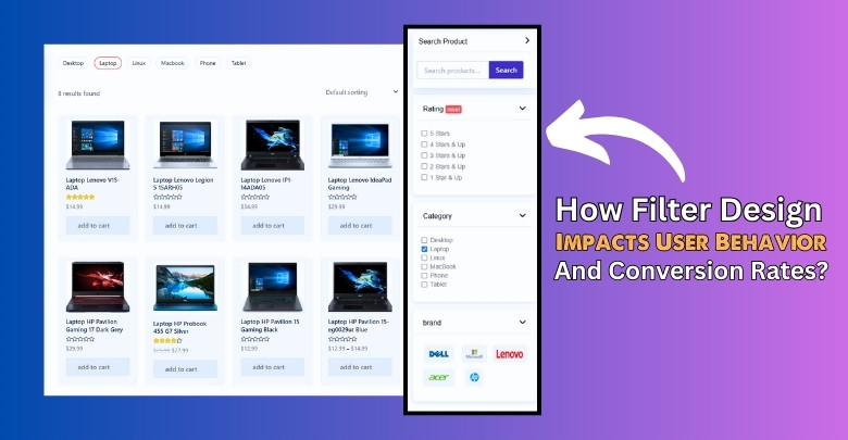
How Filter Design Impacts User Behavior and Conversion Rates?
How a person shops online is heavily influenced by how the store looks and works. When things feel smooth and easy, shoppers are more likely to stay longer and buy something. Even small design choices can make a big difference. Let’s break down how good filter design really matters.
Clear Layout Matters
A well-organized layout helps users quickly understand what they can filter. If things are all over the place, shoppers may feel lost and leave the page. Group similar filters together and keep them in one easy-to-spot area. Make sure nothing feels hidden or too complicated. A clear design keeps people focused and helps them move forward with less confusion.
Labels Should Be Simple
Labels on filters need to be short, clear, and familiar. If someone sees a filter named “Fit Type” when shopping for shirts, they should know what that means right away. Confusing or fancy labels make people stop and think, and that slows down the shopping process. Simple wording leads to quicker choices and better results. Less guessing means more buying.
Smart Button Placement
Where you place the “Apply” or “Clear All” buttons can change how people interact with the page. If buttons are too far away or hard to find, shoppers might skip filtering altogether. Put action buttons where they’re easy to see—like near the top or bottom of the filter panel. This makes the shopping process feel smooth, not frustrating.
Consistent Filter Behavior
People expect filters to behave the same way every time. If one filter updates instantly, but another needs a button click, it feels clunky. Make sure filters work in a consistent way across the site. That includes showing which filters are active and how to remove them. When setting up your shop, it’s essential to configure WooCommerce search filters to align with how users naturally browse and refine their options—poor configuration can lead to confusion or drop-offs.
Design Affects Trust
A good filter design doesn’t just help people find products—it also builds trust. If filters are clean, work well, and look modern, people feel more confident shopping on your site. But if the design feels old or buggy, users may worry about payment or product quality. Trust starts with how easy and reliable everything feels, especially while choosing what to buy.
Good filter design can quietly guide shoppers toward what they want. When filters are simple, smart, and easy to use, people stay longer and make more confident choices. Even small changes can lead to big results. Keep it clean, clear, and helpful.
Should You Use Vertical or Horizontal Filters on Your Store?
Where you place filters on your store can change how people shop. Sidebar and top bar filters both have their own strengths, depending on screen size and how many options you offer. Here’s a quick comparison to help you decide.
| Point of Comparison | Vertical (Sidebar) Filters | Horizontal (Top Bar) Filters |
| Screen Space | Uses more space on the side, good for wide screens | Takes up less space, better for tight layouts |
| Filter Capacity | Can display many filter options at once | Limited space for only a few filters |
| User Focus | Keeps filters visible while browsing products | Filters may scroll out of view as users browse |
| Mobile Experience | Can feel cramped on small screens | Works better for mobile layouts with dropdowns |
| Design Style | Traditional and detailed look | Modern and clean appearance |
Choosing the right filter layout depends on your store’s design and your users’ devices. There’s no one-size-fits-all—just what works best for your products. Try both styles if needed. A smart layout can lead to better shopping experiences.
Common Filter UX Mistakes That Affect Sales
A good filter system helps people find products quickly and easily. But when filters are poorly designed, they can confuse people or make them leave. Some mistakes seem small but can affect your store’s sales a lot. Let’s look at common filter design problems and how to fix them.

Messy Everywhere
People may become overwhelmed when they see too many filters at once. They may not know where to start or what’s even useful. Long lists without any grouping or order feel messy and frustrating. It’s better to show fewer, more focused options. If you need more filters, keep them collapsed until clicked. A clean layout makes everything feel easier and more friendly.
Bad on Mobile
Filters that work fine on a computer might be a pain on a phone. If users have to scroll too much or pinch the screen to read filter names, they’ll probably give up. Filters should be easy to tap, open, and close. A slide-out panel or dropdown works great on mobile. Keep the design simple and avoid cramming too many filters in a tiny space.
Confusing Words
If the filter labels aren’t clear, shoppers will just skip them. Terms like “Fit Type” or “Use Level” might not mean much to everyone. It’s safer to stick with words people already know, like size, color, or price. Clear and short labels help people filter faster. Every second they spend guessing is a second closer to leaving your site.
Slow Filter Loading
Filters that take too long to update can make people feel stuck. Clicking a filter and then waiting for results is not fun, especially on mobile. Fast filters make shopping smoother and more fun. Another common mistake is using outdated or slow-loading filters—taking the time to select the best AJAX filter can drastically improve response time and keep users engaged throughout their shopping journey.
No Clear Reset Option
When filters are active but hard to remove, it causes frustration. People like to change their minds while shopping, so a simple “Clear All” button helps a lot. If users can’t reset easily, they may just refresh the page—or worse, leave the store. Make sure active filters are always visible and simple to turn off with one click.
Even small filter issues can lead to lost sales. A clean layout, fast loading, and simple words make a huge difference. Pay attention to how filters look and work on all devices. The easier it is to shop, the more people buy.
FAQs About Best Practices for Optimizing Product Filters
Filters can be very powerful when used the right way. But many people still have questions about how to make them better. Below are some helpful FAQs to guide you through improving your product filters. These tips can make your store easier to use and more fun to shop.
Can Filters Be Personalized for Each Shopper?
Yes, some advanced filters can show results based on user preferences. For example, if someone often shops for medium-sized clothes, filters can remember that. This makes shopping faster and more personal. Personalized filters help people find what they like without clicking too much.
Should Filters Be Placed on Collection Pages Too?
Yes, filters on collection or landing pages are very useful. They help users narrow down items in special deals or seasonal sales. Even limited pages with fewer products can benefit from filters. It saves time and helps people get to the right items faster.
Is It Helpful to Use Sticky Filters?
Sticky filters stay on the screen even when users scroll. This helps people change filter settings without going back to the top. It makes things easier when browsing a long product list. Sticky filters are great for keeping options always in view.
Do Filters Need to Match the Store’s Language Style?
Yes, filter labels should match how your store talks to customers. If your site uses simple and fun language, filters should too. People feel more comfortable when everything sounds the same. Consistent language builds trust and makes things easier to understand.
Can Filters Be Used With Wishlists or Favorites?
Yes, some plugins allow filters to work with wishlists or favorite items. This helps shoppers sort the products they saved earlier. It makes coming back to shop feel smoother and faster. Filters that connect with wishlists give a better experience for repeat users.
Should Filters Show Up on Homepages?
Sometimes it’s helpful to show filters even on the homepage. If your homepage displays featured products or collections, filters can help sort them. But only use this if you show a lot of items on the homepage. Otherwise, it can look too busy and confusing.
Is It Good to Add a Search Bar With Filters?
Yes, a search bar with filters makes finding products even easier. People can type what they want and use filters at the same time. This saves time and helps narrow down choices quickly. Many users like having both options to find the best match.
Can Filters Help With Out-of-Stock Products?
Filters can be set to hide or show out-of-stock items. Some stores like to show them with a “Sold Out” tag, while others hide them completely. You can also let users choose whether to see them. This gives more control and avoids wasting people’s time.
Should Filter Options Be Collapsible?
Yes, collapsible filter sections help keep the page clean and organized. Users can open only what they need, like color or price. It works well on both desktop and mobile screens. Collapsible filters make the design simple and easy to use.
Bottom Line
Making your store’s filters work better isn’t just about adding more options. It’s about helping people find what they want fast and without stress. Good design, smart filter placement, and simple choices are what really help most. Keeping things clean and useful leads to more sales, fewer drop-offs, and better shopping. These are the best practices for optimizing product filters that truly make a difference for any online store.
Before setting up your filters, think about what your customers really need. Always test on phones, use clear labels, and avoid making things too complex. Keep filters fast, show results live, and give users easy ways to reset. With a little care and smart thinking, your filter setup can do a lot. Best of luck making your store smoother and more enjoyable for every shopper!