The WooCommerce checkout page is the final step in the buying process, but it often doesn’t get the attention it deserves. For many online stores, this page stays the same by default. Still, smart store owners may already be thinking about how to make it better—and that’s where the question comes in: Why customizing the WooCommerce checkout page matters?
Customizing the WooCommerce checkout page helps make shopping faster, easier, and more user-friendly. It reduces cart abandonment, improves the store’s look, supports mobile users, and builds customer trust. With the right changes, store owners can create a checkout that matches their brand and keeps buyers from dropping off before they pay.
Want to know how a few small changes can make a big difference? If so, keep reading—because this article covers everything you need to know about customizing the WooCommerce checkout page.
Why Customizing the WooCommerce Checkout Page Matters?
Before buying something online, you must go to the checkout page. But did you know this step could be changed and improved? Many stores make this page better to help customers. Let’s see why that’s important and how it helps.
Better Shopping Experience
A clear and simple checkout page makes online shopping feel easy. If people don’t understand what to do, they might leave without buying anything. Customizing the page helps avoid confusion and keeps buyers happy. It can also make the whole process quicker. The easier it is, the more likely people will finish buying.
Fewer Cart Abandonments
Sometimes, people add things to their cart but don’t buy them. One reason is a confusing or messy checkout page. When the page is clean and simple, it helps people finish their purchase. Small changes like removing extra fields or steps can really help. This means more completed orders for the store.
Looks More Professional
Stores with well-designed checkout pages look more trustworthy. It shows that the store owner cares about their website and the customers. Custom pages can match the rest of the store’s look. This makes the whole site feel connected and professional. People feel safer buying from a store that looks good.
Easier for Mobile Users
Many people shop using their phones, not computers. A checkout page made for mobile screens is easier to use. If it’s too hard to click buttons or fill out forms, people might give up. Customizing helps make everything fit and work better on phones. That way, more people can buy easily on any device.
Faster Checkout
No one likes a long checkout. If the page asks too many questions, people get annoyed. Using direct checkout for WooCommerce plugin can help remove extra steps and make things faster. This saves time and keeps buyers from getting bored. A faster checkout can lead to more sales.
Add Helpful Features
Stores can add cool things like a progress bar or special notes during checkout. These little touches make the process feel smooth and helpful. Customization lets stores give important information at the right time. For example, showing delivery options or payment methods clearly. These features help people feel more sure about buying.
Match Your Brand
Every store has its own style, colors, and feel. The checkout page should match that. A customized page can show your brand colors, fonts, and logo. This makes the whole shopping experience feel connected. It’s small details like this that help people remember your store.
Build Customer Trust
When the checkout page is clear and friendly, people feel safer. They’re entering personal info like their address or card details, so they need to trust the page. A well-designed page makes it easier to feel that trust. You can also add trust badges or secure payment signs. These things show customers that your store is reliable.
Common Problems With the Default WooCommerce Checkout Page
Some online stores don’t pay much attention to how their checkout page looks and works. But this part of the website plays a big role in whether people finish buying or leave. Here are some problems that can occur with the default setup
Too Many Fields
Many default checkout pages ask for more information than is necessary. Buyers are asked to fill in things that don’t even seem important. This can feel tiring and slow, especially when someone just wants to buy quickly. When the form feels too long, people may think twice about finishing their order. Extra fields make the checkout feel more like a chore than a simple step.
Confusing Layout
Some checkout pages are not easy to understand. The button can be hard to find, the sections may be out of order, and the text can be too small. This makes the page look messy and hard to use. Many store owners don’t notice how bad the layout is until they do a checkout flow comparison with a better one. That’s when the problems become clear.
Slow Loading Time
When a page loads slowly, it can make the whole checkout process feel annoying. People expect things to move fast, especially when they’re about to pay. The default setup sometimes takes longer to load because of extra parts or features that aren’t needed. Waiting even a few seconds longer can change someone’s mind about finishing their order. This delay can be enough to make users leave.
Poor Mobile Fit
Not every default checkout works well on phones or small screens. Buttons might be hard to tap, and some parts might not show up the right way. This makes the whole page feel clunky and hard to use on mobile devices. If users need to zoom in or scroll sideways, it becomes frustrating. The default design just doesn’t always adjust nicely to smaller screens.
No Clear Steps
Some checkouts don’t show what’s happening or what step you’re on. Without clear steps or sections, the page feels like one big block of questions. This can make people feel unsure or even lost during the process. They might wonder how much more they have to do before they’re done. That confusion can lead to people giving up halfway through.
Missing Trust Signals
The default checkout often doesn’t show signs that it’s safe or secure. There may be no lock icon, no trusted payment badges, or anything that helps buyers feel protected. This can make people nervous about sharing personal or payment information. Without those little signs of safety, they may not feel confident going forward. The lack of trust signals creates doubt right when buyers need to feel sure.
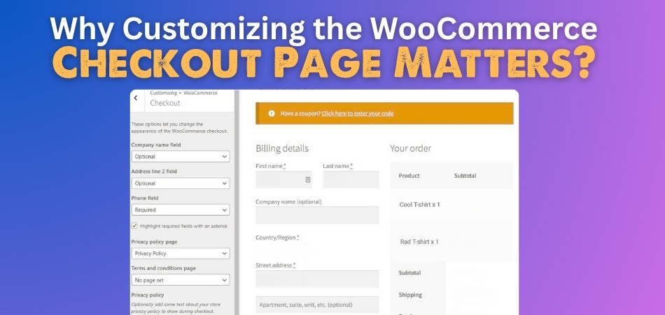
Key Elements You Can Customize on the WooCommerce Checkout Page
The checkout page isn’t just a form—it’s the final stop before a customer completes their order. Customizing it helps make shopping smooth and stress-free. Here are the key parts you can change to make things better.
- Form Fields: You can remove, change, or add new fields based on what details you really need. This keeps the form short and clear.
- Button Texts: Edit button labels like “Place Order” or “Proceed” to match your store’s tone. Clear buttons help buyers know what’s next.
- Page Layout: Rearrange sections like billing, shipping, and order summary to make them easy to follow. A clean layout avoids confusion quickly.
- Colors and Fonts: Change the style to match your brand’s look with your own fonts and colors. This makes the page feel more trusted.
- Error Messages: Update how error alerts are shown so they’re easy to read and understand. Clear messages help users fix problems faster.
- Shipping Options: Display only the shipping choices you offer, in a way that’s easy to pick. Too many options can slow people down.
- Payment Gateways: Choose how payment options appear and in what order. You can also rename them to make them easier to recognize.
- Order Summary: Customize how products, totals, and taxes are shown before the order is placed. A clear summary builds trust instantly.
- Checkout Labels: Change the wording of field labels to sound more friendly or simple. This helps customers fill out forms with less confusion.
- Terms and Conditions: Edit the text and placement of your terms box to suit your store’s style. Make sure customers know what they’re agreeing to.
Top Plugins to Customize the WooCommerce Checkout Page Easily
Running an online store is fun, but the checkout page can sometimes feel a bit boring or confusing. That’s where plugins come in—they help make things better without needing to do a lot of hard work. You can change how the page looks, works, and even what it says. Let’s check out some useful plugins that can do all that and more.
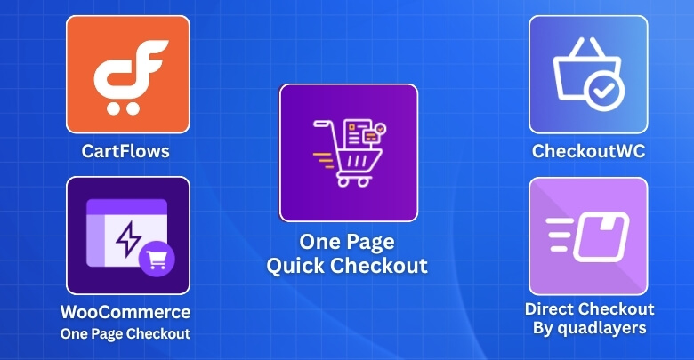
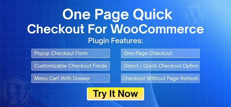
One Page Quick Checkout For WooCommerce
This plugin lets customers finish their order on a single page. It puts the product, cart, and checkout all in one place. That means fewer clicks and faster checkouts. It’s great for stores that want to keep things super simple. The setup is easy and doesn’t take much time.
Checkout Field Editor
It lets you easily add, remove, and change checkout fields. You can make it shorter by removing things you don’t need. It also helps you organize the form in a better way. The design is simple, so you won’t get lost while using it. You can even change the labels to make things easier to understand.
Direct Checkout for WooCommerce
With this plugin, buyers can skip the cart page and go straight to checkout. It helps speed up the buying process. This is great for people who want to buy fast without too many steps. It also works well with most themes and setups. You can turn it on or off with just a few clicks.
WooCommerce Checkout Manager
This one gives you lots of control over your checkout page. You can rearrange fields and even mark some as optional or required. It also allows file uploads, which can be helpful for certain types of orders. The plugin has a simple layout and is easy to use. You don’t need any special skills to get started.
CartFlows
CartFlows helps you design your checkout page to look clean and work smoothly. It has ready-made templates that save you time. You can also track how well your checkout is doing. The plugin works with popular page builders like Elementor. It’s good for people who want more design control.
Flux Checkout
This plugin gives your checkout page a more modern and clean look. It splits the process into steps, so buyers know where they are. The layout is smooth and mobile-friendly. It’s easy to set up and doesn’t need any coding. Customers find it easier to use compared to the default layout.
Mobile Optimization Tips for Your WooCommerce Checkout Page
Most people now shop on their phones, not just on computers. That’s why a mobile-friendly checkout page is more important than ever. If it doesn’t work well on small screens, people will leave without buying. Here are some ways to improve the mobile experience.
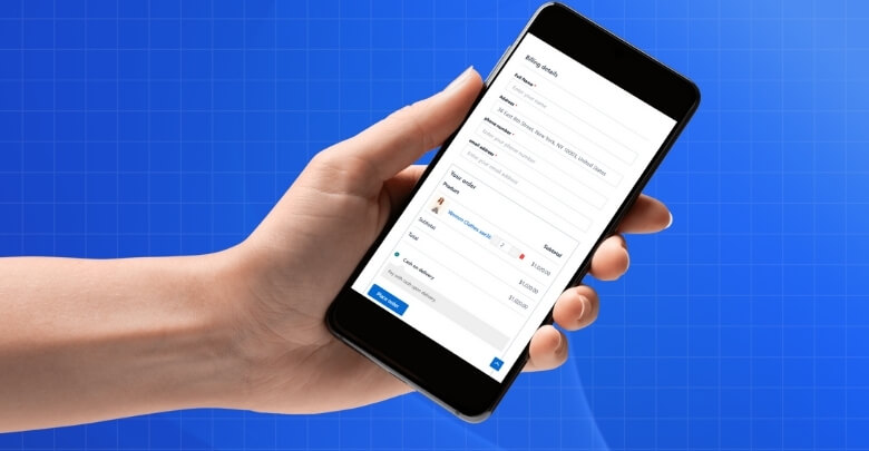
Simple Form Design
Long forms can feel tiring on a small screen. Try to keep the form short and clean with only the needed fields. Too many boxes to fill can scare people away. Make sure the form is spaced out so it’s easy to tap. Less clutter makes it easier to finish the checkout.
Large Tap Buttons
Small buttons are hard to press on phones. Make sure all your buttons are big enough for thumbs to tap easily. Place them where people expect them, like at the bottom of the screen. This helps shoppers move through checkout faster. Clear and bold buttons also guide people better.
Auto-Fill Support
Typing everything on a phone takes time. Letting browsers auto-fill names, emails, and addresses can really help. This makes the checkout faster and less annoying. Most people expect this to work on mobile. If it doesn’t, they may stop halfway.
Fast Page Loading
If the page takes too long to load, buyers might leave before they even start. Using a faster checkout can help reduce cart abandonment in WooCommerce by keeping shoppers from getting frustrated. Use light images and clean code to help it load quicker. Avoid adding too many pop-ups or moving parts. Every second counts during checkout.
Easy Payment Options
Phones work best with simple payment methods like digital wallets or one-click payments. Don’t make people type in card numbers if they don’t have to. Show mobile-friendly options first so they’re easy to find. People are more likely to buy if payment is quick. The easier it is, the better.
Clear Error Messages
If someone makes a mistake, they need to know what went wrong. Error messages should be easy to read and placed right near the problem. Red text or highlights can help show what needs fixing. This saves time and avoids frustration. Clear tips help shoppers finish checkout with no stress.
Frequently Asked Questions
There are still many small but important questions people have when it comes to customizing the checkout page in WooCommerce. Below are some helpful FAQs that clear up common doubts and give useful insights about why and how customization really matters.
How Does Checkout Customization Affect User Focus?
Customizing the checkout page helps guide users step by step without distractions. A focused layout keeps people from getting confused or clicking away. It also helps them know what to do next. When there’s less confusion, people are more likely to complete their purchase.
Can Custom Checkout Pages Improve Store Speed?
Yes, a custom checkout page can improve your store’s performance by removing extra code and unnecessary elements. Clean design loads faster and works better. Slow pages make people leave. Faster checkout pages keep users happy and help increase sales.
What Role Does Simplicity Play in Checkout Design?
Simplicity helps shoppers move through the process quickly without second-guessing their steps. A simple page feels easier and less stressful to use. It doesn’t mean boring—it means clear and to the point. That helps customers feel more confident in completing the order.
Why Should You Avoid Clutter on Checkout Pages?
Clutter distracts people and makes it harder for them to finish the checkout. Too many fields, images, or pop-ups confuse buyers. A cleaner page makes the process smoother. It helps users stay focused and get through the page without frustration.
Is Customizing Checkout Helpful for Seasonal Sales?
Yes, seasonal offers or flash sales need a fast and easy checkout to keep up with more visitors. A custom setup allows limited-time deals to be clearly shown. Buyers feel more ready to act. This makes the most of short-term traffic spikes.
How Does Custom Design Help Small Stores Compete?
A small store with a smooth and smart checkout page looks just as good as a big brand. It builds trust right away. Custom design gives control over the user’s experience. This helps smaller stores look more serious and professional.
Does Checkout Customization Help Product-Specific Stores?
Yes, if your store sells unique or special items, a custom checkout lets you ask the right questions. You can add or remove fields based on product needs. This avoids confusion and speeds up the process. It also improves customer satisfaction.
What Happens When Checkout Matches Product Type?
When the checkout page fits the kind of product you’re selling, people feel more comfortable. For example, digital downloads might not need a shipping section. Matching form types with the product makes checkout quicker. That’s a big help in reducing drop-offs.
Can Checkout Customization Improve Reviews and Ratings?
Yes, when checkout is easy, people feel better about the entire buying experience. That often leads to more positive reviews. A smooth process leaves a good impression. Happy customers are more likely to come back and recommend the store to others.
Bottom Line
Sometimes, the smallest things make the biggest difference—and the checkout page is one of them. It might seem like a simple form, but it’s the final moment that decides if a visitor becomes a buyer. If that moment feels slow, confusing, or messy, you risk losing the sale.
That’s why customizing the WooCommerce checkout page matters. It’s not just about looks—it’s about making the process smooth, fast, and stress-free for the customer. When buyers feel comfortable and confident, they’re more likely to complete their order without second thoughts.
If you want more sales, fewer cart drop-offs, and a better shopping experience overall, this is the step you can’t skip. Start tweaking your checkout today and see how much it changes the way people shop on your site.