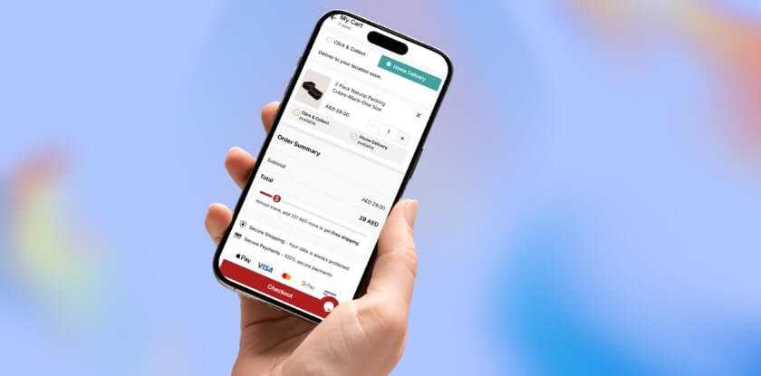
WooCommerce cart problems on mobile usually happen when touch actions, live cart updates, session continuity, or mobile-specific layout behavior do not work as reliably as they do on desktop. The store may still look normal, but products can disappear, cart updates can fail, or checkout can lose stability on phones and tablets.
This guide explains why WooCommerce cart breaks only on mobile, where the mobile cart flow usually starts failing, and what helps make it more reliable for real shoppers. Keep reading to see where mobile cart pressure usually shows up first and which fixes make the biggest difference.
Where Mobile Cart Problems Usually Start Showing Up
Mobile cart problems usually appear first where the shopping flow depends on taps, live cart updates, limited screen space, and quick movement between pages. The store may still look normal, but these pressure points often begin failing earlier on phones and tablets.
Common trouble spots include:
- Add-to-cart stops responding properly
- Mini cart updates lag behind shopper actions
- Products disappear after page movement
- Quantity changes do not hold
- Cart totals stop matching visible changes
- Cart drawers or overlays block key actions
- Checkout loses continuity after earlier cart steps
- Payment handoff feels less stable on phones
- Guest shopping becomes more fragile on mobile
- Smaller screens make cart problems easier to miss
Why WooCommerce Cart Breaks Only On Mobile?
WooCommerce cart breaks only on mobile when the cart depends on touch behavior, hidden mobile UI, live updates, or phone-based browsing conditions that are less stable than the desktop flow. The store may still look normal on a smaller screen, but key cart actions can start breaking once mobile pressure hits the wrong part of the experience.

Several mobile-specific issues usually sit behind that behavior.
Cause 1: Touch Actions Do Not Trigger Cleanly On Mobile
Mobile carts rely on taps instead of mouse clicks. If touch handling is not controlled carefully, add-to-cart actions can misfire, trigger twice, or fail to complete the way the store expects.
Cause 2: Responsive Layout Rules Hide Or Distort Cart Behavior
Some mobile cart problems are not caused by missing data, but by layout rules that make the cart harder to use on smaller screens. Buttons, totals, quantity fields, or product details can become hidden, compressed, or pushed out of view.
Cause 3: Cart Drawers, Overlays, And Mobile UI Layers Disrupt The Flow
Off-canvas carts, sticky bars, floating actions, and mobile overlays often add extra friction to the shopping flow. On phones, those layers can block cart controls, interrupt scrolling, or break the normal path from add-to-cart to checkout.
Cause 4: AJAX And Live Cart Updates Break More Easily On Mobile
Mobile cart behavior often depends on AJAX and background updates to keep item counts, totals, and mini cart contents in sync. When those requests fail, stall, or fall out of order, the cart can stop reflecting what the shopper just did.
Cause 5: Performance Optimizations Interfere With Real-Time Cart Behavior
Speed tools often apply stronger optimization rules to mobile traffic. Deferred scripts, delayed JavaScript, and aggressive front-end optimization can improve page speed while quietly breaking the live cart behavior WooCommerce depends on.
Cause 6: Theme Or Plugin Conflicts Show Up Differently On Mobile
Some themes and plugins load different layouts, scripts, or cart logic on phones than they do on desktop. That can create mobile-only conflicts where the desktop cart looks fine, but the phone version breaks under its own separate behavior.
Cause 7: Session Or Network Instability Makes Cart Continuity Less Reliable
Mobile browsing is more exposed to weaker connections, interrupted requests, and unstable session flow during movement between pages. Even short delays or dropped requests can leave the cart out of sync or cause products to disappear unexpectedly.
How To Fix WooCommerce Cart Problems On Mobile?
Mobile cart problems are usually fixed by tightening the exact parts of the shopping flow that break first on phones and tablets. The strongest fixes usually involve touch handling, mobile layout, plugin conflicts, and session stability. When those areas are cleaned up in order, the cart becomes much easier to keep reliable on real mobile devices.
Fix 1: Make Touch-Based Cart Actions More Reliable
Touch interactions need to produce one clean response every time. Mobile shoppers should not have to tap twice, fight delayed buttons, or trigger duplicate cart behavior just to add a product or update the cart.
Start with the tap behavior itself:
- Test add-to-cart buttons on real phones, not only desktop responsive mode.
- Check whether tap and click events are both firing on the same action.
- Remove duplicate event handlers tied to mobile cart interactions.
- Review custom JavaScript around buttons, quantities, and cart triggers.
Fix 2: Clean Up Mobile Layout And Responsive CSS
Some mobile cart failures are really layout failures. Cart controls, totals, product details, and quantity fields need to stay visible and usable on smaller screens instead of being pushed off-screen or hidden too aggressively.
Check the visible cart structure carefully:
- Check whether buttons, totals, quantity fields, and product details stay visible on mobile.
- Review responsive CSS and media queries around cart and checkout elements.
- Remove mobile rules that hide controls too aggressively.
- Adjust widths, spacing, and overflow issues that distort cart layout.
Fix 3: Simplify Mobile Cart Drawers And Overlay Behavior
Cart drawers, sticky bars, and mobile overlays can interrupt the normal buying flow more easily on phones than on desktop. A simpler cart path usually makes mobile behavior more stable and easier to test.
Focus on the extra UI layers around the cart:
- Disable off-canvas carts or mobile cart drawers temporarily and retest.
- Check whether overlays block scrolling, tapping, or quantity updates.
- Remove floating actions that interfere with core cart controls.
- Compare drawer behavior with the standard cart page on mobile.
Fix 4: Tighten AJAX And Live Cart Updates
Live cart behavior has to update clearly and in the right order after every shopper action. When background cart requests stall, fail, or fall out of sync, mobile shoppers often see empty carts, stale totals, or cart changes that only appear after refresh.
Look closely at how mobile updates are being applied:
- Test whether add-to-cart works without requiring a manual refresh.
- Check whether mini cart, totals, and quantities update after each action.
- Review AJAX errors and failed requests during mobile cart use.
- Try WooCommerce add-to-cart behavior with and without AJAX where relevant.
Fix 5: Reduce Mobile-Focused Performance Optimization Conflicts
Speed tools often apply stronger optimization rules to mobile traffic, and those rules can quietly break real-time cart behavior. Cart, checkout, and account pages should stay dynamic and should not be treated like static content.
Review the mobile optimization layer next:
- Pause deferred JavaScript, delayed scripts, or script combination features and retest.
- Review mobile-specific optimization settings separately from desktop settings.
- Exclude /cart/, /checkout/, and /my-account/ from cache.
- Make sure cache and CDN rules bypass WooCommerce pages when cart cookies are present.
Fix 6: Isolate Mobile Theme And Plugin Conflicts
Some themes, page builders, and plugins load separate layouts or scripts on phones, which can create mobile-only cart issues even while the desktop looks normal. A reliable WooCommerce inventory management plugin should work as part of a stable mobile cart experience, not against it.
Then narrow down the mobile-specific conflict source:
- Switch temporarily to a WooCommerce-friendly default theme.
- Disable non-essential plugins one by one and test again on mobile.
- Check whether page builders, mobile headers, or custom cart elements replace default WooCommerce behavior.
- Use WooCommerce Status tools to clear transients or review environment issues where needed.

Fix 7: Strengthen Session Continuity Under Real Mobile Conditions
Mobile cart continuity has to survive weaker connections, page movement, and interrupted browsing. Stable mobile behavior means products stay in the cart from product page to checkout, even when conditions are less perfect than desktop.
Finish by testing continuity under real mobile conditions:
- Test the cart on real phones under normal and weaker network conditions.
- Move between product, cart, and checkout pages to confirm items stay in place.
- Compare guest and logged-in shopping on mobile.
- Retest after clearing stale session-related data when cart behavior still looks inconsistent.
Testing WooCommerce Cart Stability On Mobile After The Fix
Seeing the cart work once on a phone is not enough to trust the fix. Mobile issues often return during a different tap pattern, page change, or checkout step. Testing should confirm that the cart now stays steady through real mobile shopping behavior, not just one successful action.
A stronger test usually includes checks like these:
- First Tap Works Cleanly: Add a product on mobile and confirm the first tap triggers one clear cart response without delay, duplication, or failure.
- Cart Survives Page Movement: Move across product, cart, and category pages to confirm items stay in place during normal mobile browsing.
- Item Changes Stay Accurate: Remove products, re-add them, and confirm the cart still reflects the latest action without falling out of sync.
- Quantity Updates Hold Properly: Change quantities and confirm totals, subtotals, and item counts stay correct after each mobile cart interaction.
- Drawer And Cart Page Both Work: Open the cart drawer and the full cart page to confirm both views behave consistently on mobile.
- Checkout Keeps Cart Continuity: Move from cart to checkout and confirm products, totals, and session flow remain stable during the transition.
- Guest And Logged-In Results Match: Test both browsing states to confirm mobile cart behavior stays reliable for different shopper conditions.
- Phone Platforms Show Similar Results: Compare iPhone and Android behavior to catch mobile-specific differences in cart flow, layout, or checkout stability.
- Mobile Data Does Not Break Updates: Test once on regular mobile data to confirm weaker connection conditions do not interrupt cart actions.
- Recent Changes Still Hold Up: Retest after cache clears, plugin updates, or storefront changes to confirm the mobile cart remains stable.
Why Mobile Cart Stability Depends On More Than Quick Fixes
Quick fixes can stop the most visible mobile cart problem, but they do not always remove the conditions that caused it. On many stores, the real weakness lies in how mobile cart behavior, product setup, stock handling, and checkout flow are being managed together behind the scenes.
Lasting mobile reliability usually comes from reducing hidden friction across the store, not just correcting one broken cart action. A more structured setup, including WooCommerce multi locations inventory management, can make it easier to keep product availability, cart behavior, and checkout flow working more consistently on smaller screens.
- Cleaner stock handling reduces reactive storefront fixes
- Fewer layered tools lower mobile cart complexity
- Better product flow supports steadier cart actions
- More organized store logic improves checkout consistency
- Less operational friction makes mobile issues easier to trace
- Stronger backend control helps prevent repeat cart instability
- Simpler growth creates fewer mobile-specific breakpoints
Frequently Asked Questions
Mobile cart issues can be easy to miss because the storefront may still appear usable while shoppers are quietly running into friction on phones and tablets. These questions cover a few practical concerns store owners often still have after reviewing the main causes, fixes, and testing steps.
Can A Mobile-Only Cart Problem Lower Conversions Even Without Clear Errors?
Yes. Many mobile shoppers leave after a cart action feels slow, unstable, or confusing, even if no obvious error appears. That makes the issue easy to overlook while still affecting checkout completion and abandoned-cart rates.
Should Real Phones Be Tested Instead Of Only Desktop Responsive Mode?
Yes. Desktop responsive previews help with layout checks, but they do not fully recreate touch behavior, mobile browser handling, or weaker network conditions. Real-device testing gives a more accurate view of how the cart actually performs.
Can In-App Browsers Cause Different Cart Behavior On Mobile?
Yes. Shoppers opening a store through social apps, messaging apps, or embedded browsers may experience the cart differently from someone using a standard mobile browser. That can make the issue feel more inconsistent than it really is.
Why Can Mobile Cart Issues Be Harder To Catch During Store Reviews?
Mobile problems often appear during fast, real-world shopping behavior rather than slow test clicks. A cart may look fine in a quick check, then fail when shoppers tap quickly, switch pages, or move straight into checkout.
What Usually Makes Mobile Cart Behavior More Reliable Over Time?
Consistency matters most. Stores usually stay more stable when mobile cart actions are easy to trigger, layouts stay usable on small screens, and the cart flow depends on fewer fragile layers across the storefront.
Final Thoughts
Understanding why WooCommerce cart breaks only on mobile usually comes down to one simple truth: the cart is facing more pressure on phones than it does on desktop. Smaller screens, touch-based actions, mobile layouts, and less forgiving browsing conditions can expose weaknesses that stay hidden elsewhere.
Fixing the visible issue matters, but long-term improvement usually comes from making the mobile cart flow simpler, steadier, and easier to trust. When that happens, the store does not just work better on mobile. It becomes more dependable for shoppers overall.