One-Page Checkout in WooCommerce makes the buying process feel quicker and smoother for online shoppers. It puts everything—billing, shipping, and payment—on a single page, which sounds simple enough. But not every store or buyer reacts the same way, and that’s when people want to know about the pros and cons of using one-page checkout in WooCommerce.
One-page checkout makes online shopping faster by keeping all steps in one place. It reduces clicks, works well on mobile, and helps customers review everything before paying. This setup can increase sales, reduce cart abandonment, and improve the user experience. Still, it may not suit stores with complex products or large forms, and it sometimes loads slower or feels too crowded.
Do you want to know if this type of checkout is really good for your store or not? Keep reading—this article shares everything you need to know about this topic.
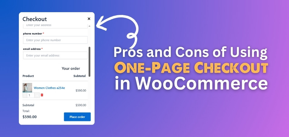
Pros and Cons of Using One-Page Checkout in WooCommerce
Your order is completed at the checkout page when you shop online. Some online stores use just one page for this, called a one-page checkout. This setup is simple and quick, but is it always better? Let’s look at the pros and cons of using the one-page checkout in WooCommerce:
Pros
Faster Checkout
One of the biggest benefits is speed. With one-page checkout, everything is in one place, so it takes less time to finish an order. You don’t have to click “next” again and again. Using direct checkout for WooCommerce plugin can make this process even faster by skipping unnecessary steps. You just enter your info, check your order, and pay. A fast checkout can make people happy and more likely to buy.
Better User Experience
People enjoy shopping more when it feels easy. A one-page checkout keeps things simple and clear. Buyers can see all the steps they need to take right away. It’s less confusing and helps people feel confident while paying. They don’t have to wonder what’s coming next. This can make online shopping feel better and smoother.
More Conversions
More people finish their orders when the checkout is easy. Long or slow checkouts make people leave the site. One-page checkout helps reduce this by making everything quick and simple. That means more buyers and more sales for the store. It removes things that slow people down. A smooth checkout can really help a store grow.
Mobile-Friendly
Many people shop using phones or tablets. A one-page checkout works better on smaller screens. It’s easier to scroll down one page than to go through many steps. Also, it often loads faster, which is great for people with slow internet. A simple design fits better on mobile. That makes it easier for everyone to buy from anywhere.
Less Cart Abandonment
Cart abandonment means people leave before finishing their order. One big reason is that the checkout takes too long or is confusing. A one-page checkout shows everything at once, which makes it easier to understand. When people feel it’s quick and easy, they are more likely to buy. It helps stop them from giving up. This can help stores get more sales.
Easier to Review
Before placing an order, it’s important to check if all the details are correct. One-page checkout lets people see everything in one spot. If something is wrong, they can fix it right there. They don’t need to go back and forth between pages. This saves time and lowers the chance of mistakes. A clear view helps people feel sure about their order.
Cons
Can Be Overwhelming
Having everything on one page might look messy to some people. Too many boxes and details at once can be hard to follow. If the page is not designed well, it can feel confusing. People might not know where to start or what to do first. This might make them leave without buying. A crowded page is not always a good thing.
Slower Load Time
If there is too much on one page, it can load slowly. People don’t like waiting for a page to open. A slow page can make someone leave before even reaching the checkout. Not everyone has fast internet, so this can be a big issue. A long page with many features can take time to show up. That’s bad for stores and buyers.
Harder to Track Steps
Store owners want to know where people stop in the checkout process. With a step-by-step setup, it’s easy to see that. But with one-page checkout, it’s harder to find which part made someone leave. This makes fixing problems more difficult. Owners might not know what part needs to be improved. That can hurt sales in the long run.
Not for Every Store
Some stores sell many things or need more buyer details. One page may not have enough space for everything. It can look too full or be hard to use. In those cases, a step-by-step checkout works better. Stores with lots of choices may need more steps. So, one-page checkout doesn’t fit every kind of store.
May Need More Testing
Making a one-page checkout look and work well takes time. It needs testing to make sure everything works right. If the design is bad, it can confuse people. Store owners might need to fix bugs or change the layout. This means more work before it runs smoothly. It’s not always simple to set up.
How to Track Conversions in a One-Page Checkout Setup?
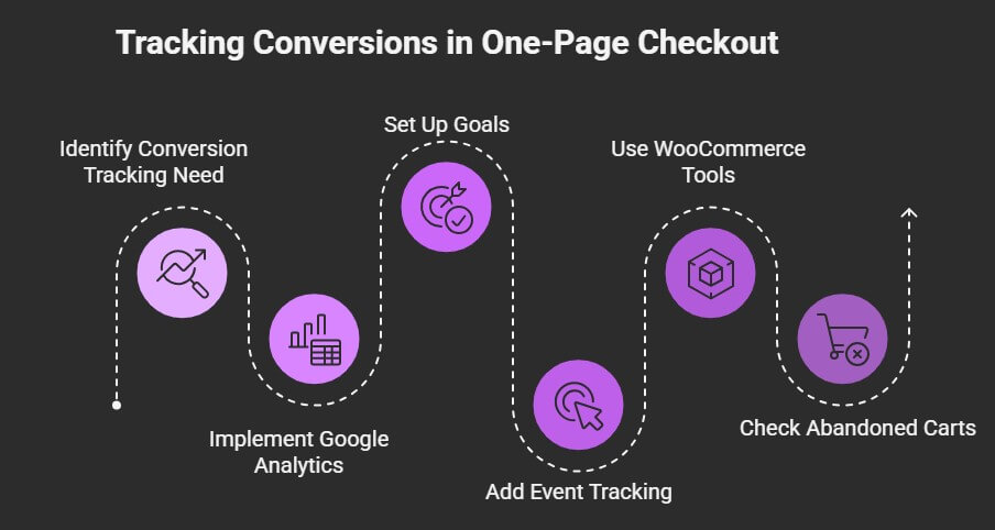
When people buy things from an online store, it’s important to know how many of them finish their orders. This is called tracking conversions. In a one-page checkout, tracking can be a little tricky since everything happens on one page. But there are simple ways to keep track. Here’s how you can do it right.
Use Google Analytics
Google Analytics is a free tool that helps track what people do on your site. You can set it up to see how many visitors turn into buyers. It shows where people come from and what they click. You can even see which buttons they press and how long they stay. This helps you understand what’s working and what’s not.
Set Up Goals
If someone completes a checkout, you can create “Goals” in Google Analytics. You need to choose a page, like the “Thank You” page, as the goal. When someone reaches that page, it counts as a conversion. This is a simple way to measure success. It tells you how many people are buying from your store.
Add Event Tracking
Sometimes, you need more details than just page views. That’s where event tracking helps. It can show when people click the “Buy Now” button or when they enter their information. You can set it up to track small actions on the checkout page. This gives you a better look at what shoppers are doing.
Use WooCommerce Tools
WooCommerce has some built-in features for tracking. You can also find extra plugins that give you more data. These tools show orders, sales, and other helpful info. Some plugins even work with Google Analytics for easier setup. This can save time and give you a clear view of your conversions.
Check Abandoned Carts
If people add items to the cart but don’t buy, that’s called cart abandonment. You can track how often this happens. Some plugins send reminders to users who didn’t finish their order. This helps bring them back to complete the purchase. It also shows where people drop off during checkout.
How to Choose the Right Checkout Strategy for Your WooCommerce Store?
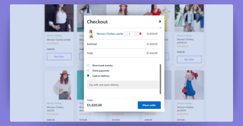
Different stores have different buyers, and how people like to shop can really change what kind of checkout works best. Some want a fast process, while others don’t mind a few extra steps. It’s all about finding what keeps your buyers happy and coming back. Let’s look at a few things that can help you decide the right checkout style.
Know Your Shoppers
Every store has its own kind of visitors, and not all of them shop the same way. Some may be quick decision-makers, while others like to take their time before making a decision. You should look at what most of your buyers prefer when it comes to checking out. If they leave the cart too often, that’s a sign that something may not be working. Think about what makes shopping smoother for them.
Count the Steps
The number of steps in your checkout can make a big difference in whether people buy or not. Too many steps might cause some users to leave without finishing their order. A shorter process usually works better, especially on phones. If simplicity and speed are key for your audience, consider the one-page checkout plugin advantages that reduce friction and improve the checkout flow. Fewer clicks often mean more completed sales.
Think About Devices
Many people shop from their phones, not just their computers. Your checkout needs to look and work well on smaller screens. A checkout that’s slow or hard to use on mobile can lead to lost sales. Make sure your layout fits well on both big and small screens. Try testing your checkout on different devices to see how easy it is to use.
Look at the Products
What you’re selling also matters when choosing a checkout style. If your products need lots of details or choices, a step-by-step checkout might be better. But if the items are simple, a fast one-page option could work great. The type of product often decides how much info your buyer needs to fill out. Make it easy, but not confusing.
Test Different Styles
Trying different checkout styles is one of the best ways to see what works. You can test one-page vs. multi-step checkouts and compare results. Look at things like how many people complete their orders or leave early. Use this info to pick what’s best. Even small changes can help a lot.
Watch the Data
Pay attention to what the numbers tell you. Track things like cart abandonment, order completion, and how long people spend on checkout. This will show what’s working and what’s not. Use plugins or built-in tools to keep an eye on this data. Let your decisions be guided by what you see, not just what feels right.
Is One-Page Checkout Mobile-Friendly in WooCommerce?
Yes, one-page checkout in WooCommerce is mobile-friendly when done right. Most people use their phones to shop, so mobile support matters a lot. A one-page layout helps by putting everything in one place. This means shoppers don’t need to click through many steps or pages.
On phones, long forms and extra clicks can be frustrating during checkout. With one-page checkout, users scroll instead of tapping multiple buttons. This keeps things quick and easy for mobile users who want to buy without delay. A clean layout also helps avoid mistakes during the order process.
Still, not every one-page setup works well on small screens. The design must be simple, easy to read, and fast to load. If there’s too much content, it can feel messy and slow. Using mobile-ready plugins or themes can help fix these common issues easily.
Tips to Optimize Your One-Page Checkout for Better Performance
Making your checkout simple can really help people finish their orders without getting confused. Sometimes a small change can make a big difference in how your store performs. A faster and cleaner page means fewer people leave before buying. Here are a few tips for improving your one-page checkout.
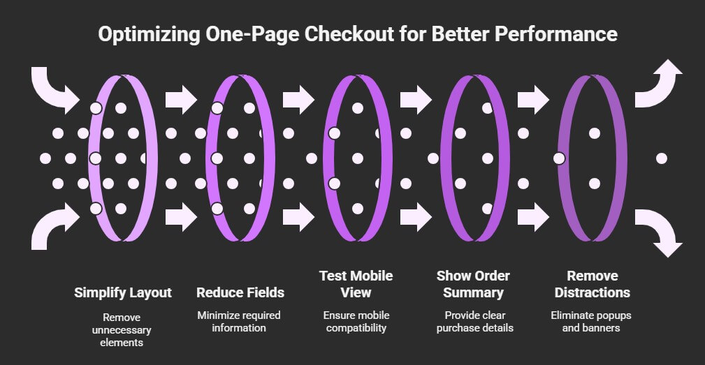
Keep It Clean
A messy page can make buyers feel unsure or even leave without paying. Remove anything that isn’t needed, like extra images or long texts. Make sure the form is easy to read and not too long. Try to group similar fields together so it looks neat. A clean and clear layout helps people stay focused and complete their orders faster.
Use Fewer Fields
Too many input boxes can feel tiring and slow things down. Only ask for the details you really need to complete the sale. For example, if the product is digital, you might not need a shipping address. Try to keep the checkout short and simple. People are more likely to finish if there’s less to fill out.
Test Mobile View
Lots of people buy things on their phones, so the checkout must work well on small screens. Check if the page loads quickly and buttons are easy to tap. If someone has to zoom in or scroll too much, they may give up. Keep everything in one column so it’s easier to follow. Mobile users should have the same smooth experience as desktop users.
Show Order Summary
Before buyers pay, they want to see what they’re getting. A clear order summary helps them feel sure about their purchase. It should include the product name, price, and total cost. If they see this clearly, they’re less likely to feel confused. This also builds trust and makes them more confident to place the order.
Remove Distractions
Things like popups or banners can take attention away from checking out. Try not to show anything that leads people off the page. The fewer clicks, the better. Keep the focus only on finishing the order. A simple design can do more than a fancy one.
Match the Checkout Style
Some stores don’t need a full checkout process. If you’re selling just one item or a single product bundle, using a single product checkout approach can eliminate unnecessary steps and boost performance. This keeps things quick and avoids making buyers go through extra fields. Not every store needs the same setup. Choosing what fits your products helps a lot.
FAQs About Pros and Cons of Using One-Page Checkout in WooCommerce
Here are some common questions people often ask when learning about one-page checkout in WooCommerce. These FAQs will help clear up doubts and give more helpful details that weren’t already mentioned in the article above. Let’s dive into them:
How Does One-Page Checkout Improve Buying Speed?
One-page checkout shortens the time it takes to place an order by putting all steps on a single page. Shoppers can enter their info and review everything without switching pages. This cuts down loading time and extra clicks. Faster checkouts lead to fewer abandoned carts.
What Makes One-Page Checkout Different from Multi-Step Checkout?
The main difference is in how the steps are shown. In one-page checkout, all fields like shipping, billing, and payment are on one page. Multi-step checkout separates these into several pages. One-page checkout feels quicker and easier for most users, especially on mobile.
Which Type of Store Should Avoid One-Page Checkout?
Stores that sell many products with lots of options may find a one-page checkout too tight. If your checkout needs extra steps, like collecting special details or custom choices, the layout can get crowded. In such cases, a step-by-step process works better.
How Can One-Page Checkout Affect Customer Trust?
If designed clearly, it actually builds trust by being transparent. Customers see everything they need, including prices, totals, and fields, on one page. They don’t feel confused or surprised. This makes them feel safer when buying something online from your store.
What Features Help Make One-Page Checkout Easy to Use?
Helpful features include clear labels, autofill support, smart field layouts, and live error messages. These small touches make the checkout easier for everyone. They also prevent buyers from making mistakes. Simple design choices improve the whole shopping experience.
What Steps Help Reduce Mistakes in One-Page Checkout?
Use real-time error messages, required field markers, and easy-to-read field names. These help users avoid skipping anything important. If something is missing or wrong, a quick message can guide them. This saves time and avoids order issues later.
Which Layout Style Works Best for One-Page Checkout?
A single-column layout usually works best, especially for mobile screens. It keeps things in a clear order and avoids clutter. Place shipping, billing, and payment fields in the right sequence. Avoid sidebars or distractions that pull attention away from completing the order.
End Note
Some shoppers love a fast and easy checkout, while others prefer a step-by-step process that feels more organized. That’s why choosing the right style matters. The one-page checkout may work great for some stores but not for all.
When looking at the pros and cons of using one-page checkout in WooCommerce, it’s clear that it brings speed, simplicity, and better mobile use. But there are also things like design challenges, slower loading, or tracking issues that store owners must keep in mind. What works best depends on your products and your customers’ behavior.
