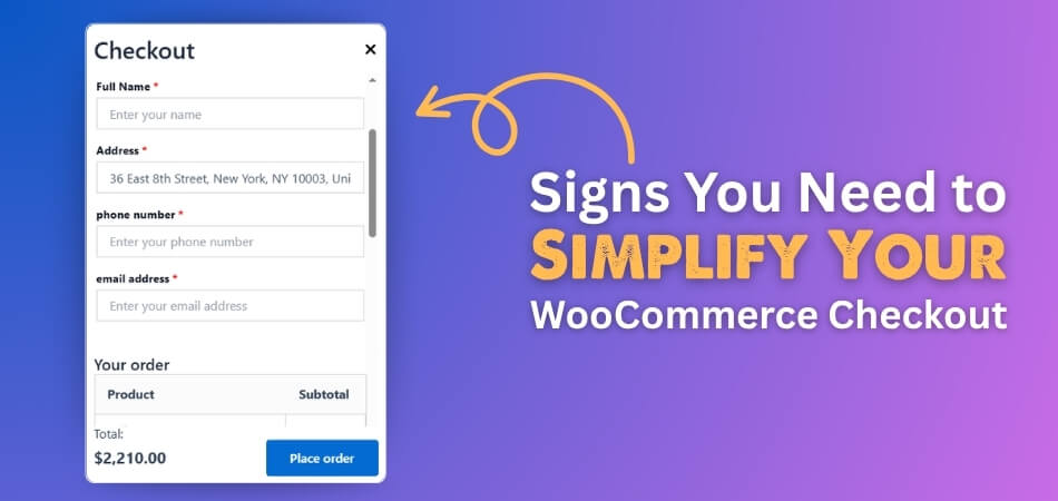
WooCommerce checkout is where shoppers finish their order and pay for the things they want. When this part of your store is smooth, customers are more likely to buy. But if it feels hard or confusing, many people will leave without buying. This is why you might want to know about the 5 signs you need to simplify your WooCommerce checkout.
The five clear signs that show you need to simplify your WooCommerce checkout are: lots of abandoned carts, too many fields to fill, slow page loading, trouble on mobile devices, and confusing steps. If your customers are facing any of these problems, they are more likely to quit before they buy.
Do you want to know what each sign really means and how it affects your store? Keep reading this article, because you will find every important detail about this topic and learn how to make your WooCommerce checkout better.
5 Signs You Need to Simplify Your WooCommerce Checkout
Sometimes, your online store’s checkout can get a bit messy without you even noticing. A complicated checkout process can confuse your customers and even make them leave before buying. It’s not always easy to spot the signs early. But there are some clear hints that tell you it’s time to clean things up. Let’s take a look at those signs one by one.
Lots of Abandoned Carts
When people keep adding things to their cart but don’t complete the checkout, that’s a clear warning sign. A long or confusing checkout process often makes them quit. Customers may get frustrated if the steps aren’t clear or take too long. They may leave before paying, even when they really want the product. This kind of drop-off hurts your store more than you may realize.
The more screens and fields they face, the more likely they are to give up. Creating an account or answering too many details can be too much. A short and clean checkout helps people finish buying. By checking your cart data, you’ll see how many users are leaving halfway. That’s often the push you need to make things simpler.
Too Many Fields
Long forms are one of the biggest turn-offs during checkout. People don’t enjoy typing lots of personal information just to place an order. Asking for things like the company name or the second address can feel unnecessary. The more you ask, the more time it takes. That leads to fewer completed purchases.
Only ask for the details that are needed to send out the order. Basic info like name, email, and shipping address is usually enough. Every extra field adds one more reason for someone to leave. Try going through your own checkout and count how many steps there are. Cutting down a few fields can make a big difference.
Slow Page Loading
Any slow-loading checkout page can make customers lose interest fast. People expect speed, especially when they’re ready to buy something. Delays can feel like the website is broken or not safe. It turns a good shopping experience into a frustrating one. That often leads to people leaving the page.
Fast checkout builds trust and keeps things smooth. Test your page on different devices to see how it performs. Big images or extra tools can make pages heavy and slow. Removing what’s not needed can help things load faster. A quick, snappy page makes people more likely to finish their order.
Mobile Trouble
A lot of people shop using their phones, and your site needs to work well on small screens. If they have to zoom in, scroll too much, or tap tiny buttons, it becomes a hassle. Shopping should feel smooth, not like a puzzle. A mobile checkout should be clean, simple, and easy to use. That way, customers can buy anytime and from anywhere.
Big buttons, readable text, and a clear layout are super helpful. You don’t want your users squinting or tapping the wrong thing. Try placing a test order from your own phone. That will help you spot anything that feels awkward or slow. Fixing those small things makes a big difference for mobile users.
Confusing Steps
A checkout that feels too long or unclear can make customers give up. They shouldn’t feel lost or unsure about what to do next. If the steps are all over the place or the buttons are hard to understand, people get annoyed. Even if they like the product, they might still leave. A clear and simple path helps them move forward with ease.
Using easy words like “Next” or “Place Order” can guide people better. One simple way to do this is by using the Direct Checkout for WooCommerce Plugin, which helps skip extra pages and send users straight to payment. Keeping the number of steps small and each one clear really makes a difference. Showing a progress bar can also help people feel more in control. A better checkout flow means more people buying from your store.
How Many Fields Are Too Many in WooCommerce Checkout?
Most people don’t enjoy filling out long forms when buying something online. It feels boring and takes up too much time. If the checkout asks for many details, buyers may feel annoyed and leave. They want to place the order quickly without typing too much.
You should only ask for things that are truly needed for the order. Name, email, address, and payment info are usually enough. Asking for extra things like the company name or a second phone number isn’t always needed. The more fields you add, the more people might leave the page.
In most cases, more than six fields can feel like too much for a regular checkout. Keep it short to help buyers finish. A short and easy form feels better and keeps people from giving up. Clean checkouts bring more orders and happy customers to your store.
Common Confusing Elements Used on Checkout Pages That Lead to Poor Sales
A checkout page should be quick and simple, not slow or confusing. When buyers feel lost, they often leave without paying. Below are common things that make checkouts messy and lower your sales.
- Too Many Form Fields: Extra fields make the form feel long and boring. Customers often quit when they see a lot to fill out.
- Forced Account Creation: Being asked to create an account before buying feels pushy. Many shoppers leave when they don’t want to sign up.
- Unclear Error Messages: Messages like “Invalid field” don’t help users fix their mistake. Clear guidance is needed to help them move forward.
- Hidden Shipping Costs: Extra costs shown at the end feel like a surprise. This makes people feel tricked and stop their purchase.
- Long Multi-Step Process: Too many checkout steps make people feel stuck. A simple one-page checkout often works better and faster for everyone.
- Poor Mobile Design: Small buttons and crowded screens make mobile shopping hard. People leave fast if they can’t tap or read properly.
- Slow Page Loading: Waiting even a few seconds can feel too long. A slow page makes the store look weak or broken.
- Confusing Button Labels: Buttons with unclear words like “Continue” confuse people. It’s better to use clear labels like “Next” or “Place Order.”
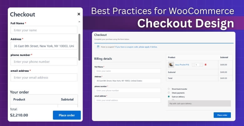
Best Practices for WooCommerce Checkout Design
Keeping your WooCommerce checkout page clean and simple can help more people finish their orders. Many small things can make a big difference. A smooth checkout means fewer problems and faster payments. Let’s look at some easy tips to do it right.
Keep It Short
Long forms can make people feel tired or bored. Most buyers don’t want to fill too many boxes just to buy something. Ask only for important things like name, email, and shipping address. Leave out extra questions that don’t help. A short form makes the checkout faster. When things are quick and simple, people are more likely to finish their order.
Use One Page
Going through many pages can be annoying during checkout. People may feel like it’s taking too long. Putting everything on one page helps them do it all in one place. It also saves time and feels easier. They can see what they need to do without clicking around. A one-page checkout is simple and works better for most people.
Show Progress Clearly
If your checkout has a few steps, it’s good to show where the buyer is. A progress bar or step numbers can help. It shows how far they’ve come and what’s left. This keeps people from feeling lost. They feel more sure when they see clear steps. That helps them stay until the end and complete the order.
Make It Mobile-Friendly
Many people shop using their phones, not just computers. Your checkout should work well on small screens as well. Big buttons, clear text, and simple layout help a lot. If people can tap and read easily, they won’t leave. Make sure the page loads fast on mobile. A phone-friendly checkout brings more happy customers.
Use Clear Buttons
Some buttons are confusing if the words are not clear. Use simple words like “Place Order” or “Pay Now.” These tell people what will happen when they click. Avoid words like “Continue” or “Next” that don’t say much. When buttons are clear, people click with confidence. That helps them finish without problems.
Show Total Cost
No one likes seeing extra costs at the end. Always show the full price, including shipping and tax, before payment. This helps people trust your store more. It also saves them from getting shocked later. When everything is clear, they are more likely to complete the order. Honest pricing builds customer trust.
Tips on Building Trust During the Checkout Process
Trust is something every online shopper looks for during checkout. If the process feels shady or too much, people may stop right there. Even the design and wording can affect someone’s confidence while buying. Let’s explore what really helps build trust while they check out.
Clear Return Policy
People feel safer when they know they can return something if needed. Place your return policy link where it’s easy to find. Use simple words that explain what they can return and how long they have. When customers see this, they feel less pressure and more at peace. A clear return option shows you care about their experience.
Honest Product Details
Shoppers like to be sure about what they’re buying before paying. Add short and honest product info even near the checkout. This reminds them what they’re getting and helps avoid second thoughts. Use real pictures and avoid fancy words that confuse people. When they feel sure about the product, they feel better about placing the order.
Save Cart Option
Sometimes people need more time before buying. Giving them the option to save their cart can help them come back later. It shows you care about their shopping and not just quick sales. You can even offer to email the cart to them. This small step builds comfort and trust without any pressure.
Fast Support Access
Quick help during checkout is always a good thing. Adding a help button or small chat link gives customers a sense of support. They may never use it, but seeing it makes them feel safer. It tells them you’re there if anything goes wrong. Support that’s easy to find makes the whole process more trustworthy.
Easy-to-Use Forms
Forms that are hard to fill can make people feel unsure. Keep labels clear, and make sure every field works without errors. If a mistake happens, give a soft and helpful message. It should feel like someone guiding, not blaming. A smooth form makes people trust the website more.
Guest Checkout Choice
Many new buyers just want to place their order and leave. For some users, being required to create an account feels like a barrier—offering a guest option can ease that tension. However, before enabling it, it’s worth understanding the pros and cons of guest checkout to see how it fits your store’s trust-building strategy. Giving choices helps people feel more in control. A small change like this can lead to better trust and more sales.
Trust Seals and Badges
Trust badges like “Secure Payment” or “100% Safe” help buyers feel protected. Put them near the payment section where people look before placing an order. Don’t overdo it—just a few trusted ones are enough. These symbols work because people recognize them from other sites. A familiar badge adds quick comfort during payment.
Plugins That Can Help Simplify Your WooCommerce Checkout
Making your WooCommerce checkout simple can help more people finish their orders without any stress. Sometimes, small things make buyers leave before paying. With the right tools, you can make the checkout faster and easier. Let’s look at a few helpful plugins to do that.
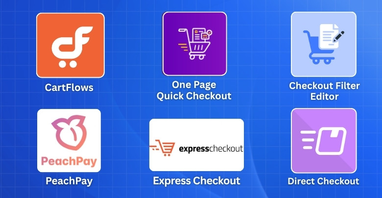
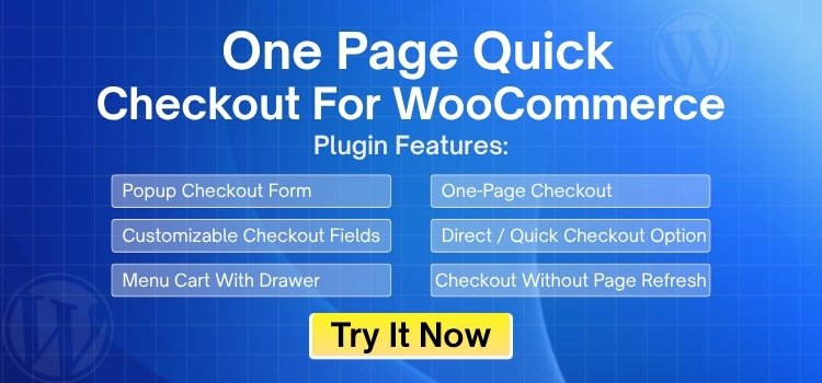
One Page Quick Checkout For WooCommerce
One page quick checkout for the WooCommerce plugin keeps the checkout process fast and clean for your customers. It lets people check out without going to another page or waiting for anything to reload. You can also change how the checkout form looks and works. It fits with any page builder, so it’s easy to use. Everything happens quickly on one page, which helps more people finish their orders.
Features:
- Popup Checkout Form
- One-Page Checkout
- Checkout Form Customization
- Direct Checkout Button
- AJAX-Powered Checkout
- Support with Any Page Builder
Direct Checkout Plugin
This plugin helps make the checkout process simple and fast. It takes buyers straight from product to payment, skipping the cart page. Fewer steps mean fewer chances for people to leave. It’s a great way to keep things moving smoothly. This plugin is perfect for stores that want fast checkouts.
Features:
- Skip Cart Page
- Send Users Directly to Checkout
- Supports Buy Now Buttons
Checkout Field Editor
Checkout field editor plugin gives you control over what fields show up during checkout. You can remove fields you don’t need and keep only the basics. It helps make the checkout form clean and easy to finish. You can even add custom fields if needed. A simple form means fewer drop-offs.
Features:
- Add or Remove Fields
- Reorder Fields Easily
- Add Custom Fields Like Notes or Text
- Hide Unwanted Fields
- User-Friendly Settings Panel
Express Checkout Plugins
These plugins include options like PayPal Express or Apple Pay. They make it easy for people to pay with just a few clicks. No need to fill in all the details again. They work great for fast and mobile checkouts. These tools help customers pay quickly and easily.
Features:
- Works with PayPal, Apple Pay, Google Pay
- Speeds Up Mobile Checkout
- Reduces Form Fills
- Helps Customers Complete Purchases Faster
CartFlows
CartFlows lets you build a custom checkout that feels smooth and easy to follow. You can design the steps to match your store’s style. It helps you add things like thank-you pages and offers after the purchase. That makes the shopping feel more complete. It helps people stay focused from start to finish.
Features:
- Custom Checkout Steps
- Drag-and-Drop Builder
- Works with Any Theme
- Better Checkout Layouts
PeachPay
PeachPay gives buyers a fast way to check out with saved payment info. They don’t need to fill out the same forms every time. It’s simple, fast, and works on all types of devices. It’s great for repeat buyers and even first-time ones. This plugin helps speed up the entire checkout.
Features:
- One-Click Checkout
- Save Customer Info for Faster Payments
- Works on Desktop and Mobile
- Easy for New and Repeat Buyers
How Do You Measure the Effectiveness of Your WooCommerce Checkout After Simplifying It?
After making your WooCommerce checkout simple, it’s important to know if the changes really helped. You need to look at what’s working and what’s not. Some clear signs can show if things are better now. Here is what to check:
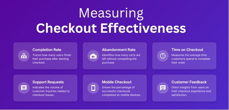
Checkout Completion Rate
This number shows how many people start and finish the checkout. If more people are finishing their orders, your changes are working. A higher completion rate means buyers find the process easy. You can check this through your store’s stats or plugins. Watch for improvements after every update.
Cart Abandonment Rate
When people add items to their cart but don’t pay, that’s cart abandonment. This often happens because of lost sales due to complex WooCommerce checkout, where buyers feel confused or stuck. If this number goes down, your checkout is better. A smooth and fast checkout helps people stay and complete the order. You can check this rate weekly to spot patterns. Lower numbers are always a good sign.
Time Spent on Checkout
The time customers spend during checkout can say a lot. If it takes too long, they may leave before paying. Shorter times usually mean your form is easier and faster. Use tools or plugins to track the time. A quick checkout makes people happy and more likely to return.
Support Requests
If buyers keep asking for help during checkout, something may still be confusing. After you simplify it, these help messages should go down. Fewer questions mean people understand what to do. Keep an eye on messages or emails about checkout issues. Less support needed shows the page is clear.
Mobile Checkout Rate
Many people shop on their phones, so it’s good to check mobile success. A good checkout should work well on both phone and desktop. If mobile orders increase, it means the new design is better. You can check this using simple reports or tools. A strong mobile rate means more happy shoppers.
Customer Feedback
Buyers often share what they like or don’t like. You can ask them how the checkout felt after the changes. Read their reviews, emails, or simple survey replies. Their words give you honest clues. Good feedback means your new checkout is easy and friendly.
Frequently asked questions
Even a small change in the checkout process can make a big difference in how buyers feel while shopping. If you’re working on improving your WooCommerce checkout, you might have a few questions in mind. Here are some simple answers to common questions that can guide you through making your checkout better and easier.
Why Should Checkout Be Tested Regularly?
Testing helps you find bugs or confusing areas before buyers do. You can test on different devices to see if it works smoothly everywhere. Regular testing also helps you spot slow-loading pages. Fixing these early stop problems before they cost you sales.
Can Colors and Fonts Affect Checkout Experience?
Yes, hard-to-read fonts or very bright colors can confuse or distract buyers. Soft, clear fonts and calming colors make the page easier to use. If buttons or text are hard to see, people may leave. Good design choices keep checkout smooth and easy.
Why Are Fewer Clicks Better in Checkout?
Each extra click adds time and effort. If buyers have to click through many pages or pop-ups, they may give up. A short, direct path from cart to payment helps keep them engaged. Less clicking usually means more completed sales.
How Can Button Placement Improve Checkout Flow?
Placing buttons where people naturally look saves time and confusion. “Place Order” or “Continue” should be in the same spot every time. If people have to search for what to click, they may quit. Clear button placement guides buyers through the process smoothly.
Does Free Shipping Influence Checkout Behavior?
Yes, many shoppers expect free shipping and may leave if they don’t see it. Even a small extra fee can feel like a deal-breaker. Showing shipping info early helps set expectations. Offering free shipping where possible keeps buyers more interested.
What Happens When Checkout Is Too Flashy?
Overusing animations, popups, or flashy banners can distract and slow down the page. These extras make the process harder instead of better. Simple pages load faster and feel easier to use. Keep checkout clean and straight to the point for better results.
How Do Confirmation Emails Help After Checkout?
A quick and clear email shows buyers that their order went through. It builds trust and lowers worry. Add simple details like order number, items, and shipping info. A friendly email helps the checkout feel complete and professional.
What If Customers Want to Change Items Last Minute?
If they can’t easily go back or edit their cart, they may give up. Add a clear “Edit Cart” button before payment. This gives buyers a feeling of control. Small things like this help finish the sale smoothly.
Final Thoughts
It’s easy to miss how small issues in your checkout can cause big problems for your store. Long forms, slow pages, or too many steps can quietly push customers away. But paying attention to the 5 signs you need to simplify your WooCommerce checkout can turn things around.
When you notice things like abandoned carts or customers leaving before paying, these are signs you can’t ignore. Simple changes to your checkout can help more people finish their orders and feel happy about shopping with you.
Don’t let a tricky checkout cost you sales. Start paying attention to what your customers experience—and take action where it matters, and take action today. Your shoppers—and your sales—will thank you for it.