Setting up a single-page checkout in a WooCommerce site may look simple, but small mistakes can easily make it complicated. A checkout page should feel fast, smooth, and simple for buyers. If not, it can cause frustration, and people may leave before paying. That is why many store owners often look for common mistakes to avoid when setting up a single-page checkout.
The most common mistakes in setting up a single-page checkout are asking for too many details, having a cluttered layout, adding hidden costs, slow page loading, forcing account creation, poor mobile design, unclear error messages, and missing trust signals. These problems often push customers to abandon their purchase, leading to fewer sales and a frustrating shopping experience.
Do you want to know how to avoid these mistakes and set up a checkout that feels smooth, clear, and trustworthy for your buyers? Then, keep reading because this article covers every important detail you need to understand about single-page checkout setup and improvements.
Common Mistakes to Avoid When Setting Up a Single-Page Checkout
Setting up a single-page checkout sounds simple, but there are many things that can go wrong if not planned well. A checkout should feel smooth, clear, and quick for the customer. If it creates confusion or frustration, people may leave before finishing their purchase. To help avoid that, here are some common mistakes you should watch out for.
Too Many Fields
One of the biggest issues is asking customers to fill in too many details. Long forms make the process feel heavy and slow. People want to get done quickly, especially when using one page checkout for wholesale stores, so only ask for information that is truly needed. Keep it short and simple to keep them moving forward.
No Clear Layout
A messy design can confuse buyers and make them second-guess their steps. If fields are placed randomly or the design looks crowded, customers may not know where to start. A clean layout with proper spacing helps guide them smoothly. Good design builds confidence to complete the checkout.
Hidden Costs
Nothing annoys a customer more than unexpected charges at the last step. If you add extra shipping fees or hidden taxes too late, people are more likely to quit. Always show the total cost early in the process. Being clear builds trust and reduces cart abandonment.
Slow Loading
Speed plays a big role in online checkout. If the page takes too long to load, customers may leave before entering their details. A fast checkout feels reliable and smooth. Optimizing images and reducing unnecessary code helps keep the page quick.
No Guest Option
Forcing people to create an account before buying can turn them away. Many just want to make a quick purchase without signing up. Offering a guest checkout keeps things simple and welcoming. Later, you can give the option to create an account if they want.
Weak Mobile Design
Many people shop on their phones, so a checkout that works poorly on mobile is a big mistake. Small buttons, zooming issues, or broken layouts can frustrate users. A mobile-friendly checkout should be easy to read and tap. A smooth mobile design keeps more buyers engaged.
Poor Error Messages
If a customer makes a mistake, they should know exactly what went wrong. Weak or unclear error messages can confuse people and waste time. Always show messages near the problem field in simple words. This makes fixing errors quick and stress-free.
Missing Trust Signals
Customers want to feel safe when entering their personal and payment details. If your checkout page lacks trust signs like security badges, SSL icons, or customer reviews, buyers may hesitate. These small details show that the site is secure and reliable. Adding clear trust signals helps build confidence and encourages customers to finish their purchase.
How Can WooCommerce Site Owners Properly Set Up a Single-page Checkout?
Setting up a single-page checkout on a WooCommerce site may sound simple, but it takes the right steps to make it smooth and effective. When done properly, it helps customers finish their purchase faster and easier. Let’s look at how WooCommerce site owners can set it up the right way.
Step 1: Install the Plugin
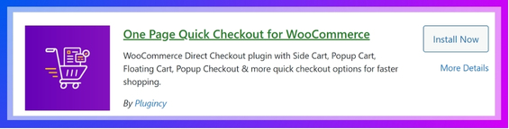
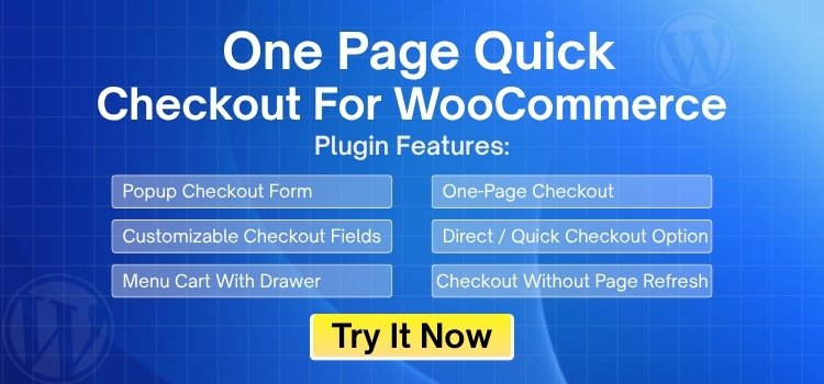
WooCommerce comes with a checkout page, but sometimes it may not work well or may not be set up for better sales. To fix this, you can use a dedicated plugin. A great choice is the direct checkout for WooCommerce plugin, which makes the process simple and lets customers finish their order on one page. It helps increase sales and improve the overall shopping experience. Here’s how you can install it:
For the Free Version:
- Go to your WordPress Admin Dashboard.
- Navigate to Plugins > Add Plugin.
- Search for “One Page Quick Checkout for WooCommerce”
- Click Install Now and then Activate.

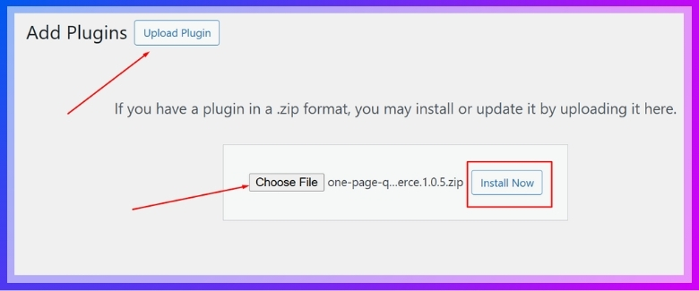
For the Pro Version:
- Go to the plugin’s official website and complete your purchase.
- After purchase, you’ll receive a download link via email.
- Download the ZIP file to your computer.
- From your WordPress Admin Dashboard, go to Plugins > Add New.
- Click “Upload Plugin” at the top.
- Select the downloaded ZIP file, then click “Install Now”.

- Once installed, click “Activate”.
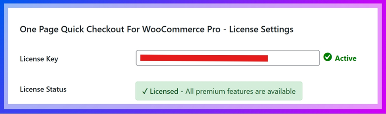
- Navigate to Onpage Checkout > Plugin License in your dashboard menu.
- Enter your license key to unlock PRO-only features.

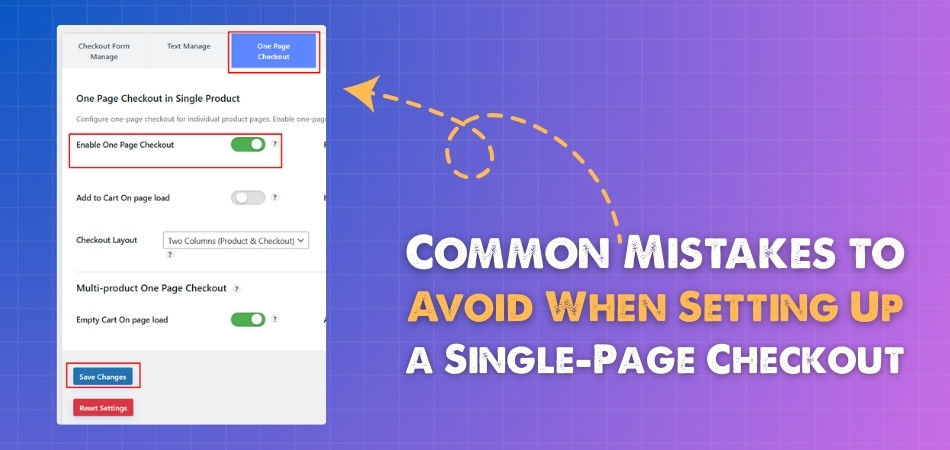
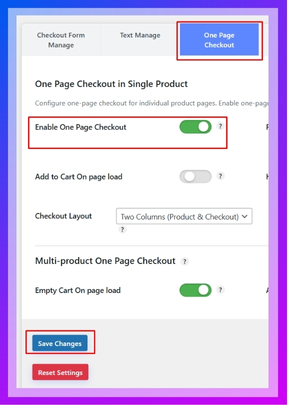
Step 2: Enable Single-page Checkout
After installing the plugin, the WooCommerce Single-Page Checkout feature is usually enabled by default. If it’s not, you can easily turn it on manually:
- In your dashboard, go to Onpage Checkout > One Page Checkout.
- Toggle the Enable One Page Checkout option to On.

Step 3: Enable Single-page Checkout for Individual Products
Want the Single-Page Checkout only for specific products? Here’s how:
- Go to Products in your dashboard.
- Click Edit under the product you want to modify.

- Scroll down to the One Page Checkout settings section on the product edit page.
- Turn on the One Page Checkout option.

- Save and publish the product.
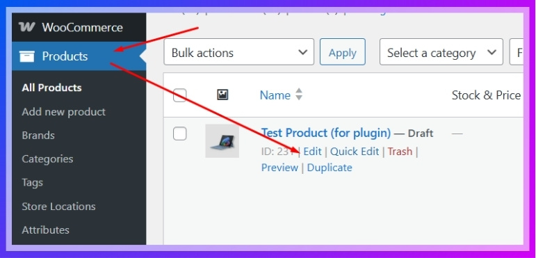
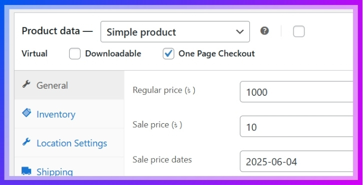
Now, this product will display the checkout form directly on its page!
Step 4: Enable Single-page Checkout for All Products
If you want to apply Single-Page Checkout across your entire store:
- Go to Onpage Checkout > One Page Checkout.
- Turn on the “Enable for All Products” option.

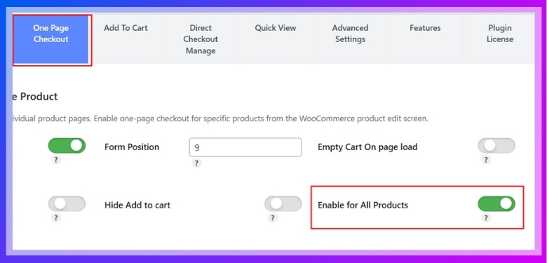
Step 5: Additional Configuration Options
Customize the checkout experience further to align with your store’s needs:
- Form Position – Choose where the checkout form appears on the product page.
- Empty Cart on Page Load – Useful for flash sales or special events.
- Add to Cart on Page Load – Automatically adds a product to the cart when the page loads.
- Hide Add to Cart Button – Focuses the user directly on the checkout.
- Checkout Layout – Adjust the design to fit your brand’s look and feel.
To adjust these settings:
- Go to Onpage Checkout in your WordPress dashboard.
- Click on One Page Checkout.
- Adjust the settings as needed to optimize the checkout experience.
Design Patterns for Single-page Checkout That Improve Conversion Rates
Designing a single-page checkout is not only about looks; it is about making the process smooth and clear for the customer. A well-planned design can turn visitors into buyers more effectively. Let’s explore some proven design patterns that improve conversion rates.
Clear Call-to-Action
The checkout button should stand out and be easy to find. If it blends with the rest of the page, people may not notice it quickly. Use clear text like “Place Order” or “Complete Purchase” to avoid confusion. A strong call-to-action reduces hesitation and speeds up checkout.
Progress Indicators
Even in a single-page checkout, showing progress can help. Small visual cues like checkmarks or highlighted sections tell customers what step they are on. This reduces uncertainty and makes the process feel shorter. When customers see progress, they feel more motivated to finish.
Autofill Support
Autofill makes the checkout faster by filling in details like name, email, and address automatically. Many browsers and devices already have saved information, so allowing autofill cuts down typing. This makes the process smoother, especially on mobile. Quick form filling improves convenience and reduces cart abandonment.
Guest Checkout Option
Forcing account creation can slow down the process and frustrate buyers. Offering a guest checkout option keeps things simple and friendly. Customers can always create an account later if they want. Guest checkout removes barriers and helps more people complete their purchase.
Smart Form Validation
Instant error detection improves the checkout experience. If a customer enters a wrong email or leaves a field blank, the system should point it out immediately. Clear and simple error messages save time and prevent confusion. Smart form validation keeps the process smooth and stress-free.
Minimal Distractions
Extra links, pop-ups, or ads on the checkout page can pull customers away. The focus should stay on completing the purchase, not on browsing other products. Removing unnecessary elements keeps the page clean and direct. A distraction-free checkout increases the chance of higher conversions.
Key Benefits of Using a Single-page Checkout in WooCommerce
A checkout page is one of the most important parts of an online store, and its design directly affects sales. A well-planned single-page checkout can improve user experience and help reduce cart abandonment. Let’s explore its main benefits in detail.
Faster Process
Customers value speed when completing their orders, and single-page checkout offers exactly that. With all details like billing, shipping, and payment on one page, there is no need for extra clicks. This helps reduce the time spent on checkout. When buyers see a shorter process, they are more likely to finish it quickly. Faster checkout not only improves sales but also leaves customers with a better impression of the store.
Lower Cart Abandonment
One of the biggest reasons people leave their carts is a complicated checkout process. When steps are spread across multiple pages, it can frustrate customers and cause drop-offs. This is often connected to multi-step checkout problems, where extra clicks and long forms make people quit. A single-page checkout keeps the process simple, which reduces the risk of abandoned carts.
Easy Navigation
One key advantage of single-page checkout is that it keeps everything within easy reach. Buyers don’t need to reload pages or go back and forth to fix mistakes. They can review all details on the same screen before completing payment. This reduces errors, saves time, and makes the process stress-free. Easy navigation leads to better satisfaction and smoother conversions for any WooCommerce store.
Mobile Friendly
Most people shop using their phones, and single-page checkout works perfectly for them. Switching between multiple pages on a small screen often causes delays and mistakes. A one-page layout reduces scrolling, keeps forms compact, and ensures quick action. Mobile shoppers can complete purchases without struggling with complex layouts. This smooth mobile experience helps stores capture more sales from their mobile users and build stronger trust.
Improved Clarity
Clarity is important during checkout, and a single-page design ensures that everything is visible in one place. Customers can review order details, shipping options, and payment methods without confusion. When the process feels transparent, trust increases naturally. Buyers know exactly what they are paying for and how much it will cost. This kind of clear layout not only reduces doubts but also makes customers feel more confident to complete their purchase.
Higher Conversions
Every store owner wants to improve conversion rates, and single-page checkout plays a big role. A faster and easier process leads to fewer abandoned carts and more completed orders. Customers prefer not to deal with long forms or complex steps. By removing these barriers, stores can directly increase sales. A simple, focused checkout page keeps customers engaged until the final step, which brings higher conversion results.
How to Track Your Single-page Checkout Performance?
Tracking how your single-page checkout is performing is very important if you want to improve your sales. A checkout may look simple, but you need to know if customers are completing their orders. Let’s see how you can track it better.
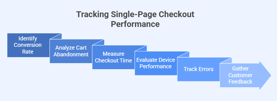
Conversion Rate
The first thing to check is how many people finish their purchase after starting checkout. A higher number means your checkout is working well. If the rate is low, it could mean something is causing drop-offs. Watching conversion rates helps you spot where improvements are needed.
Cart Abandonment
Noticing how many customers leave without completing their order tells a lot about performance. If the number is high, it may show that the checkout process is too long or unclear. Tracking abandonment gives you a chance to fix problems. Small design changes or clearer steps can reduce it.
Checkout Time
Measuring how long customers take to complete the checkout can show if the process is smooth. If it takes too long, people may get frustrated and leave. A faster checkout keeps customers interested and makes the process feel simple. Keep an eye on average checkout time to improve speed.
Device Performance
Customers use phones, tablets, and computers to shop. If checkout works better on one device and worse on another, it can affect sales. Tracking performance by device helps you make sure the design fits all screens. A smooth mobile experience is especially important to avoid losing buyers.
Error Tracking
Errors during checkout can stop customers from finishing their order. Tracking error messages shows you which fields or steps cause the most trouble. Fixing these problems makes the process clearer and easier for customers. Error tracking is key to reducing frustration and boosting sales.
Customer Feedback
Listening to what customers say about their checkout experience is very helpful. Feedback can point out issues that numbers alone may not show. Comments about confusion, missing features, or problems guide you toward useful changes. Adding surveys or review requests can help collect feedback easily.
Tips to Recover Lost Sales From Checkout Abandonment
Checkout abandonment happens when customers add items to their cart but leave before completing their purchase. This is a common problem that can hurt sales. With the right steps, you can recover many of these lost opportunities. Here are some simple but effective ways to bring back lost checkout sales:
- Send Reminder Emails: Abandoned cart emails bring customers back by reminding them about items they left behind and encouraging them to finish buying.
- Offer Limited Discounts: A small discount or free shipping can give hesitant buyers the final push they need to complete their purchase immediately.
- Simplify Checkout Process: Complicated steps frustrate customers, so removing extra clicks and forms creates a smoother path that makes completing checkout much easier.
- Use Exit Popups: Exit-intent popups can capture attention when customers try to leave, offering deals or reminders that persuade them to stay.
- Add Multiple Payments: Providing different payment methods ensures customers don’t leave just because their preferred way to pay isn’t available.
- Highlight Trust Badges: Trust symbols like SSL certificates, secure payment logos, or guarantees reduce doubt and make customers feel safe entering their details.
- Enable Guest Checkout: Forcing signups creates friction, while allowing guest checkout helps customers complete purchases quickly without creating unnecessary accounts first.
- Retarget with Ads: Targeted ads remind customers about their abandoned products while browsing elsewhere, gently encouraging them to return and purchase.
Frequently asked questions
Setting up a single-page checkout can bring great results, but many store owners have small questions about how to make it smooth. These FAQs cover extra details and practical concerns that are not discussed in the main article.
Why Is Testing Checkout Flow Important?
Testing the checkout flow ensures that customers can complete their purchase without facing unnecessary hurdles. By simulating the buying process yourself, you can identify confusing steps, broken links, or technical glitches. Regular testing helps you catch problems before customers experience them and leave.
How Does Checkout Design Impact Trust?
Design plays a big role in how trustworthy a checkout page feels. A clean and professional layout with clear order summaries gives buyers confidence. When a page looks cluttered or poorly designed, customers may doubt its security and decide not to pay.
Should Checkout Forms Have Auto-save Features?
Auto-save in checkout forms can be very helpful when customers accidentally refresh or close the page. If their details remain saved, they don’t have to start over. This simple feature reduces frustration and helps people return to finish their order smoothly.
Why Is Checkout Button Placement Essential?
The position of the checkout button affects how quickly customers can complete their order. A button placed too far down the page may go unnoticed. Clear placement at the right spot ensures customers see it quickly and proceed without hesitation.
How Can Order Summaries Reduce Mistakes?
Showing a detailed order summary helps customers review items, quantities, and prices before paying. Without this, they might feel unsure or make errors. An accurate summary reduces confusion, builds trust, and encourages buyers to confidently finish the purchase process without second-guessing.
What Role Does Language Simplicity Play?
Checkout instructions should always be written in simple, easy-to-understand language. Complicated terms confuse customers and slow them down. Using clear words like “Billing Address” instead of technical phrases ensures that all buyers understand the process and complete it without hesitation.
Should Checkout Pages Include Support Links?
Adding a small “Need Help?” or “Contact Support” link on the checkout page can reassure buyers. If they face a problem, they know help is nearby. This reduces stress, builds confidence, and increases the chance of order completion.
Bottom Line
A checkout page is the final step that decides whether a customer completes the purchase or leaves the cart behind. Even small issues can create frustration and push buyers away, which directly affects sales and customer trust.
By understanding the common mistakes to avoid when setting up a single-page checkout, store owners can create a process that feels smooth, quick, and safe. From reducing form fields to improving mobile design, every small improvement makes checkout easier and more reliable for customers.
Remember, a single-page checkout is not just about speed; it’s about building confidence at the moment that matters most. Keep things simple, transparent, and customer-focused, and you’ll see fewer abandoned carts and more completed sales in your store.