Mobile devices have changed the way people shop online, making every step of browsing faster and more personal. With smaller screens, the way options are displayed becomes very important. This often leads shoppers to wonder how do WooCommerce filters work on mobile devices?
WooCommerce filters on mobile work through sliding panels or filter buttons that open vertical menus. Shoppers tap checkboxes, sliders, or swatches to narrow products. Filters use AJAX or reloads to update results instantly. Active filters show as chips, keeping the experience smooth and touch-friendly.
Readers who are interested in this topic may want to learn more about the small but important details. Mobile filters come with both challenges and best practices that affect the shopping experience. In this article, you will find everything explained in simple words with clear examples.
How Do WooCommerce Filters Work on Mobile Devices?
WooCommerce filters on mobile devices work the same way as on desktop. The difference is mainly in how they are shown on smaller screens. Filters move into panels or buttons instead of sidebars. This makes them easier to use with fingers on touch screens. Let’s look at how WooCommerce filters work on mobile.

Mobile Basics
On phones, filters help narrow down products without changing how they function. The system works the same, but the screen design adjusts the layout. This ensures customers can still pick filters comfortably. The main goal is to keep product browsing smooth and simple.
Layout Changes
When space is limited, sidebars usually turn into a filter button. This button often sits above the product list for easy access. By tapping it, customers can open a panel or drawer. Inside, filters display in a neat vertical style that fits well.
Panel Behavior
Instead of a fixed sidebar, the filter panel slides over the page. Customers can open or close it with one tap on a button. Large touch-friendly checkboxes and sliders appear inside for use. This makes sure the options remain clear and easy to tap.
Filter Methods
Some setups update products as soon as a filter is tapped. Others wait for the user to press an apply button. Many stores rely on WooCommerce Ajax product filter so results appear instantly. Both styles keep choices active until removed or reset by the shopper.
Update Results
With AJAX active, filters refresh products instantly without reloading the page. If it isn’t enabled, the page reloads to apply changes instead. Either way, filters stay active as the user continues browsing, keeping results quick and consistent.
URL Handling
Filter choices are stored in the page address, known as the URL. This helps keep selections active while browsing, sorting, or reloading. Even the back button works correctly by following recent filter steps. This gives customers a smooth and dependable shopping experience.
Filter Types
Price sliders, size options, color choices, and rating filters are common. On phones, they appear as checkboxes, swatches, or sliders. Simple toggles, like in stock or on sale, are also shown. These options make product searching easier without overwhelming the small screen.
Clearing Options
Active filters usually show as chips above the product grid area. Each chip can be tapped to remove that single selection instantly. A clear all button is also available to reset everything. This helps users adjust results without starting their shopping process again.
WooCommerce filters on mobile are designed for touch screens. The system keeps product browsing smooth and quick, even on small displays. Customers can easily open filter panels, apply choices, and see updates. Clear options and simple layouts ensure the best shopping experience.
Types of WooCommerce Filters Commonly Used on Mobile
Types of WooCommerce filters often look different on mobile screens. They are shaped to fit smaller layouts while keeping product searches simple and clear. Each filter type has its own style and works in a unique way. Let’s look at the most popular ones in detail.
Price Sliders
On mobile, price sliders allow shoppers to drag handles to set minimum and maximum values. The design is touch-friendly, so users can easily adjust prices with their fingers. Some sliders also include number boxes for direct typing. This helps keep filtering simple and flexible.
Checkbox Lists
Checkbox lists show options like size, brand, or material in a vertical format. On phones, the checkboxes are larger to make tapping easier. Users can select multiple boxes at once, which helps refine results. They are straightforward and work well with many product categories.
Color Swatches
Color swatches display colored squares or circles instead of text options. On mobile, these swatches are often large enough for comfortable tapping. They make it easy to quickly pick a shade without reading labels. Shoppers find them visually clear and simple to understand.
Simple Dropdowns
Dropdown filters are great for keeping long option lists neat on small screens. When tapped, the list expands fully so users can scroll smoothly. They work well for categories with many choices, like brands. Clear labeling makes them easy to scan and choose from quickly.
Active Filter Chips
After picking options, many stores show small chips with the chosen filters. On mobile, these chips appear near the product grid and can be removed with one tap. A clear all option often sits beside them. This gives users control without opening the filter panel again.
WooCommerce filters on mobile are designed for simple touch use. Price sliders, checkboxes, swatches, and dropdowns each bring their own benefit. Active chips make managing filters quicker and easier. Together, they keep product searches smooth and user-friendly.
Challenges of Using WooCommerce Filters on Mobile Devices
Filters are very important for helping shoppers find products on smaller screens. But using them on mobile often comes with problems that can annoy users. These small issues can quickly make shopping harder than it should be. Let’s look at some common challenges together.

Small Tap Targets
On mobile, tiny checkboxes or buttons can be hard to press. Shoppers may tap the wrong filter option and feel frustrated. Designing larger, easy-to-tap targets solves this problem. Clear spacing between each filter option also helps improve comfort and accuracy.
Overlapping Menus
Sometimes filters overlap with menus or other elements on small screens. This makes it difficult for users to scroll or select options. Fixing this requires a responsive design that keeps filters separate. Clean layouts ensure filters and menus never clash with one another.
Hidden Filters
Many filters end up buried too deep in mobile layouts. Customers may not notice them unless they search carefully through menus, leading to missed opportunities for better navigation. Keeping them visible and easy to open makes the experience smoother.
Slow Response
Filters that take too long to update results can frustrate mobile shoppers. Limited bandwidth on mobile networks makes this issue worse. Using Ajax helps update results quickly without full page reloads. Fast filters keep customers focused and engaged during product searches.
Language Barriers
One overlooked challenge is making filters usable for international customers, and multilingual WooCommerce filters ensure shoppers can browse products in their preferred language. Without this, buyers may abandon the site quickly. Language-friendly filters build trust and make global shopping much easier.
Mobile filters should feel simple, fast, and easy to use every time. Clear layouts, quick updates, and larger tap areas make a big difference. Adding language support builds trust with more shoppers. Solving these issues leads to smoother mobile shopping experiences.
Best Practices for Designing WooCommerce Mobile Filters in WooCommerce
Best practices help filters work smoothly on small screens. They make sure people can quickly find products without confusion. Simple layouts, clear buttons, and touch-friendly designs matter the most. Let’s look at some useful practices that improve mobile filters.
Collapsible Menus
Using collapsible menus keeps the screen neat while still showing filter options. Instead of long lists, filters stay hidden until tapped by the shopper. This makes navigation much easier on small screens. It also avoids crowding the layout and helps keep attention on the products.
Sticky Filter Buttons
Placing sticky filter buttons ensures that the filter option is always visible. Even when users scroll down the product list, the button stays in place. This saves time and reduces effort while shopping. Customers can open filters anytime without needing to scroll back up.
Touch-friendly Layouts
Designing filters with large tap areas makes them easy to use on touch devices. Small checkboxes or sliders are difficult for fingers, especially on smaller screens. Filters should have wide spaces, bold labels, and enough padding. These simple design changes make the user experience much better.
Sidebar Adaptation
A good practice is to keep filters accessible, and many stores choose to display filters on the left sidebar in WooCommerce before adapting them into a mobile-friendly collapsible layout. This allows easy desktop use while still offering smooth access on smaller screens.
Clear Reset Options
Providing a clear reset button saves time for users. Instead of removing filters one by one, they can clear all selections at once. On mobile screens, this button should be easy to spot and tap. It gives shoppers a quick way to start fresh.
Designing mobile filters in WooCommerce needs thoughtful planning. Collapsible menus, sticky buttons, and touch-friendly layouts make the process smooth. Sidebar use and clear reset options add even more comfort. These practices keep shopping quick, simple, and enjoyable.
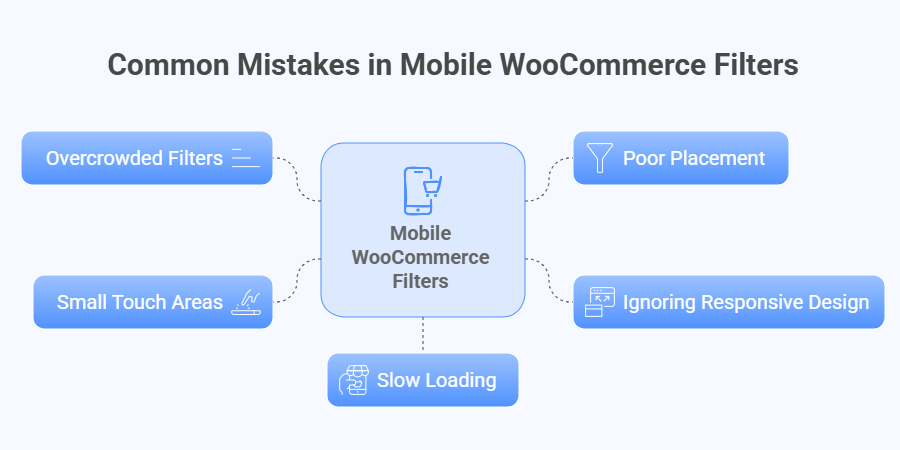
Common Mistakes to Avoid With WooCommerce Filters on Mobile
Mobile shopping is now more common than ever, and filters play a big role in making it smooth. When filters are not set properly, they can confuse shoppers and cause them to leave. Paying attention to details makes a big difference. Let’s explore the mistakes you should avoid.

Overcrowded Filters
When too many filter options are crammed together, it overwhelms users on small screens. Customers end up scrolling endlessly and may lose interest. Keeping filters short and focused makes them easier to use. A clean design helps shoppers find products faster without stress.
Poor Placement
Filters placed at the wrong spot on a page can go unnoticed. If users cannot find them quickly, they won’t bother searching longer. Putting filters at the top or in a clear sidebar helps. Good placement ensures shoppers can use them right away.
Ignoring Responsive Design
Filters that look fine on desktops may break on mobile devices. Overlapping text or hidden checkboxes can make navigation frustrating. Responsive design ensures filters adjust smoothly to any screen size. This keeps the shopping experience consistent, no matter the device used.
Small Touch Areas
Tiny checkboxes or buttons can be very hard to tap on phones. Users may hit the wrong option and feel annoyed. Larger tap areas with good spacing fix this problem. Simple design changes make mobile filters much more user-friendly overall.
Slow Loading
Filters that take too long to update discourage mobile shoppers quickly. Slow internet connections make this worse. Using Ajax or caching improves speed and keeps results instant. Faster filters keep people engaged and prevent them from abandoning the store early.
Mobile filters work best when they are clear, fast, and simple. Avoiding mistakes like overcrowding or poor design improves customer satisfaction. Responsive layouts and quick updates keep shoppers happy. With proper setup, filters make mobile shopping easier and more enjoyable.
FAQs About How Do WooCommerce Filters Work on Mobile Devices?
Mobile filters in WooCommerce often raise questions because the screen size and design are different from desktops. These FAQs answer some of the most common doubts about mobile filter behavior. Read on to understand how they really work in practice.
Can Filters Stay Open While Browsing?
Yes, filters can remain open in some designs while browsing product lists. This makes it easier to adjust options without reopening panels. Some stores also allow sticky filter panels. Testing your layout ensures it works smoothly for customers.
Do Filters Work With Touch Gestures?
WooCommerce filters are designed to respond well to touch gestures. Sliders move with finger swipes, and checkboxes react with simple taps. Larger touch areas improve accuracy for mobile users. Always test gestures on different devices to ensure smooth interaction.
Can Filters Be Customized Differently for Mobile?
Yes, many plugins allow custom layouts just for mobile screens. You can hide certain filters or change their display style. This makes browsing easier on small devices. Adapting filters for mobile often improves speed and user satisfaction.
Do Filters Work Without Internet Refresh?
When Ajax is enabled, filters update results instantly without page reloads. This keeps browsing fast and user user-friendly. Without Ajax, filters reload the page each time. Choosing Ajax gives the best mobile experience for most stores.
Can Filters Be Hidden Behind Icons?
Yes, many stores use icons like a funnel symbol to hide filters. Tapping the icon opens a panel with filter options. This saves space on smaller screens. Icons are easy for shoppers to recognize and use.
Are Filters Affected By Screen Orientation?
Filters may look different when switching from portrait to landscape view. A good responsive design adjusts the filter panel automatically. This keeps the layout neat across both orientations. Always test filters in both directions for smooth usability.
Can Multiple Filters Work Together on Mobile?
Yes, customers can combine filters like price, color, and size on mobile. The system applies all chosen filters to narrow results. This helps people shop with precision and speed. Combining filters is one of the strongest mobile features.
Do Filters Save Settings When Returning to the Page?
Some setups remember filter settings when users return from a product page. This keeps their search active without restarting. It depends on the plugin or theme features. Saving filters improves convenience and reduces repeated effort for users.
Can Filters Be Used With Voice Search?
Filters themselves are not voice-activated, but they can work alongside voice search. Customers can speak to find products, then refine with filters. This creates a modern and flexible shopping experience. Combining both options keeps browsing simple and engaging.
Do Filters Work the Same on Tablets?
Yes, filters usually behave like a mobile on tablets, but with more space. Panels may appear larger, and buttons are easier to tap. Tablets give a better view for checkboxes and sliders. Testing on tablets ensures filters adapt properly for all users.
Conclusion
WooCommerce filters make mobile shopping smooth by adjusting the layout without changing the core function. They move from sidebars into panels, buttons, or overlays, and update results with either Ajax or reloads. This keeps filtering simple, touch-friendly, and efficient, which explains how do WooCommerce filters work on mobile devices.
For the best shopping experience, filters should remain clear, quick, and easy to use. Adding larger tap areas, sticky buttons, collapsible menus, and visible reset options helps a lot. Keep your design light, responsive, and user-friendly. Wishing you the best in creating smooth and enjoyable WooCommerce mobile shopping experiences.
