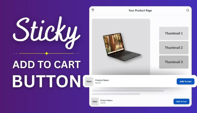
WooCommerce powers many online stores around the world, helping sellers create smooth shopping experiences. If you’re working on your mobile product pages, you might already be thinking about how to make the WooCommerce add to cart button sticky on mobile. This small detail can make a big difference in mobile sales by keeping the buy option always visible.
Make the WooCommerce Add to Cart button sticky on mobile by using the PRO version of “One Page Quick Checkout for WooCommerce.” Go to Onpage Checkout > Add to Cart > Advanced, and turn on “Sticky Add to Cart on Mobile.” Save changes to apply the setting.
If you’re curious to explore this feature more deeply, you’re in the right place. This article shares every important detail, from setup steps to testing and design tips. Keep reading to learn how sticky buttons improve shopping and make your mobile store better.
How to Make the WooCommerce Add to Cart Button Sticky on Mobile?
“Add to Cart Button Sticky on Mobile” means that the Add to Cart button stays visible and fixed on the screen—usually at the bottom—while a user scrolls through a product page on a mobile device. This ensures that the user can quickly make a purchase without having to scroll back up or down.
To achieve this effect in WooCommerce, you’ll need to use a plugin. This is because plugins offer enhanced functionality that regular WooCommerce settings do not provide. Here’s how you can do it:
Plugin Installation
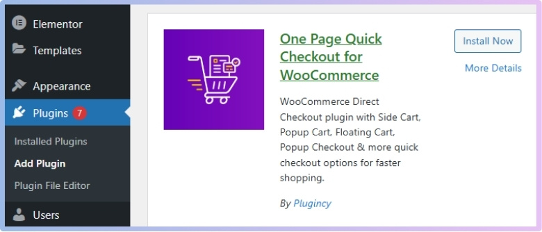
You’ll need to install a plugin that supports advanced mobile features to enable the sticky Add to Cart button feature. One of the popular plugins designed for this purpose is the direct checkout for WooCommerce plugin, officially named One Page Quick Checkout for WooCommerce. It comes with both free and PRO versions, with the sticky button feature available in the PRO version. Here’s how you can install it:
Free Version:
- Go to your WordPress Admin Dashboard → Plugins.
- Click on “Add New Plugin”.
- Search for “One Page Quick Checkout for WooCommerce”.
- Click “Install Now”.
- Then click “Activate”.

PRO Version:
- Visit the official website and complete your purchase.
- After purchasing, check your email for a download link.
- Click the link to download the plugin ZIP file.
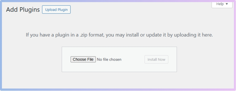
- Go to WordPress Admin Dashboard → Plugins → Add New.
- Click Upload Plugin, select the downloaded ZIP file, and click Install Now.
- After installation, click Activate.

- Navigate to Onpage Checkout > Plugin License in the dashboard.
- Enter your license key to unlock PRO features.
Manual Installation (Using FTP)
- Download the Plugin (Free or PRO version ZIP).
- Extract the ZIP File on your computer.
- Upload via FTP:
- Open your FTP client (e.g., FileZilla).

- Connect to your site and go to /wp-content/plugins/.
- Upload the extracted plugin folder here.
- Open your FTP client (e.g., FileZilla).
- Activate the Plugin from your WordPress admin → Plugins → Activate One Page Quick Checkout for WooCommerce.

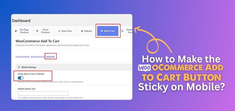
Enable Sticky Add to Cart Button on Mobile (PRO Feature)
This feature is only available in the PRO version. Here are the steps to enable it:
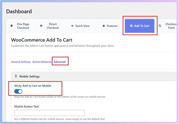
- Log in to your WordPress Dashboard.
- Click on Onpage Checkout.
- Go to the “Add to Cart” section.
- Click on “Advanced”.
- Scroll to Mobile Settings.
- Locate “Sticky Add to Cart on Mobile” and toggle it ON.
- Click Save Changes.

You’re done here. If you want additional customization, follow the guide below:
Additional Mobile Customization Options:
- Mobile Button Text: Set a different text label for mobile (optional).
- Mobile Button Size: Choose one of the following:
- Same as Desktop
- Larger
- Smaller
- Full Width
- Mobile Button Icon Only: Enable this to show only the icon without text, for compact mobile views.

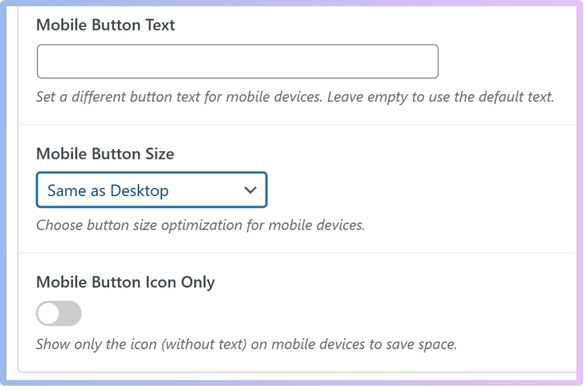
Once your preferred settings are applied, click Save Changes. The sticky Add to Cart button will now be active on mobile product pages.
Where Should the Sticky Add to Cart Button Appear on Mobile Screens?
Designing mobile eCommerce experiences requires careful attention to details like the placement of the sticky “Add to Cart” button. Whether it appears at the top or bottom of the screen can significantly impact user engagement and conversion. The table below compares both positions across key usability and performance factors to help you choose the most effective option for your users.
| Factors | Bottom of Screen | Top of Screen |
| Visibility | High — naturally within thumb reach and line of sight | Lower — may be missed as users scroll down |
| Accessibility (Thumb Reach) | Excellent — aligns with ergonomic design of mobile use | Poor — users must reach to top, which is harder, especially on larger phones |
| Disruption to Content | Minimal — overlays bottom, less likely to block main content | Can obstruct header or navigation elements |
| Conversion Rate Impact | Often higher, more intuitive, and actionable | Lower — can be less noticeable, especially in scroll-heavy pages |
| Best for Long Product Pages | Yes — remains accessible even while scrolling through lengthy descriptions | No — user must scroll back up to access |
| A/B Testing & Heatmap Findings | Frequently shows higher engagement in user testing and heatmaps | Often ignored in heatmaps, less frequent engagement |
| Common UX Practice | Preferred — used by major eCommerce platforms (e.g., Amazon, Shopify) | Rare — not commonly adopted |
User testing and heatmaps almost always favor the bottom of the screen for mobile sticky “Add to Cart” buttons, due to better visibility, accessibility, and higher conversion rates. However, actual placement should be validated through A/B testing on your own platform.
Should You Show Quantity Selectors on Sticky Add to Cart Bars?
Adding extra options to a sticky Add to Cart bar sounds smart. But sometimes, too many things on a small screen can cause problems. So, should we add a quantity selector or not? Let’s look at the good and the not-so-good sides to decide better.
Makes buying quicker
People love when shopping is simple and fast, especially on their phones. If they can choose the quantity and add items without scrolling, it saves time. This helps when someone wants to buy more than one item quickly. It’s great for things like snacks, books, or school supplies. Everything they need is right there in front of them. This small change can make shopping feel smooth and easy every time.
Less need to scroll
Instead of scrolling up and down the product page to find things, users can make choices directly from the sticky bar. This is useful when someone wants to change the number of items. It also helps people who have trouble moving their hands often. Less movement means less frustration while using a phone. With fewer steps, buying becomes more fun and simple for everyone involved.
Handy on small screens
Since mobile screens are small, it’s important to save space smartly. A sticky bar keeps the Add to Cart button always in sight. Adding the quantity option there keeps everything together in one place. It helps users stay focused and not feel lost while shopping. No extra taps or confusion—just easy clicks and clear options. This layout fits well on mobile devices and improves the whole shopping process.
Good for fast choices
Sometimes people suddenly decide to buy more items without planning it. When they see the quantity selector always on screen, it’s easy to act fast. No need to go back and forth or think too much. It supports last-minute choices and encourages extra buying. This can be really helpful during sales or limited offers. Having it right there pushes people to make faster decisions without delay.
Might feel too crowded
Too many things in a small sticky bar can be distracting or messy. Some people might feel confused when there are too many buttons at once. It’s important not to add too many tools that aren’t always needed. Keeping things clean and simple can also help people feel more comfortable. Sometimes less is better when designing for small mobile screens. A balanced layout keeps users happy and stress-free while shopping.
Adding quantity selectors can help make shopping easy and fast. But it might also make the screen feel too full or confusing. Try adding it only when it fits the product type and store style. Make small changes first and watch how people react to them.
How Sticky Add to Cart Buttons Influence Checkout Flow in WooCommerce?
Sticky “Add to Cart” buttons are super useful, especially for mobile shoppers. They let people add items without having to scroll all the way back. This small change makes shopping feel quicker and easier for everyone. Let’s look at how they affect the checkout flow in WooCommerce stores.
Smoother Shopping Flow
Customers often feel annoyed when they need to scroll back to buy. A sticky button solves that by staying visible at the bottom of the screen. It keeps shoppers focused and moving forward without losing their place. This leads to a much easier and smoother shopping process overall. Many store owners see more sales just from this small change. It works especially well for stores with long product pages on mobile devices.
Less Drop-Off
Some users leave the site if buying feels hard or confusing. Sticky buttons help by removing extra steps and keeping things easy to tap. This makes it much more likely that people stay until they buy. The cart process feels fast and stress-free with fewer chances to get distracted. When people don’t have to search for buttons, they stay more interested. This can lower the number of shoppers who leave without purchasing anything.
Better Mobile Usability
People use their thumbs a lot when shopping on mobile phones. Sticky buttons stay in that thumb-friendly zone at the bottom area. This makes adding items super simple without scrolling or reaching up high. It’s also great when users are reading or checking reviews lower on the page. They don’t need to scroll back just to add an item to the cart. That’s why it works well across all types of product pages.
Encourages Quick Actions
Sometimes people decide to buy fast when the button stays visible. It gives a little push to act without making things feel rushed. Users can add to the cart without breaking their focus on the product. In some WooCommerce stores, once the button is clicked, checkout starts right away. To ensure a secure and personalized checkout experience after the user taps the sticky add to cart button, some store owners choose to enable mandatory login for checkout in WooCommerce, especially when managing sensitive customer data or gated products.
Helps All Types of Shoppers
Every shopper behaves differently, but they all need easy access to buy. Whether someone scrolls a lot or reads everything in detail, it helps. They can stay focused on what they’re doing and buy whenever they’re ready. It also works great for people who visit from social media links. Sticky buttons support all kinds of users without needing extra effort or clicks. That’s why this feature fits almost every online store perfectly.
Sticky buttons help users shop faster and complete their orders easily. They remove small problems that can stop someone from buying products. On mobile, they save time and improve the whole shopping experience. Adding one can be a smart and simple upgrade for any store.
How to Test Sticky Add to Cart Functionality on Different Mobile Devices?
Testing sticky “Add to Cart” functionality on different mobile devices is crucial to ensure a seamless and effective user experience before launching it live. This involves a comprehensive approach covering responsiveness, browser compatibility, and usability. Here are the steps to follow:
1. Define Your Target Devices and Browsers
Before you begin testing, identify the most common mobile devices, operating systems, and browsers used by your target audience. This data can usually be found in your website’s analytics. Prioritize testing on:
- Operating Systems: Latest and common older versions of iOS (Apple) and Android (various manufacturers).
- Browsers: Chrome, Safari (iOS), Firefox, Samsung Internet, and Edge.
- Device Types: A range of smartphones (e.g., iPhone, Samsung Galaxy, Google Pixel) and tablets (e.g., iPad, Android tablets) with varying screen sizes and resolutions.
2. Responsiveness Testing
The sticky bar must adapt perfectly to different screen sizes and orientations.
Initial Checks (Developer Tools):
- Browser Developer Tools: Use your desktop browser’s developer tools (e.g., Chrome DevTools, Firefox Developer Tools). Enable “Device Mode” or “Responsive Design Mode” to simulate various mobile devices and screen resolutions.
- Inspect Elements: Check the CSS and layout of the sticky bar. Ensure elements within the bar (product name, price, quantity selector, “Add to Cart” button) are correctly sized, spaced, and legible.
- Orientation Changes: Rotate the simulated device from portrait to landscape and observe how the sticky bar adjusts.
Real Device Testing:
- Physical Devices: This is the most critical step. Test on a selection of actual physical mobile phones and tablets from your target list. This accounts for real-world nuances in touch response, rendering, and performance that emulators might miss.
- Scrolling Behavior: Scroll up and down the product page slowly and quickly. Ensure the sticky bar appears and disappears (if designed to do so) smoothly without flickering, jumping, or overlapping other content.
- Content Overflow: If the product name or other content is long, verify that it wraps correctly or truncates elegantly without breaking the layout.
- Interaction with Other Elements: Check how the sticky bar interacts with other sticky elements (e.g., header, footer, navigation menus) or pop-ups on the page. Ensure no elements overlap or obscure each other.
3. Browser Compatibility Testing
Different browsers might render HTML, CSS, and JavaScript slightly differently.
- Cross-Browser Platforms: Utilize cloud-based testing platforms like BrowserStack, Sauce Labs, or LambdaTest. These services provide access to a vast array of real devices and browser combinations, allowing for parallel testing and efficient bug detection.
- Native Browser Testing: Open your website directly on the actual browsers installed on your chosen mobile devices (e.g., Safari on an iPhone, Chrome on an Android phone).
- Functionality Check:
- Button Click: Verify that tapping the “Add to Cart” button within the sticky bar correctly adds the product to the cart.
- Quantity Selector: If a quantity selector is present, ensure it functions correctly (incrementing/decrementing, direct input), and the quantity is reflected accurately in the cart.
- Variant Selection (if applicable): Ensure that selecting product variants (e.g., color, size) from the sticky bar updates the product details and price correctly, and that the functionality works as expected.
- Error Handling: Test what happens if a user tries to add an out-of-stock item or an invalid quantity from the sticky bar. Ensure appropriate error messages or feedback are displayed.
- Load Time: Assess how quickly the sticky bar loads and becomes interactive on different browsers and network conditions (e.g., Wi-Fi, 4G, 5G).
4. Usability Testing
Beyond functionality, focus on how intuitive and user-friendly the sticky bar is.
User Feedback (Qualitative):
- Pilot Testing: Ask a small group of internal team members or trusted users to test the sticky bar on their own devices.
- Recruit External Testers: Conduct formal or informal usability sessions with actual target users. Provide them with tasks (e.g., “Find Product X, add 3 to cart, and proceed to checkout”) and observe their interactions.
- Gather Feedback: Ask open-ended questions about their experience:
- “Was the ‘Add to Cart’ button always easy to find?”
- “Did the sticky bar feel obstructive or helpful?”
- “Was adjusting the quantity straightforward?”
- “Did anything confuse you or make you hesitate?”
Behavioral Analytics (Quantitative):
- Heatmaps and Scroll Maps: Use tools (e.g., Hotjar, Crazy Egg) to analyze how users interact with your product pages. See if they are engaging with the sticky bar, if there are areas of confusion (mis-clicks), or if the sticky bar is leading to higher conversions.
- A/B Testing: Once implemented, conduct A/B tests. Compare the conversion rates and user behavior of product pages with and without the sticky “Add to Cart” bar (or with different variations of the sticky bar, e.g., with/without quantity selector). This data is invaluable for continuous optimization.
- Cart Abandonment Rates: Monitor cart abandonment rates for users who interact with the sticky bar versus those who don’t.
5. Pre-Launch Checklist
Before pushing live, ensure you’ve covered these final checks:
- Performance: The sticky bar should not negatively impact page load speed or overall website performance, especially on slower networks.
- SEO Considerations: Ensure the sticky bar doesn’t interfere with search engine crawlers’ ability to access content on your page.
- Accessibility (WCAG): Verify that the sticky bar is accessible to users with disabilities (e.g., keyboard navigation, screen reader compatibility, sufficient color contrast).
- Analytics Integration: Confirm that clicks and interactions with the sticky “Add to Cart” button are correctly tracked in your analytics platform.
Thorough testing across these dimensions will help ensure your sticky “Add to Cart” functionality performs optimally, enhances user experience, and contributes positively to your conversion goals on mobile devices.
Common Issues With Sticky Add to Cart on Mobile and How to Fix Them
On mobile, sticky “Add to Cart” buttons can be very helpful, but they don’t always work perfectly. Sometimes they glitch or don’t look right with your store’s design. These small problems can confuse users or stop them from buying. Let’s go over the most common issues and how you can fix them easily.
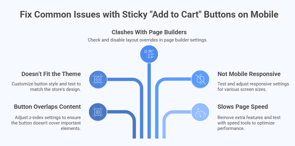
Button Overlaps Content
There are times when the sticky button hides other parts of the page. This usually happens when the z-index settings are not set correctly in the theme or plugin. The fix is simple—adjust the z-index so the button doesn’t cover anything important. You might need help from a developer or plugin support to find the exact spot. Once fixed, users can scroll and shop without the button blocking product details or reviews.
Doesn’t Fit the Theme
In some cases, the sticky bar looks out of place on mobile screens. It might have the wrong color, font, or size, which can confuse or annoy users. If your sticky bar isn’t blending well with the rest of your mobile theme, it may be time to customize Add to Cart button style and text to ensure clarity and cohesion across your storefront. This small change can make the button look cleaner and match your brand better.
Clashes With Page Builders
Some store owners use page builders like Elementor or WPBakery to design pages. These tools can sometimes cause layout issues with sticky buttons. You might notice spacing problems or strange alignments when the page loads. One fix is to check if the builder has layout overrides affecting the cart bar. Turning off certain settings or using simple templates can often solve this without needing code changes.
Not Mobile Responsive
Even though the button works fine on a desktop, it may act weird on mobile. It could appear too large, off-center, or even disappear on some screens. This usually means the design doesn’t fully adjust to smaller devices. To fix it, check the responsive settings in your theme or plugin. Test on multiple screen sizes to make sure everything looks and works properly on phones and small tablets.
Slows Page Speed
A sticky bar can sometimes slow down your store, especially if it loads too many scripts. You might notice longer wait times when the page opens on mobile. To fix this, remove extra features or animations from the cart button plugin. You can also test your site with tools like PageSpeed Insights to see what’s causing delays. A simple, clean design often works best for mobile speed and smooth shopping.
Sticky cart buttons are helpful, but only when they work the right way. Fixing small problems keeps your site fast, clear, and easy to use. Try checking design, settings, and mobile view often. A few tweaks can make your button work perfectly again.
Commonly Asked Questions
Making the “Add to Cart” button sticky on mobile can help users shop faster and make purchases easier. But sometimes, store owners have questions about setup, design, and behavior. These FAQs answer the most common concerns in a simple and helpful way. Whether you’re just starting or fine-tuning your WooCommerce store, these answers will clear your confusion.
How Can I Know If the Sticky Button Is Working on All Pages?
To check if your sticky button works everywhere, visit several product pages on your mobile phone. Scroll up and down to see if the button stays at the bottom of the screen. Make sure it appears on every product, not just one or two. If it’s missing from some pages, your plugin or theme settings may need fixing.
Why Is the Sticky Button Not Showing for Logged-Out Users?
Sometimes, settings can make the sticky button appear only when users are logged in. This might be for stores with special rules or private products. You can fix this by checking the plugin settings and making sure the button shows for all users. Also, test the site in a private browser window to see how it looks to guests.
Can I Add a Special Message Beside the Sticky Button?
Yes, you can often add short text like “Limited Offer” or “Buy Now” next to the button. This can help grab attention and make users act faster. Many sticky cart plugins offer custom text fields where you can add your own message. Just be sure the message is short and easy to read on small screens.
Is It Possible to Hide the Sticky Button for Some Products?
Yes, some plugins let you choose which products should or shouldn’t show the sticky button. You can usually turn the sticky feature off for special items like digital downloads or grouped products. Look for product-level settings inside the plugin options. This helps you keep your store layout clean and organized.
Will the Sticky Button Still Work After I Update WooCommerce?
Most good plugins are built to work with WooCommerce updates. But sometimes after a big update, things may stop working for a short time. To avoid problems, always back up your site before updating. Also, check if the plugin has a new version that supports the latest WooCommerce release.
Can I Change the Shape or Corners of the Sticky Button?
Yes, you can change how the button looks using the plugin’s style settings or custom CSS. You can make the corners round, sharp, or even full-width across the screen. A nice-looking button can match your store better and make it easier to click. Try simple styles that look good and are easy for thumbs to tap.
What Happens If Two Plugins Try to Make a Sticky Button?
If more than one plugin is creating a sticky button, they might not work well together. You could end up with buttons overlapping or one not showing at all. The best fix is to use only one plugin for this feature. If needed, ask a developer to remove the extra button code from your theme or plugin.
Can I Track How Many People Click the Sticky Button?
Yes, you can track button clicks using tools like Google Analytics or plugins with built-in tracking. This helps you see if users are clicking the sticky button and if it’s helping your sales. Some sticky cart plugins offer reports or connect with your analytics tools. Checking this data helps improve your store.
Will the Sticky Button Show in Mobile Search Results?
No, sticky buttons do not appear in Google or search engine results. They are only part of the website layout after the page loads. Search engines only see the content and structure, not floating buttons or sticky bars. But having a good sticky button can help people stay on your site longer after they arrive.
Last Words
Making your WooCommerce “Add to Cart” button sticky on mobile helps shoppers buy quickly without scrolling back and forth. You can easily do this using a plugin like “One Page Quick Checkout for WooCommerce” and enabling the sticky option under mobile settings. It improves mobile shopping and boosts sales by keeping the button always within reach. With a few simple steps and the right settings, you now know how to make the WooCommerce add to cart button sticky on mobile.
Before going live, test on different phones, clean up the design, and make sure everything runs smoothly. Keep things easy to tap, don’t overcrowd the sticky bar, and match the button with your store’s look. A good user experience keeps shoppers happy and ready to buy. Best of luck with your WooCommerce store—hope your sticky button brings more smiles and more sales!