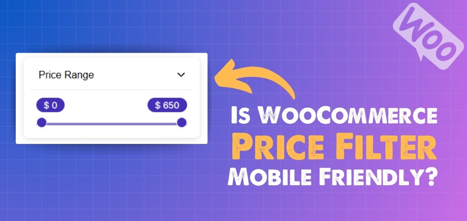
Price filters are small but powerful tools that help shoppers stay within their budget while browsing products. They remove the stress of endless scrolling and guide buyers straight to what they want. Many store owners often wonder, is WooCommerce price filter mobile friendly?
Yes, WooCommerce price filters are mobile-friendly when built with a responsive design. They use sliders, buttons, and collapsible menus to fit small screens. This helps shoppers quickly select price ranges, improving navigation, speed, and customer satisfaction across all devices.
Would you like to know how mobile responsiveness changes conversions, common filter issues on smaller screens, and the best placement for filters in a WooCommerce shop? If yes, keep reading because this article explains everything you need to know.
Is WooCommerce Price Filter Mobile Friendly?
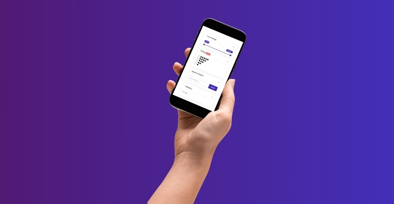
When people shop online, they expect a smooth and simple experience on any device they use. Since many visitors now browse from their phones, it becomes very important to make every part of the store easy to use. Let’s see how this connects with price filters.
Mobile Shopping
Most online shoppers today use their mobile devices more than desktops. If price filters are not designed for smaller screens, customers may find it hard to adjust them. A mobile-friendly filter lets them select price ranges with ease, even on compact displays.
Easy Navigation
Good design on mobile means visitors don’t have to zoom in or scroll too much. Price filters should be shown in a clean way, like a simple slider or buttons. This makes it faster to move between different price ranges without confusion.
Better Layouts
On small screens, space is limited. That’s why collapsible menus and side panels are often used for filters. These layouts allow shoppers to focus on the products while still being able to open filters whenever they need them.
Faster Decisions
A clear and easy filter helps buyers reach products that match their budget quickly. Instead of scrolling through all items, they can just set a price range. This saves time and gives them a more direct path to checkout.
Smooth Function
Filters that respond quickly and without errors make the shopping process stress-free. If a filter feels slow or clunky on mobile, shoppers might leave the store. A responsive design ensures filters work properly with just a few taps.
Clean Appearance
Cluttered designs often push people away. On mobile, a simple filter layout makes the store look neat and professional. This also creates trust and makes buyers more comfortable while exploring products.
Wide Compatibility
Since people use different phones and tablets, filters should adjust to all screen sizes. Responsive plugins make sure the filter looks good and works fine, no matter the device being used by the shopper.
Real Connection
For shoppers, it feels convenient when a store provides easy tools like a WooCommerce product price filter. Features like these quietly improve the browsing experience without drawing too much attention, yet they still play an important role in guiding choices.
Customer Retention
When buyers can quickly set their budget range, they are more likely to stay longer on the site. A mobile-friendly filter increases the chance of them finding exactly what they need and making a purchase instead of leaving.
Long-term Value
Stores that focus on a better mobile design build stronger customer satisfaction. Over time, this adds value not just to the shopping process but also to how buyers view the brand. A good filter becomes part of that positive memory.
Price filters that are mobile-friendly make online shopping faster, cleaner, and more enjoyable. Paying attention to these small details can help both customers and store owners get better results in the long run.
Why Is Mobile Responsiveness Important for WooCommerce Price Filters?
Mobile responsiveness is more than just a design choice today; it is a basic need for online stores. When features like price filters are adapted well for mobile, they bring unique advantages that directly impact both customers and store performance. Let’s look into them.
SEO Benefits
Search engines favor websites that are mobile-friendly. If your WooCommerce store has responsive price filters, it improves the overall mobile usability score. This can help your store rank higher on search results and attract more visitors.
Lower Bounce Rate
When buyers find it hard to use filters on mobile, they often leave quickly. A responsive filter reduces frustration and keeps people browsing for longer. This lowers the bounce rate and gives your store more chances to make a sale.

Competitive Edge
Many online stores compete for the same customers. If your store provides a smooth price filtering option on mobile, it sets you apart. This small improvement can make the difference between a shopper choosing your site or a competitor’s.
Increased Trust
Shoppers often judge a store by how well it works on mobile. If filters respond quickly and look well-designed, it shows reliability. This builds trust and makes customers more confident to spend money in your store.
Future Ready
Technology keeps changing, and mobile use is only growing. By making your price filters responsive today, you prepare your store for long-term success. It ensures your site will stay useful across new devices and shopping habits.
Mobile responsiveness for WooCommerce price filters is not just about better looks; it adds real business value. It supports SEO, builds trust, reduces bounce rates, and helps your store stay competitive in a fast-changing market.
What Common Issues Do Shoppers Face With Price Filters on Mobile?
Shopping on mobile should feel smooth, but sometimes price filters make it harder instead of easier. Many people run into small design problems that affect their shopping experience. Let’s look at some of the common issues they face.
Tiny Sliders
One of the most frustrating issues with price filters on mobile is when sliders are too small. Shoppers often struggle to grab and move the handles with their fingers. This makes it hard to set the right price range. Many times, people accidentally choose the wrong numbers.
Overlapping Text
Another common problem is overlapping text on mobile screens. When the price numbers or labels overlap, it becomes confusing to understand what range has been selected. This can lead to mistakes or even make shoppers leave the page without finishing.
Slow Loading
Price filters that take too long to load also cause trouble. On mobile, where internet speed can vary, a slow filter feels annoying. Shoppers may click several times, thinking the filter is broken. This often results in wasted time and frustration.
Unclear Layout
Sometimes the layout of the price filter is not mobile-friendly. The buttons or ranges may not fit well on smaller screens. This creates confusion about how to adjust the filter. If shoppers cannot figure it out quickly, they may give up on using it.
Unresponsive Touch
A common issue is when the filter does not respond well to touch. Shoppers may try to adjust the range, but the filter either moves too much or not at all. This makes the process tiring, especially when they want to shop quickly.
Price filters on mobile should make shopping easier, but small design flaws can turn them into obstacles. Fixing these simple problems can create a much smoother and friendlier shopping experience for everyone.
Where Should You Place Price Filters in a WooCommerce Shop for Mobile Users?
When shopping from a phone, people want quick and simple ways to narrow down products. If price filters are not easy to spot, they may leave the store without buying. Let’s look at where to place them for the best results.
Top of the Page
Placing price filters at the top helps users notice them right away. This works best when customers usually start shopping with a clear budget in mind. It saves them time and makes their shopping smoother because they don’t have to scroll too much.
Sidebar Option
If your design supports a sidebar on mobile, price filters can sit there. They stay visible while users browse, which helps them make changes easily. This design works better if the sidebar is simple and not cluttered with too many tools.
Sticky Filter Bar
A sticky filter bar at the top or bottom of the screen is very handy. It moves with the page, so users can tap on filters anytime without scrolling back. For the best experience, many store owners prefer to show filter on WooCommerce shop page directly, instead of hiding it deep inside menus.
Under Product Grid
Placing filters under the first few rows of products can work for stores that want to highlight items first. It lets shoppers see what’s available, then refine their search. But it should not be too far down, or it may get ignored.
Collapsible Menu
For smaller screens, collapsible menus are a clean choice. Filters remain hidden until tapped, saving space but still being easy to reach. This keeps the layout neat, especially if you have many filter options besides price.
Making price filters easy to find on mobile can greatly improve sales. The best spot depends on your shop design and customer needs. The key is keeping it simple, clear, and quick to use.
Do Mobile-friendly Price Filters Affect Conversions in WooCommerce Stores?
People shopping online with their phones expect everything to be quick and simple. Small screen sizes mean every second counts when searching for products. One feature that can make this smoother is mobile-friendly price filters. Let’s see how these filters impact product discovery and sales.
Smooth Shopping
Price filters help customers cut through endless product lists and focus only on items they can afford. Without them, shoppers might scroll too long and leave the store. A clear, mobile-friendly price filter keeps the buying process fast and frustration-free.
Better Product Discovery
When filters are easy to use on mobile, customers can quickly find products that match their budget. This improves browsing and keeps people engaged for longer. More time spent looking at relevant products usually means a higher chance of adding items to the cart.
Boosting Conversions
Conversions improve when shoppers don’t feel stuck or lost. If price filters respond instantly and display the right products, customers are more likely to complete a purchase. Even small improvements in filtering speed can create noticeable growth in sales numbers.
User Experience
Mobile shopping often feels cramped if filters are clunky or hidden. A neat slider or button for price ranges makes the store look clean and easy. Shoppers feel more in control, which builds confidence to buy and reduces drop-offs.
Higher Sales
The smoother the shopping process, the more products get sold. Mobile-friendly price filters encourage buyers to move quickly from browsing to checkout. When customers find what they want without hassle, they are more willing to spend and even return for future purchases.
Mobile-friendly price filters make a big difference in WooCommerce stores. They simplify product discovery, keep users happy, and boost sales. Stores that want better conversions should treat smooth filtering as a must-have feature.
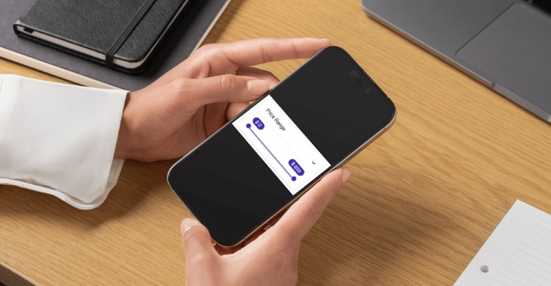
How Can You Test Mobile Friendliness of a Price Filter in WooCommerce?
Making sure your store’s price filter works smoothly on mobile is very important. A filter that is hard to use can push shoppers away. Luckily, there are some simple ways to test how your filter looks and works on smaller screens. Let’s look at them step by step.
Browser Resize
One of the quickest ways is to simply shrink your browser window on a desktop. Drag the window to make it narrow and see how the filter reacts. This will help you notice if the slider, dropdown, or layout shifts in a way that makes it hard to use.
Inspect Tool
Most browsers have an inspect or developer tool. Right-click and select “Inspect,” then choose a mobile view. You can switch between screen sizes like an iPhone or an Android. This lets you test how the price filter responds without needing a physical phone at hand.
Real Device Test
Nothing beats using your own phone. Open your store on both Android and iPhone if possible. Check how the price filter works with touch, as sometimes sliders feel sticky or too small. When you test price filters across different devices, you’ll often uncover common WooCommerce filter problems, such as sliders not responding well to touch or filters overlapping with the layout.
Online Testing Tools
There are free tools like Google Mobile-Friendly Test or BrowserStack. Just paste your store URL and see how it looks on multiple devices. These tools can highlight layout issues and show if your price filter is readable and easy to tap.
Performance Check
Mobile friendliness is not just about looks. Test if the filter loads quickly on a mobile connection. Slow filters can frustrate users. Try switching between Wi-Fi and mobile data to see if the price filter responds fast or causes delays while updating results.
Testing your WooCommerce price filter on mobile is simple and doesn’t need much time. By trying different methods, you can quickly find issues and make sure your shoppers enjoy a smooth experience.
FAQs About Is WooCommerce Price Filter Mobile Friendly
When people shop on mobile, they want tools that work well without causing stress. WooCommerce price filters play a key role here. Many shoppers wonder if these filters are really mobile-friendly and how they affect their buying experience.
Is WooCommerce Price Filter Easy to Use on Touch Screens?
Yes, WooCommerce price filters can be easy to use if they are designed properly. On touch screens, sliders should be large enough so that fingers can move them without mistakes. When the filter responds quickly, it feels natural to use. If the design is too small or slow, customers may find it hard to set the right price range.
Does a Mobile-friendly Price Filter Save Shopping Time?
A mobile-friendly price filter definitely saves time while shopping. Instead of scrolling through hundreds of items, shoppers can quickly set their budget. This brings up only the products they want to see. By skipping unnecessary steps, buyers can move faster to checkout.
Can WooCommerce Price Filters Work Well With Small Screens?
Yes, they can, but only if they are responsive. A responsive design means the filter adjusts to any screen size, whether it’s a phone or tablet. Without this, filters may look cramped or confusing. A well-designed filter makes shopping easier even on very small displays.
Do Mobile-Friendly Price Filters Improve Store Trust?
They do, because smooth filters make the store look more professional. If shoppers can use the filter easily without errors, they feel confident about the site. A clunky filter often gives the impression that the store is not well-managed. Clean design builds trust in the brand.
Are WooCommerce Price Filters Compatible With All Mobile Devices?
Yes, with responsive plugins, filters can adjust to many devices. Whether someone is using an Android phone or an iPhone, the filter should look and work the same. If the store owner uses a modern WooCommerce filter plugin, compatibility is much stronger. This ensures all shoppers get the same good experience.
Can Mobile-friendly Price Filters Help Reduce Cart Abandonment?
Yes, they can help reduce cart abandonment. When shoppers find products that fit their budget faster, they are more likely to buy. A slow or confusing filter often pushes people to leave before checkout. A smooth filter keeps customers focused on completing their purchase.
Do Responsive Price Filters Affect Search Engine Ranking?
Indirectly, yes. Search engines look at how mobile-friendly a site is. If the price filter works well on mobile, it improves the overall usability score. This makes the store more likely to rank higher in search results and attract more visitors.
Are WooCommerce Price Filters Customizable for Mobile Use?
Yes, many WooCommerce plugins allow customization for mobile. Store owners can choose slider styles, button sizes, and layouts that work better on small screens. This flexibility makes it easier to match the filter with the store design. A custom setup also improves the overall shopping experience.
Do Mobile-friendly Filters Increase Repeat Purchases?
Yes, because shoppers like to return to stores that are easy to use. If they had a smooth time setting price ranges before, they will feel confident coming back. A simple tool like a price filter creates comfort. Over time, this can turn first-time buyers into regular customers.
Can a Bad Price Filter Hurt Mobile Sales?
Yes, a poorly designed price filter can harm sales. If it is slow, too small, or confusing, shoppers may leave the store without buying anything. Many people will not give a second chance to a frustrating store. That is why fixing price filter issues is very important for mobile sales.
Conclusion
Price filters play a quiet but powerful role in making mobile shopping enjoyable. A well-designed filter not only helps customers set their budget but also builds confidence in the store. When everything works smoothly, visitors spend more time exploring and buying.
So, is WooCommerce price filter mobile friendly? The simple answer is yes, it can be if designed right. When filters are responsive, quick, and easy to use, they greatly improve the shopping flow and keep customers engaged.
To get the best results, always test filters on different devices, keep layouts clean, and focus on speed. These small steps create a big impact on sales and customer trust. Keep improving your store, and best wishes for growing your success.