One page checkout has changed the way people complete online purchases by putting all steps on a single page. While it looks simple, the actual performance can vary a lot depending on the device being used. That is why many people want to know about mobile vs desktop performance for one page checkout.
The main difference between mobile and desktop performance for one page checkout is screen size and input method. Mobile devices face slower speeds, touch inputs, and keyboard pop-ups. Desktops offer faster performance, larger displays, and better autofill. These differences affect user speed, accuracy, and error handling during checkout.
Are you curious about which factors matter most when comparing these two experiences? If so, this article will guide you through all the important details. You will find everything you need to understand how each device performs, what challenges exist, and how businesses can improve both sides effectively.
Mobile vs Desktop Performance for One Page Checkout
One page checkout is designed to make buying faster and simpler. Mobile and desktop users often face very different experiences while checking out. These differences can impact speed, ease, and the chances of completing a purchase. Understanding them helps improve both platforms effectively.
| Area | Mobile | Desktop |
| Network and CPU | Often slower networks and weaker CPUs | Faster, more stable networks and CPUs |
| Screen space | Small screen, more scrolling | Wide screen, more info visible at once |
| Input method | Touch typing, bigger tap targets needed | Keyboard and mouse, precise pointer |
| Keyboard behavior | On screen keyboard can hide fields | No on screen keyboard, fields stay visible |
| Autofill strength | OS and browser autofill, mixed reliability | Strong browser autofill and saved cards |
| Wallet options | Apple Pay and Google Pay are common | Saved cards and browser wallets are common |
| Error visibility | Errors can fall below the fold | Errors are easier to see without scrolling |
| Distractions | Calls, app switches, notifications | Tab switching, but fewer hard interruptions |
| Navigation pattern | Single column works best | Single or gentle two-column layout can work |
Network Power
Slow mobile networks and weaker processors can delay checkout performance badly. Desktops with stronger processors and faster broadband networks handle scripts, images, and forms faster. This difference matters because even a small delay can make shoppers leave the checkout quickly. Faster performance always builds trust and satisfaction.
Screen Size
Small mobile screens limit how much checkout content is visible instantly. Users scroll more and may miss important details like fees or totals. Desktops with wide screens display the summary and form side by side. This clear visibility makes reviews easier, reducing confusion and last-minute mistakes.
Input Method
On mobile, typing uses touch, which is less precise, so bigger buttons and spacing help. Desktops use a keyboard and mouse, making text input faster and corrections easier. This changes checkout speed, error rates, and how quickly people complete forms without getting frustrated or abandoning.
Keyboard Issues
On mobile devices, the on-screen keyboard hides content while typing in fields. This problem often forces extra scrolling, making checkout more difficult. Desktop devices avoid this issue since the keyboard is physical. With more visible space, users can complete tasks more comfortably without constant up and down scrolling.
Autofill Help
Mobile autofill can feel unreliable since it depends on device and browser. Sometimes fields do not fill properly, and users must retype information again. Desktop browsers usually provide stronger autofill with saved cards and addresses. This smoother performance makes the process quicker, with fewer errors slowing customers down.
Wallet Use
Phones support quick payments with Apple Pay and Google Pay quite easily. These methods remove most typing and encourage faster checkouts. Desktops mainly use saved credit cards and browser wallets. Many stores also simplify things using one page checkout for WooCommerce, making payments smoother across both mobile and desktop.
Error Display
When checkout errors appear on mobile, they might hide below the fold. This means users may miss them unless they scroll carefully upward. Desktops avoid this issue since wider screens show both forms and warnings clearly. This visibility helps users fix problems quickly without repeating earlier form steps.
User Distractions
People using mobile often face calls, texts, or app notifications during checkout. These interruptions can pause progress or reset the whole form unexpectedly. Desktop users still multitask with tabs, but rarely lose progress entirely. Saving carts and progress helps both groups continue checkout smoothly without starting everything again.
Layout Flow
Mobile checkout works best using a single column design guiding users downward. This approach reduces confusion, keeps focus, and avoids wasted scrolling movements. Desktop checkouts can use two columns, showing order summary and forms together. This design reduces scrolling, improves clarity, and makes review steps faster before final payment.
Both mobile and desktop checkouts matter equally for business success today. Shoppers expect speed, clarity, and simple steps when finishing a purchase online. Small changes in design or speed can reduce abandoned carts greatly. Understanding these device differences helps improve user trust, convenience, and sales effectively.

Impact of Mobile vs Desktop Checkout Speed on Conversions
When people shop online, every second during checkout matters. A smooth and quick process makes buyers complete their orders with ease. But when delays happen, even small ones, they can affect their decision. Let’s look deeper into this topic.
Mobile User Patience
Mobile users are often on the go, using data connections or shared networks that may not always be stable. A checkout delay of even a few seconds feels longer on a small screen, which leads to frustration. This frustration increases the chance of dropping out.
Desktop Comfort Zone
On desktops, users usually have stronger internet connections and more stable browsing experiences. A short delay here may feel less annoying because they are often sitting down, focused, and ready to finish the purchase without distractions, compared to mobile users.
Higher Drop Chances
Research shows that the longer it takes for a page to load, the higher the abandonment rate. Even small lags create doubt and impatience. While one-page setups often perform better, testing also shows that multi-step checkout speed on mobile can slow conversions significantly compared to desktop.
Distractions Matter
Mobile shoppers are easily distracted by notifications, calls, or switching between apps. If the checkout is not quick and smooth, these distractions can pull them away before they complete the order. Every second of delay increases the chance of losing them.
Conversions Impact
When mobile checkout is slow, businesses often see more abandoned carts compared to desktops. This means fewer completed purchases and lost sales opportunities. A fast and clear checkout experience is important to keep customers interested and increase final conversions.
Small delays in checkout can make a big difference. Mobile users, in particular, expect fast results. Making checkout smoother and faster helps reduce abandonment and encourages more people to complete their purchase.
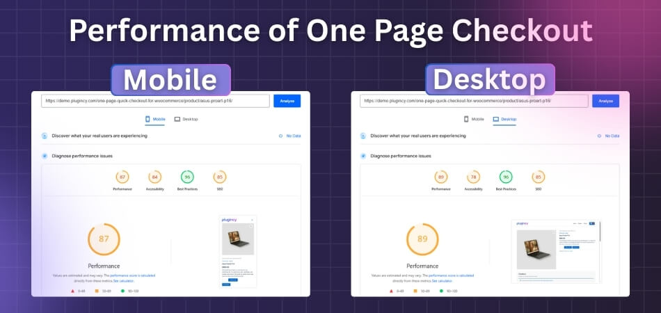
Tools to Test Mobile vs Desktop Checkout Performance
The best tools to compare mobile vs. desktop checkout performance are PageSpeed Insights, GTmetrix, and WebPageTest. Each tool offers specific settings to simulate the different hardware and network conditions of mobile and desktop users.

Here is how to use these tools to compare the performance of your checkout page:
1. PageSpeed Insights (PSI)
How it Works: PSI, powered by Google’s Lighthouse, is the most straightforward tool for a direct comparison, as it automatically runs a test for both mobile and desktop from a single URL submission.
- Enter URL: Go to the PageSpeed Insights website and enter the URL of your checkout page (or the last page of your shopping cart).
- Run Analysis: Click “Analyze.”
- Compare Results: The tool will generate a single report that provides scores and data for both device types.
- Default View: PSI defaults to the Mobile report first, as Google prioritizes mobile-first indexing. Note that a lower Mobile score is completely normal because it simulates a slower, mid-tier device (like a Moto G4) on a slower mobile network.
- Switch Tabs: At the top of the report, you can easily switch to the Desktop tab to compare the scores and Core Web Vitals (LCP, INP, CLS) side-by-side.
- Actionable Feedback: Use the section labeled “Opportunities” to see specific recommendations for improving speed on the device that needs the most help (usually mobile).
2. WebPageTest (WPT)
How it Works: WPT is the gold standard for deep, customizable testing. It allows you to run a test on a real mobile device or a simulated device under specific network conditions, which is crucial for a realistic comparison.
- Configure Mobile Test: On the WebPageTest homepage, select your preferred location. Under “Test Settings,” go to the Device option.
- Select an actual mobile device (e.g., iPhone, Moto G4) or an emulated one.
- Crucially, set the Connection to a realistic mobile speed, such as “4G” or “3G Slow” (often a better indicator of real-world mobile usage than the faster “Cable” default).
- Configure Desktop Test: Run a second, separate test using the same test location.
- Select a standard desktop browser (e.g., Chrome) and set the Connection to a fast speed like “Cable” or “FIOS” (to simulate a typical home wired connection).
- Run Comparison: Once both tests are complete, use the “Visual Comparison” feature on WebPageTest to input the URLs of your two test results. This allows you to visually watch the filmstrip view of your checkout page loading frame-by-frame on the two different devices and connection speeds.
- Analyze Waterfall: Compare the Waterfall charts to see exactly which elements (images, scripts, CSS) load slower on mobile due to the restricted network bandwidth.
3. GTmetrix
How it Works: GTmetrix provides a powerful, simplified interface, incorporating both Lighthouse and other auditing metrics. It allows users to simulate various devices and connections.
- Run Desktop Test: For your initial benchmark, enter your URL and use the default settings, which are typically Chrome (Desktop) on an Unthrottled or fast connection speed.
- Configure Mobile Test: Expand the “Analysis Options” section.
- Simulate Device: In the “Device” dropdown, select a Simulated Device option (this is typically available on GTmetrix PRO plans). This automatically sets the screen resolution, user agent, and device pixel ratio to match a common mobile phone.
- Throttle Connection: To simulate a realistic mobile experience, ensure you change the “Connection” speed to “4G Slow” or “3G”.
- Compare Reports: Run the mobile test and compare the final GTmetrix Grade, performance scores, and Core Web Vitals against your initial desktop report. Pay close attention to differences in the Largest Contentful Paint (LCP), as this often indicates unoptimized images or slow server response on the mobile version.
Common Issues Slowing Down One Page Checkout on Mobile Devices
A fast checkout helps people finish orders without stress. But many mobile pages feel heavy and slow, which can scare buyers away. The good news is these issues are fixable with simple steps. Keep reading to learn what to fix first.
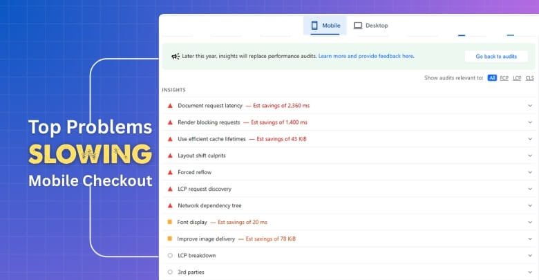
Heavy Images
Large, uncompressed images take longer to load on mobile data. When product photos are not resized, phones waste time downloading more pixels than needed. Use modern formats, proper dimensions, and lazy loading. This reduces data use, speeds up pages, and keeps shoppers from leaving early.
Too Many Scripts
Extra tracking tags, chat widgets, and unused libraries add weight to a page. Each script means more requests and longer waits. Audit what you really need, remove duplicates, and delay noncritical code. This keeps checkout smooth while still collecting the most important data.
Poor Responsive Layout
If layouts are not built for small screens, elements shift and cause reflows. Buttons may move after loading, which leads to wrong taps and frustration. Use a mobile-first grid, set fixed image sizes, and reserve space. This prevents layout jumps and improves tap accuracy.
Render Blocking Resources
CSS and JavaScript that block rendering stop the page from showing quickly. When everything loads at once, the first screen appears late. Inline critical CSS, defer nonessential scripts, and preload key files. These steps help the page show useful content much sooner.
Chatty Network Calls
Multiple API calls for shipping, coupons, or inventory can stack up. Slow servers or unneeded requests delay totals and button states. Batch requests, cache common data, and show clear loading states. This keeps the flow predictable and reduces confusing pauses during checkout.
Tidy images, trim scripts, and build for small screens. Reduce blocking files and noisy requests. These changes make one-page checkout quicker on phones and help more people complete their orders with confidence.
Future Trends in Mobile and Desktop Checkout Performance
Checkout speed is becoming more important as people expect instant results. Technology is moving fast, and both mobile and desktop will see big changes soon. These upgrades will make shopping smoother than ever. Let’s explore what’s coming next.
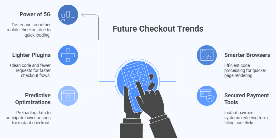
Power of 5G
With 5G networks expanding worldwide, mobile checkout will feel faster and smoother. Pages and payment systems will load in seconds, even when handling large files. This will reduce waiting time, lower dropouts, and create a more reliable buying experience.
Smarter Browsers
Browsers are being updated to process code more efficiently. They can now block heavy scripts, pre-load content, and run background tasks smarter. This means pages will render quicker, forms will fill faster, and checkout steps will take less time.
Lighter Plugins
Lightweight checkout plugins are being built with speed in mind. Instead of loading bulky scripts, they focus on clean code and fewer requests. Many experts predict that faster flows will also encourage loyalty, with one-page checkout repeat purchases becoming a growing trend as shoppers favor convenience.
Secured Payment Tools
Wallets like Apple Pay, Google Pay, and other instant payment systems will continue to rise. These tools cut down form form-filling and clicks. Shoppers can approve transactions quickly, which lowers friction and makes mobile and desktop checkout equally efficient.
Predictive Optimizations
Upcoming tools will predict what buyers are about to do and prepare data ahead of time. This includes preloading payment methods, address suggestions, and inventory checks. By guessing needs early, checkout feels almost instant and creates a better shopping rhythm.
Future improvements like faster networks, lighter code, and smarter tools will make checkout much quicker. Both mobile and desktop shoppers will benefit, and businesses will see smoother sales without the delays that frustrate people today.
FAQs About Mobile vs Desktop Performance for One Page Checkout
People often have doubts about how checkout works differently on mobile and desktop. These questions and answers will clear up common concerns and explain what affects speed, ease, and success during checkout. Let’s look at the most important ones.
Why Do Mobile Checkouts Feel Less Secure?
Many people feel less safe entering payment details on a phone because the screen is small and the card fields look cramped. Pop-ups and redirects also create worry. On desktop, large screens and clear layouts make the process feel more trustworthy. Better design and visible trust badges can help mobile checkouts feel safer as well.
How Does Battery Life Affect Checkout?
On mobile devices, low battery can cause stress and push people to abandon checkout quickly. If the phone slows down due to power-saving mode, pages may load slower. Desktops rarely face this issue since they are plugged in. Offering quick payment options helps mobile users finish before the battery runs out.
Does Checkout Speed Change With Location?
Yes, location affects both mobile and desktop checkout performance. Mobile users in rural or low-signal areas often face slower speeds than those in cities. Desktop users with wired broadband usually get more stable results. Optimizing pages to load fast even on weak networks helps balance this issue.
How Do Updates Affect Checkout?
System or browser updates on mobile sometimes slow down apps or cause checkout bugs until fixes arrive. On desktop, updates are usually smoother but still may affect extensions or plugins. Keeping checkout pages tested on new versions helps prevent issues. Regular updates also ensure stronger security for users.
Why Is Copy-paste Harder on Mobile?
Copying addresses or card numbers on mobile is trickier because of touch controls. Users may tap the wrong spot or select extra characters. On desktop, the mouse makes copy-paste easier and more precise. Simple autofill fields help reduce this hassle for mobile shoppers.
How Do Pop-ups Affect Performance?
On mobile, pop-ups often block the small screen and slow checkout by forcing extra taps. Some pop-ups even reload parts of the page. On desktop, they are easier to close and less disruptive. Limiting pop-ups in checkout helps both platforms but matters more for mobile.
Why Do People Abandon Carts Faster on Mobile at Night?
At night, people often use phones while multitasking in bed or while resting. Distractions like messages or sleepiness make them drop checkout midway. Desktop users at night are usually sitting and focused. Simplifying steps for mobile late-night shoppers can reduce dropouts.
How Do Screen Protectors Affect Checkout?
Thick screen protectors or cracked glass can make tapping fields harder on mobile devices. This slows down typing and may cause repeated mistakes. Desktops avoid this problem since they use physical keyboards. Designing larger tap areas helps mobile users overcome this small but real issue.
Conclusion
Mobile and desktop checkouts both serve the same purpose, but their performance differs due to network speed, screen size, and input methods. Mobile offers wallet convenience but faces higher errors, while desktop provides smoother stability and visibility. This is the real picture of mobile vs desktop performance for one page checkout.
To finish, the best way forward is keeping pages light, trimming scripts, and designing layouts that suit both devices. Always optimize for speed, simplify forms, and make wallet payments easy. With these steps, your checkout will be smoother, faster, and more reliable. Best wishes for higher conversions and happier customers.