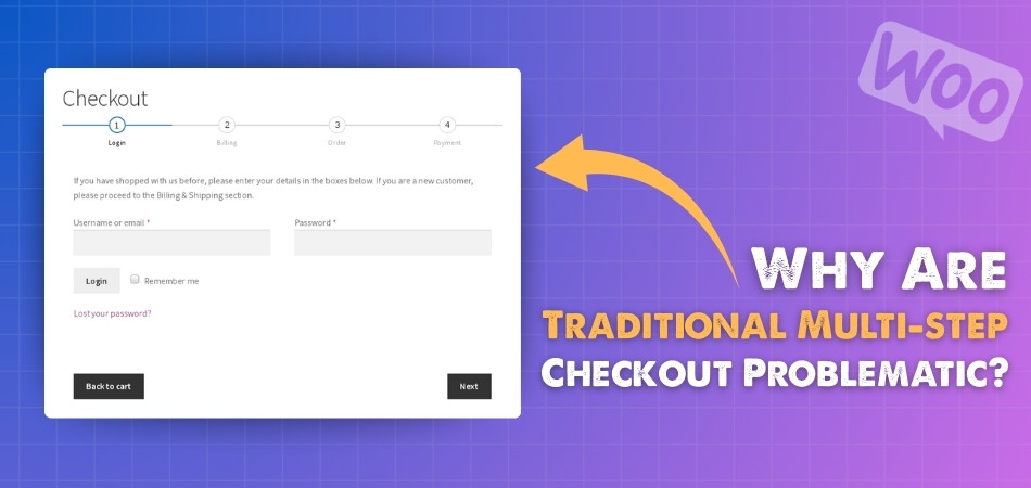
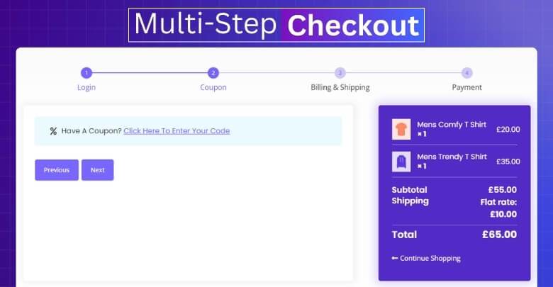
Checkout in WooCommerce can be done in different ways, such as one page checkout or the more common multi-step checkout. While both are used in online stores, many shoppers feel that the longer process makes things harder. If you are reading this, you may be asking yourself, Why are traditional multi-step checkout problematic?
Traditional multi-step checkout is problematic because it takes longer, asks for too much information, and often makes customers repeat steps if they make mistakes. Slow page loading, unclear progress, and poor mobile experience increase frustration. These issues push many shoppers to abandon their carts before finishing.
Do you ever wonder why so many people leave their shopping carts before paying? If you are curious to know the exact reasons and how they affect sales, keep reading. In this article, you will find all the important details explained clearly.
Why Are Traditional Multi-step Checkout Problematic?
Shopping online feels exciting until the checkout process becomes a hassle. When a store makes you go through many steps to buy something, it can quickly turn into a frustrating task. There are several reasons why traditional multi-step checkouts cause problems, and knowing them helps understand why they push customers away. Let’s take a closer look at the main issues.

Too Many Steps
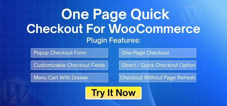
When people are ready to buy something online, they want to finish quickly. A long checkout with many pages can feel tiring and annoying. Each extra step increases the chance someone will quit before finishing. This makes it harder for stores to make sales. Simple and fast options like One Page Checkout for WooCommerce usually work better.
Slow Loading Pages
In multi-step checkout, each step often loads a new page. If a page takes time to load, it can make people feel bored or frustrated. Slow pages also create doubt about whether the website is working well. When users feel like it’s taking too long, they often give up. Fast checkouts keep people more focused.
Too Much Information
Some checkout forms ask for too many details. This can make the process feel like a chore. People don’t like filling out long forms when all they want is to buy something. Asking for only what’s really needed is a better idea. Fewer questions usually mean fewer people quitting midway.
Hard to Fix Mistakes
With traditional multi-step checkout, if someone makes a mistake early on, they often don’t find out until the end. Then they have to go back and fix it, which takes time. This back-and-forth can be frustrating. It’s better when people can see and fix problems right away. Clear feedback helps make the checkout smoother.
No Clear Progress
Often, there’s no clear sign of how many steps are left. When users don’t know how long something will take, they feel unsure and may leave. A progress bar or step counter can help. It gives people a sense of control and reduces stress. Knowing what’s coming next makes a big difference.
Mobile Trouble
Multi-step checkouts can be even worse on phones. Switching between pages on a small screen isn’t fun. Buttons can be hard to tap, and typing can be slow. A long process on mobile often leads to people giving up. A short, simple flow works best on small screens.
Distractions and Drop-offs
With every extra step, there’s a greater chance for people to get distracted or lose interest. They might get a message, check another tab, or just change their mind. The more time it takes, the more likely they’ll leave without buying. A quick checkout helps keep their attention until the end.
Simple Fixes That Make Multi-step Checkout Less Painful
Multi-step checkout often feels like a burden when it takes too much time or asks for unnecessary details. The good news is that small changes can make it smoother and less frustrating. Here are some simple fixes that actually work.
- Reduce Form Fields: Cut out questions that are not essential. Fewer fields mean customers spend less time and are more likely to finish.
- Add Progress Indicators: Show buyers how many steps are left. Clear progress markers reduce stress and keep them motivated to complete checkout.
- Enable Guest Checkout: Let people buy without creating an account. This saves time, lowers barriers, and makes customers more willing to purchase.
- Offer Auto-fill Support: Allow browsers to auto-fill addresses and payment details. This reduces typing, speeds up the process, and avoids customer frustration.
- Keep Pages Fast: Speed matters in every step. A slow-loading page pushes people away, while quick checkout pages keep them engaged.
- Use Mobile-friendly Design: Buttons should be easy to tap, and forms should fit smaller screens. Optimizing checkout for mobile prevents drop-offs.
- Provide Instant Error Alerts: Show mistakes immediately instead of at the final step. Real-time error messages help customers fix issues without leaving checkout.
- Add Multiple Payment Choices: Offer different payment methods for convenience. When people see their favorite option, they are more likely to buy.
Why Do So Many Websites Still Use Traditional Multi-Step Checkout?
Even with better options available, many websites still stick to traditional multi-step checkout. It might look familiar, but that doesn’t mean it’s the best choice. Still, there are reasons why businesses keep using it. Let’s find out what’s really behind this choice.

Old Setup Still Works
Many websites were built years ago using checkout methods that were common back then. These older systems still work fine, so some store owners don’t feel the need to change them. Updating a checkout process takes time and effort. If things seem okay, they prefer to leave it alone. They think, if it’s not broken, why fix it?
Fear of Change
Some businesses worry that switching to a new checkout might break something on their site. They’re afraid it could confuse customers or cause technical problems. This fear holds them back from trying faster and easier options. They often choose to stay safe rather than take a risk. Keeping things the same feels more comfortable to them.
Development Costs
Changing the checkout process isn’t always free. Website owners may need to hire developers or buy special tools. This can cost money, especially for small businesses. Because of this, they choose to delay the upgrade. They focus on saving money instead of improving the checkout experience.
Lack of Awareness
Some people simply don’t know there’s a better way. They might not be aware of one-page checkout or other simpler options. If no one tells them or shows them the difference, they keep using what they know. Without clear information, they assume the current way is fine. This keeps outdated checkouts in use.
Platform Limitations
Not every website platform supports modern checkout features. Some themes or tools are limited in what they can do. Even if the owner wants to change it, the platform might not allow much customization. This makes updates harder unless they switch to something new. Many avoid the hassle and stay with what’s available.
Copying Big Brands
Some smaller stores copy what big companies do. Since large stores often have long checkouts, others think that’s the correct way. But those big sites have strong systems and loyal customers. Smaller shops don’t always get the same results. Copying without thinking doesn’t always work.
Missing User Feedback
If customers don’t complain, website owners think everything is fine. Many users won’t bother sending feedback; they just leave without buying. Without clear signs of problems, store owners don’t know that checkout is causing issues. They assume all is good when it’s not. So, nothing changes.
Does Single-page Checkout Work Better Than Traditional Multi-step Checkout?
Yes, single-page checkout often works better than traditional multi-step checkout for most online stores. It reduces the time needed to finish purchases, making the process smoother. Customers feel more confident when they see everything on one page without extra steps.
Single-page checkout also lowers cart abandonment because buyers are less distracted. They complete their purchase quickly without switching between multiple screens. Another advantage is the SEO benefits of fast checkout, as search engines value websites that load faster and keep users engaged.
Multi-step checkout can still work in some cases, but it usually feels longer and more stressful for shoppers. Many people prefer finishing their purchase in one go instead of clicking through several stages. This is why single-page checkout is becoming the smarter choice for modern businesses. For better decision-making, the following table compares traditional multi-step checkout with single-page checkout:
| Feature | Single-page Checkout | Traditional Multi-step Checkout |
| Speed | Faster, everything is on one page | Slower, the user has to go through many steps |
| User Experience | Simple and smooth process | Can feel long and tiring |
| Cart Abandonment | Lower, users finish quickly | Higher, users often leave before finishing |
| Mobile Friendliness | Easy to use on phones | Harder to tap and scroll on small screens |
| Error Handling | Easy to spot and fix mistakes | Errors show up late, often at the end |
| Setup Time | May need a plugin or extra setup | Usually already built into older sites |
| Flexibility | Easy to update and test new changes | Harder to change without a full rebuild |
When Is the Right Time to Switch to Single-page Checkout?
Switching from a traditional checkout to a single-page checkout is a big decision for any online store. It doesn’t happen randomly, and businesses usually look for the right signs first. So let’s see when switching actually makes sense.
High Cart Abandonment
If many customers leave their carts before paying, it’s a strong sign that the checkout is too long. Multi-step checkout often pushes buyers away with extra clicks. Switching to a single-page flow can reduce this drop-off. It gives customers less time to change their minds and more reasons to complete the order.
Slow Checkout Process
When checkout takes too long, customers quickly lose patience. A single-page checkout saves time by putting everything in one place. Instead of loading new pages, buyers can complete details faster. This makes the whole process smoother and less stressful.
More Mobile Buyers
With more people shopping on phones, checkout needs to be easy on small screens. Multi-step checkout often feels heavy on mobile. Single-page checkout fits better because there’s less scrolling and fewer clicks. A shorter process means more mobile users finish their purchase.
Frequent User Complaints
Sometimes customers complain about the checkout being confusing or hard to use. If you keep hearing such feedback, it’s time to act. A single-page checkout can remove those barriers. Giving buyers a clear and simple flow improves their overall shopping experience.
Need for Higher Conversions
If sales aren’t meeting goals, checkout design could be the problem. A long and complicated process loses potential customers. A single-page design can directly improve conversions by cutting down the steps. The easier the process, the more sales a store makes.
Updating Store Features
During store updates or redesigns, it’s the perfect time to rethink checkout. Instead of keeping outdated methods, switching can make sense. Adding single-page checkout during updates saves future effort. It helps the site stay modern and ready for customer needs.
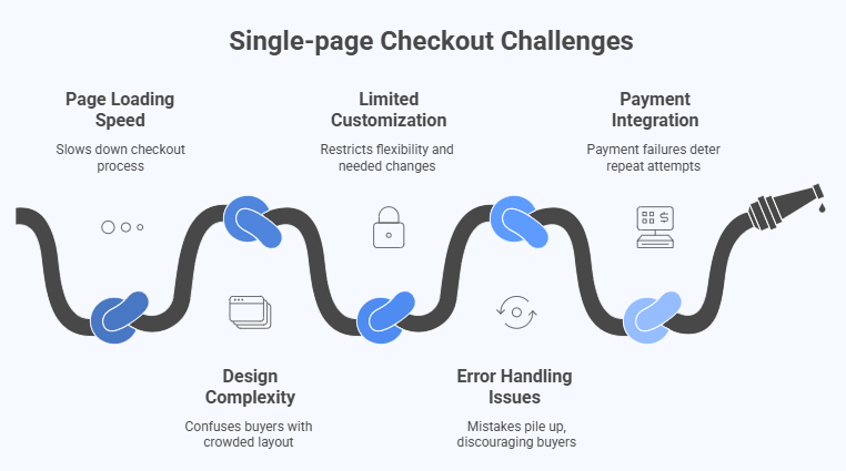
Single-page Checkout Challenges You Should Know Before Switching
Single-page checkout sounds like the perfect solution, but it also comes with its own challenges. Many store owners don’t realize these problems until they face them directly. Here are some common issues you should know before switching.

Page Loading Speed
Since everything loads on one page, it can sometimes slow down. A heavy page with too many scripts may frustrate buyers. Slow loading checkout reduces trust and increases cart abandonment. Making sure the page is optimized is very important.
Design Complexity
Placing all details on a single page can make it look crowded. If not designed well, mistakes in single-page checkout can easily confuse buyers. Too much information at once makes the page harder to follow. A clean and simple layout is the key.
Limited Customization
Some platforms or themes don’t fully support single-page checkout. This can limit what you want to add or change. Store owners may need extra plugins or coding work. Without flexibility, checkout may not match customer needs completely.
Error Handling Issues
If errors are not shown clearly, customers may miss them. On one page, mistakes can pile up quickly. This makes the process harder and discourages buyers. Showing instant feedback for errors can solve this problem.
Payment Integration
Single-page checkout must connect smoothly with different payment options. Some setups may face issues with gateways or security checks. If payments fail, customers won’t try again. Testing all payment methods carefully is important before using them live.
Frequently Asked Questions
Still have questions about why multi-step checkouts can be a problem? This section answers some common doubts and gives extra details to help you understand what makes this checkout method less ideal in many situations.
Is Multi-step Checkout Bad for Impulse Buying?
Yes, it slows down the buying mood. People who decide quickly to buy something might change their mind during a long checkout. Every extra step gives them time to rethink. That’s how stores lose impulse buyers.
Can Multi-Step Checkout Hurt Repeat Purchases?
If the checkout feels tiring once, customers may not want to do it again. They remember the slow experience and may look for easier options next time. Fast, smooth checkout helps keep buyers coming back. Long checkout pushes them away.
How Does Multi-step Checkout Affect Analytics Tracking?
It’s harder to track where exactly people drop off. Since checkout is split across pages, it takes more work to find the problem step. This makes it tough to improve performance. One-page checkout gives clearer data.
Can Multi-Step Checkout Lower Trust in Smaller Stores?
Yes, smaller stores don’t always have a known name. If their checkout looks too complex, it makes buyers nervous. A clean, short checkout builds trust faster. The long format feels outdated or risky.
How Does Multi-step Checkout Handle Browser Crashes?
If a browser crashes midway, most buyers won’t come back to finish. They may have to start over. That’s frustrating and leads to lost sales. Single-page setups reduce this risk.
Does Multi-step Checkout Affect Promo Campaign Results?
Yes, even a good discount can be wasted if checkout feels too hard. People may click the promo link but leave before paying. A smoother process helps you make the most of your offers.
How Does Checkout Frustration Affect Reviews?
Checkout frustration often leads to negative reviews. Customers share their poor experiences online, warning others about slow or confusing checkouts. Even if the products are good, checkout complaints can hurt ratings and push new buyers away from the store.
Bottom Line
Shopping online should feel quick and easy, not stressful. A long checkout with too many steps often makes people give up before finishing their order. Stores that ignore this issue risk losing valuable customers every single day.
The main question Why Are Traditional Multi-Step Checkout Problematic? is answered by the fact that they waste time, confuse buyers, and increase cart abandonment. Slow pages, repeated mistakes, and poor mobile design only make the situation worse for both stores and customers.
Switching to a simpler process can change everything. Whether it’s reducing steps, adding one-page checkout, or fixing small issues, the benefits are clear. A smooth checkout helps customers stay happy and ensures businesses don’t lose sales that could have been completed.
