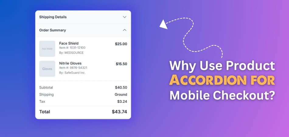
A product accordion is a simple design element that makes checkout pages look clean and organized. Many shoppers who buy through their phones may often wonder why checkout feels easier on some sites than others. That thought often leads to the question of why use product accordion for mobile checkout?
Using a product accordion in mobile checkout improves clarity and speed. It hides extra details until needed, saving space and reducing scrolling. Shoppers stay focused, edit items easily, and complete orders faster. Accordions keep checkout neat, helping mobile users avoid frustration and finish purchases without delay.
Readers who are curious about making mobile checkout smoother will find this topic very useful. This article shares how product accordions work, who benefits the most, and why they are better than traditional checkout layouts. It also includes best practices that help sellers and buyers enjoy a quicker and clearer checkout process.
Why Use Product Accordion for Mobile Checkout?
Mobile checkout needs to be simple and clear for every shopper. Small screens make it hard to show too much information at once. That is why product accordions are a smart option. They let people shop faster and keep everything neat and well-organized. Here are the specific reasons for using accordions for mobile checkout:
Screen Space
On small screens, showing all product details at once feels messy. Accordions let the main points stay visible while extra details stay hidden. This design keeps checkout pages neat and less crowded for shoppers. It allows the focus to stay on finishing the purchase quickly.
Less Scrolling
When all details appear together, checkout pages become very long. Accordions shorten the process by collapsing details until someone needs them. This makes moving through checkout easier and saves valuable time. Shoppers can complete their purchase with less effort and fewer steps overall.
Order Clarity
Shoppers like seeing their cart clearly without too many distractions everywhere. Accordions keep the main order summary visible while allowing quick detail checks. Anyone can expand an item if they want to edit something. Using tools like WooCommerce one page checkout plugin can also help improve this.
Easy Editing
Changing details during checkout should feel smooth without unnecessary page loading delays. Accordions make it possible to adjust sizes, colors, or quantities quickly. Shoppers only need to tap once to expand and edit. This saves time while also keeping everything inside one single checkout page.
Avoid Clutter
Many items in one cart can make the page look crowded. Accordions prevent the design from showing everything at the same time. This keeps things neat while still allowing details to be opened anytime. The shopping process feels simpler and less stressful for every mobile user.
Faster Process
Pages that load only what is needed always feel quicker overall. Accordions keep extra information hidden until it becomes necessary for the shopper. This means faster checkout loading, and smoother movement between steps. Shoppers finish buying without delays, making the overall experience much better.
Product accordions make mobile checkout shorter and easier for all users. They reduce clutter and let shoppers control what details they want. With less scrolling, the whole checkout feels smooth and less stressful. This simple design improves speed and helps people complete purchases more easily.
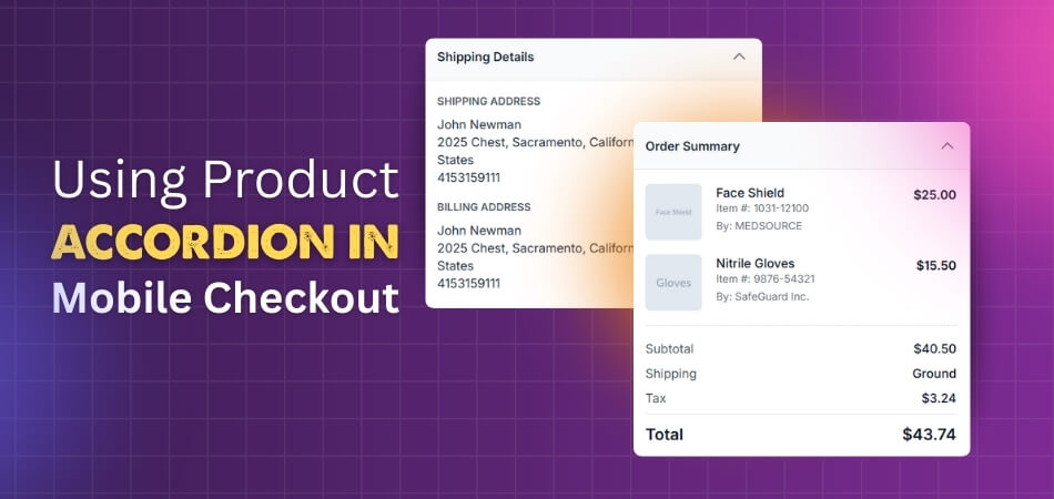
How Does Product Accordion Work in Mobile Checkout?
A product accordion in mobile checkout is a tool that manages space. It hides long order details while showing only short summaries on small screens. When tapped, it expands to show full details like items and prices. This feature works with simple coding that controls expand and collapse actions.
Collapsed View
When the page loads, the accordion starts in a closed position. The header with the total price and item count is still visible. Behind the scenes, CSS hides details using styles like max-height or display. This default collapsed setup ensures the shopper sees a clean, organized screen.
Tap Action
The header works like a button that reacts to touch. JavaScript listens for a tap or click on the header area. When triggered, the script checks the current state of the accordion. Based on that, it decides whether to open or close the hidden section.

Toggle Control
Each time the header is activated, the toggle function runs. Simple conditions handle switching between open and closed states. If closed, it expands to show all order details; if open, it collapses again to hide the extra content.
Smooth Expansion
Opening the accordion feels natural because of animated transitions in style. CSS or JavaScript slowly increases the height of the section. This makes the panel slide down smoothly instead of appearing instantly. The visual movement helps the user understand that details are expanding clearly.
Display Details
Inside the expanded section, all order information becomes clear to the shopper. Product names, prices, discounts, and shipping charges appear in full view. These details were already on the page but were kept hidden before. The accordion only changes visibility, not the content that was already loaded.
Collapse Again
Closing the accordion works the same way but in reverse order. The toggle function sets the content back to hidden by height. Animation smoothly slides the panel up to reduce screen clutter. Only the summary header remains, keeping focus on the main checkout fields.
A product accordion makes mobile checkout cleaner without removing order details. It helps shoppers stay focused while still keeping information close to them. The expand and collapse steps use very simple coding and styling. This design keeps checkout smooth, easy, and friendly for small-screen users.
Who Benefits Most From Product Accordion in Mobile Checkout?
Shopping on mobile can sometimes feel tight on space, and every detail has to fit in a small screen. This is where product accordion layouts come in handy. They help keep checkout pages clean while showing the right details. Let’s look at who benefits most.

Small Businesses
Product accordion layouts are very beneficial to small businesses. They usually want to give buyers a smooth checkout without spending big on custom designs. An accordion keeps things organized, reduces clutter, and makes it easy for customers to review items quickly before paying.
Online Shoppers
Mobile shoppers like a simple and stress-free checkout. Product accordions make it possible to see key product details without endless scrolling. With fewer steps and less confusion, buyers feel more confident about finishing their purchase instead of leaving the cart.
E-commerce Stores
Big and small e-commerce stores benefit from improved sales with an accordion design. It reduces checkout drop-offs by keeping everything tidy and easy to manage. When buyers can check product details and prices quickly, they are more likely to complete the order.
Non-Profit Platforms
From small shops to donation platforms, even those using one-page checkout for non-profits can benefit from accordion layouts that keep mobile screens clean and simple. Donors can review details quickly and focus on completing their contribution without distractions.
Returning Customers
People who come back to buy again want the checkout to be quick. Product accordions shorten the process by showing what matters at a glance. Repeat buyers don’t have to waste time on long forms, which makes them more likely to shop again.
Product accordion in mobile checkout helps both sellers and buyers by keeping things clear, fast, and easy. No matter the size of the store, this design choice creates a smoother buying experience for everyone.
Product Accordion vs Traditional Checkout Layout on Mobile
Checkout design on mobile plays a big role in how fast and easily people can buy. Accordion-style layouts and traditional long forms work differently, and the way they handle space and clarity makes a big difference for buyers.
| Feature | Product Accordion (Accordion-Style) | Traditional Checkout (Long Forms) |
| Screen Use | Saves space by folding sections | Uses long scrolling forms |
| Navigation | Easy to jump between sections | Hard to go back and forth |
| Clarity | Shows key info in small chunks | Shows everything at once, feels crowded |
| Speed | Faster to review and confirm | Slower, more scrolling needed |
| User Focus | Keeps focus on one step at a time | Overloads with all details at once |
| Error Handling | Easier to spot and fix mistakes | Errors may be missed in long forms |
| Mobile Friendliness | Designed to fit small screens | Not always optimized for small screens |
| Checkout Completion | Higher chance of finishing the purchase | Higher chance of cart abandonment |
| Visual Design | Clean and modern look | Can look outdated or messy |
| User Comfort | Less stressful, feels simple | Can feel tiring and confusing |
Overall, accordion-style checkout gives a cleaner and quicker experience on mobile. Reducing clutter and focusing on key steps helps customers finish their purchase with less stress compared to long traditional forms.
Best Practices for Using Product Accordion in Mobile Checkout
Designing checkout pages for mobile needs careful thought, because buyers want a smooth process without confusion. Product accordion layouts can help, but only if used in the right way. Let’s go through some best practices to make them work well.
Keep It Simple
The key to a good accordion design is simplicity. Do not overload each section with too much information. Keep product details short and easy to read. Clear headings help buyers understand where they are and what to do next quickly.
Easy Expand Collapse
Accordion sections should open and close smoothly without delay. Customers should never feel stuck or lost while checking their order. Adding clear arrows or plus signs helps guide them. The easier it is to expand or collapse, the better the experience.
Test on Devices
What looks good on one phone may not work well on another. Always test the accordion layout on different screen sizes and brands. This ensures that buttons, text, and product details remain clear, readable, and easy to interact with everywhere.
Limit Extra Steps
One best practice is to minimize unnecessary steps, which is especially important if you offer quick checkout for digital products where customers expect instant access. The accordion should reduce clicks, not add more. Fewer steps mean faster checkout and happier buyers.
Highlight Key Info
Important details like product name, price, and total should be easy to find within each section. Buyers should not have to dig for key information. Keeping the main details visible helps build trust and prevents second thoughts before completing the order.
Using a product accordion in mobile checkout is all about making the process smooth, clear, and stress-free. With simple steps, easy navigation, and thoughtful design, you can create a checkout that works better for both buyers and sellers.
FAQs About Why Use Product Accordion for Mobile Checkout?
People often have common questions about the product accordion in mobile checkout. These questions help clear doubts and explain why it is useful. Let’s look at some of the most asked questions and simple answers about this design.
Does Product Accordion Improve User Trust?
Yes, it helps build trust. When shoppers can clearly see what they are buying, they feel more confident. The accordion makes details easy to check without confusion. A simple, organized layout shows that the store cares about clear information.
Can Accordion Reduce Cart Abandonment?
Accordions can lower cart abandonment because they keep the checkout simple. Long forms often frustrate shoppers, which makes them leave. With fewer steps and less scrolling, people are more likely to finish their purchase. This means more sales for the store.
Is Accordion Checkout Good for Speed?
Yes, it can make checkout faster. Shoppers do not waste time scrolling through endless fields. They only open the section they need at the moment. This makes the whole process smooth and quick compared to long checkout forms.
Does Accordion Design Work With Coupons?
Accordion layouts work well with coupon or discount fields. Instead of showing everything at once, the coupon box can stay hidden until a buyer taps it. This keeps the page clean while still giving easy access. It helps avoid clutter and distraction.
Can Accordions Handle Multiple Products?
Yes, they are great for handling many products. Each product can have its own section that expands when needed. Shoppers can edit the details of one item without affecting the rest. This keeps the checkout page organized even when the cart is full.
Do Accordions Help With Mobile Data Use?
Accordions improve perceived speed by showing only what’s needed. Only the necessary parts load first, and hidden sections load when opened. This means faster loading on weaker networks. It improves the shopping experience for users with limited data.
Are Accordions Easy to Maintain?
Yes, they are easy for developers to manage. The design uses simple code for expanding and collapsing sections. Stores can update product details without redesigning the whole checkout. This makes maintenance quick and less costly for businesses.
Can Accordions Support Guest Checkout?
They work well with guest checkout. Buyers who do not want to create accounts can move through the steps faster. Accordions show only the needed fields, like shipping and payment. This makes it simpler for first-time shoppers to complete an order.
Does Accordion Improve Mobile Readability?
Yes, it makes content easier to read on small screens. Breaking details into sections means no tiny text crammed together. Shoppers can open one part at a time, which makes reading less stressful. Clear layouts improve understanding and reduce mistakes.
Are Accordions Useful for Global Shoppers?
Yes, they work well for international buyers. Accordions can show country or language-specific details only when needed. This avoids overwhelming users with information that does not apply to them. It makes the checkout process friendly and simple across regions.
Conclusion
Product accordions make mobile checkout clear, simple, and user-friendly without overwhelming the screen. They reduce long scrolling, avoid clutter, and give shoppers control over how much detail they want to see, which helps them complete their purchase with less stress.
So, why use product accordion for mobile checkout? It saves screen space, makes checkout faster, and shows key details only when needed. By keeping everything neat and easy to expand, it improves both the shopping flow and customer satisfaction.
To get the best results, keep the accordion design simple, test it on different devices, and highlight only the most important details clearly. Focus on smooth expand-and-collapse actions that shoppers can trust. Best wishes as you create cleaner and faster mobile checkout pages.