The Form Templates feature allows you to select and customize predefined layout designs for your product filters. You can choose from multiple template styles and adjust their color settings to match your store’s branding seamlessly.
Available Templates
Each template offers a unique design approach, allowing you to choose the one that best fits your store’s layout and theme.
Minimal Template (Free)
A simple and lightweight design with no borders or shadows.
No box shadow
No borders
Lightweight layout
Clean and minimal appearance
Elevated Template (Free)
A card-style design with subtle elevation and soft borders.
Box shadow card
Soft borders for subtle separation
Compact spacing for clean layout
Modern Template (Premium)
A contemporary card layout combining shadows and borders for visual depth.
Subtle card shadow for depth
Soft borders for clarity
Compact spacing for alignment
Classic Template (Premium)
A traditional card layout with balanced spacing and structured design.
Box shadow card for subtle emphasis
Soft border separation
Compact and space-efficient design
Bordered Template (Premium)
A sharp and defined card layout emphasizing border clarity and order.
Defined soft borders for separation
Subtle box shadow for balance
Compact spacing for organized display
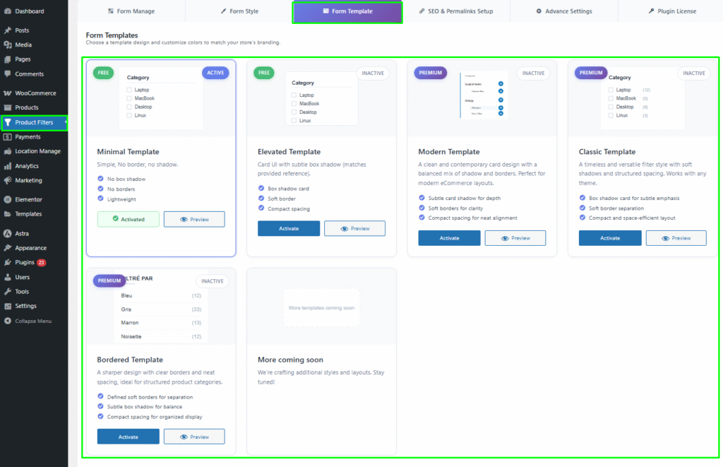
More Templates Coming Soon
Additional template designs and layouts are under development and will be available in upcoming updates.
Template Actions
Each template includes the following actions:
Quick Preview: Instantly preview the selected template before activation.
Activate: Apply the template to your filter layout.
Active/Inactive Status: Indicates which template is currently in use.
Color Settings
You can customize the template colors to align with your store’s branding.
The following color settings are available:
Background Color: Defines the background color of the template area.
Primary Color: Controls the color of key highlights and active filter elements.
Secondary Color: Used for hover effects or secondary highlights.
Border Color: Adjusts the color of borders around filter elements.
Text Color: Defines the color of text labels and category names.
Each color option includes a Select Color button that opens a color picker for easy customization.

Preview and Activation
Hover over a template to view its Quick Preview.
If you like the design, click Activate to apply it to your filters.
The active template will be highlighted as “Activated.”
You can switch templates anytime without losing your existing filter configuration.