
All sections
Step 4 of the builder holds each slider’s own settings in five tabs. They control movement, size, look and navigation, and override the defaults from Settings → Defaults for this slider only.
Playback
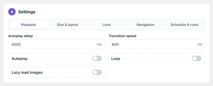
| Setting | What it does |
|---|---|
| Autoplay delay | Time on each slide, in milliseconds. Default 4000. |
| Transition speed | How long the slide movement takes. Default 600 ms. |
| Autoplay | Slides move on their own. A pause button is added for accessibility. |
| Loop | After the last slide, start again from the first. |
| Lazy load images | Images further down load only when they scroll into view. |
Size & layout
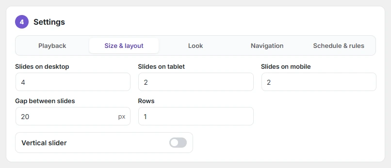
Slides on desktop / tablet / mobile set how many cards show at once. When you switch type, Slidario picks sensible numbers: products 4 / 2 / 2, categories and logos 6 / 4 / 2. Also set the Height (default 420 px), the Gap between slides (default 16 px), the number of Rows, and Vertical slider.
Look
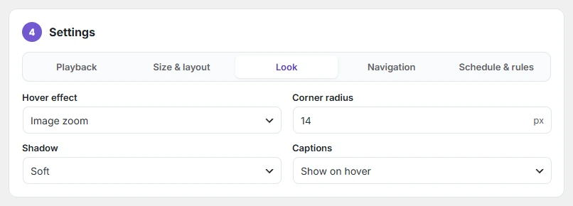
Hover effect: None, Image zoom, Card lift, or Zoom and lift. Corner radius: 0–40 px. Shadow: None, Soft, Medium or Strong. Captions: show on hover or always visible.
Navigation

Navigation style: Arrows and dots, Thumbnails, Progress bar, or Numbers (1 / 5). Turn Arrows and Dots on or off. Logo, product and category sliders can also move as a continuous ticker. Story sliders have Time per story.
Schedule (Schedule & rules in Pro)
Show the slider only between two dates; see scheduling a slider. In Pro this tab also holds display rules.
Every slider can be moved with the keyboard arrow keys while it is on screen.