Mobile Breakpoint controls the screen width where the plugin should treat the visitor’s device as mobile. This helps Dynamic AJAX Product Filters apply mobile-specific behavior at the right screen size.
This setting is useful when your theme’s mobile layout starts at a different width than the plugin’s default mobile width.
When Should You Use Mobile Breakpoint?
Use this setting when:
- The filter layout switches too early or too late on mobile/tablet.
- Your theme uses a custom responsive breakpoint.
- Sidebar filters need to move above products on mobile.
- Popup, drawer, or mobile filter behavior does not match your theme layout.
- The filter looks correct on desktop but not on tablet or mobile.
Step 1: Open Advanced Settings
- Go to your WordPress Dashboard.
- Navigate to Product Filters > Advanced Settings.
- Find the option named Mobile Breakpoint.
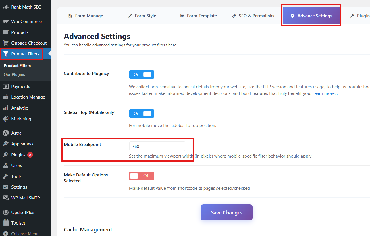
Step 2: Set the Mobile Breakpoint Value
Enter the screen width, in pixels, where the plugin should start using mobile behavior.
Default value:
768
This means the plugin treats screens at or below 768px as mobile.
Example values:
768
991
1024
Use the value that matches your theme’s responsive layout.
Step 3: Save Changes
After entering the breakpoint value:
- Click Save Changes.
- Clear your cache if you use a caching or optimization plugin.
- Test the filter on desktop, tablet, and mobile screen sizes.
Expected Result
After setup, the plugin will apply mobile-specific filter behavior based on your selected screen width.
For example:
- If the value is 768, mobile behavior starts at 768px and below.
- If the value is 1024, mobile behavior starts at 1024px and below.
- If your theme switches to tablet/mobile layout at 991px, setting the breakpoint to 991 can help the filter match the theme layout.
Example Use Cases
Theme Uses Tablet Layout at 1024px
If your theme changes to a mobile/tablet layout at 1024px, set:
1024
This helps the filter behave like mobile on tablets.
Theme Uses Mobile Layout at 768px
If your theme follows the common 768px mobile breakpoint, keep the default value:
768
Sidebar Filter Needs to Move Earlier
If your sidebar becomes too narrow on tablets, increase the breakpoint value.
Example:
991
Related Setting: Sidebar Top on Mobile
The Sidebar Top (Mobile only) option works together with Mobile Breakpoint.
When Sidebar Top (Mobile only) is enabled, the sidebar filter can move above the product list on mobile screens.
The Mobile Breakpoint value decides when that mobile behavior should start.
Example:
Sidebar Top (Mobile only): On
Mobile Breakpoint: 768
This means the sidebar filter will move to the top when the screen width is 768px or smaller.
Notes
- Enter only the number, without
px. - The default value is usually 768.
- Increase the value if you want mobile behavior to start on tablets.
- Decrease the value if you want mobile behavior only on smaller phones.
- After changing the value, clear cache and test with browser responsive mode.
- If your theme has its own custom breakpoint, use the same or closest value here.
Troubleshooting
Mobile layout starts too late
Increase the Mobile Breakpoint value.
Example:
991
or:
1024
Mobile layout starts too early
Decrease the Mobile Breakpoint value.
Example:
768
or:
640
Sidebar is not moving to the top on mobile
Check the following:
- Sidebar Top (Mobile only) is enabled.
- The Mobile Breakpoint value is correct.
- Your theme sidebar markup is compatible.
- Cache has been cleared.
- No custom CSS is forcing the sidebar position.
Filter popup/drawer does not match mobile layout
Check:
- The breakpoint matches your theme’s responsive breakpoint.
- The selected filter layout supports mobile behavior.
- The page builder is not overriding the layout.
- Cache or optimization plugins are not delaying scripts.