
Every Slidario slider is made in one builder page with four steps on the left and a live preview on the right: 1 Slider type, 2 Style, 3 content (slides, products, categories, reviews and so on) and 4 Settings. Changes show in the preview right away; nothing goes live until you click Publish or Update.

1. Slider type
Ten types: Image, Gallery, Video, Post, Logo, Before/After, Products, Reviews, Story PRO and Categories. From template opens the template library. You can change the type later; each type keeps its own content.
2. Style
Each type has its own styles. Locked styles show a PRO badge in the free plugin. All styles are listed in slider types and styles. Here you also set an optional Heading above the slider and Line under the heading; with a heading, the arrows move next to it.
3. Content
This step changes with the type: slides from the media library, videos, posts, before and after images, products, categories or reviews. Each type has its own article in this documentation.
4. Settings
Five tabs: Playback, Size & layout, Look, Navigation and Schedule (Schedule & rules in Pro). They are explained in slider settings.
Live preview
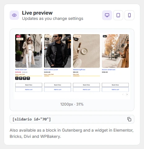
The preview uses the same code as your site, so it looks exactly like the slider will. Switch between desktop, tablet and phone widths with the three buttons. After the first save, the card shows the shortcode with a copy button.
New sliders start with the defaults from Slidario → Settings → Defaults (autoplay, arrows, dots). Every slider can change them in its own settings.