
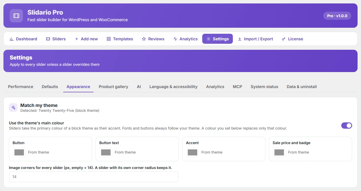
Slidario sliders take your theme’s colours, fonts and buttons by themselves, so they look like part of your store from the first minute. You can still set your own button, accent and sale colours and the image corners in Settings → Appearance. This is free.
| Setting | What it does |
|---|---|
| Use the theme’s colours, fonts and buttons | On by default. Block themes give their primary and accent colours; buttons use your theme’s button style. |
| Button / Button text | Colours of Add to cart and other buttons. |
| Accent | Dots, progress bars and highlights. |
| Sale price and badge | Sale prices and sale badges. |
| Image corners | 0–40 px; empty means 14 px. |
Each colour shows From theme until you change it; Reset goes back to the theme. The page shows which theme was detected and whether it is a block or classic theme.