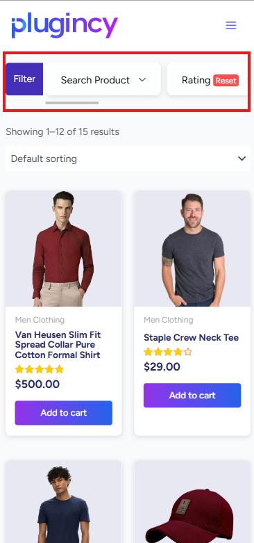
Dynamic AJAX Product Filters for WooCommerce includes mobile layout settings that help control where the filter sidebar appears on smaller screens.
These settings are useful for improving the mobile shopping experience, especially when your filters are displayed in a WooCommerce sidebar.
You can manage these options from:
WordPress Dashboard → Product Filters → Advanced Settings
Sidebar Top (Mobile only)
The Sidebar Top (Mobile only) option controls the position of the filter sidebar on mobile devices.
When this option is enabled, the filter sidebar is displayed above the product list on smaller screens.
This allows customers to see and use the filters before browsing the products.
Why Use Sidebar Top on Mobile?
On desktop, filters are commonly displayed in a left or right sidebar beside the product grid.
On mobile, there is not enough horizontal space to keep the sidebar beside the products. Depending on the theme, the sidebar may appear below the products, which can make filters harder to find.
Enabling Sidebar Top (Mobile only) helps by moving the sidebar above the products on mobile screens.
This improves usability because customers can access filters before scrolling through the product results.
Mobile Breakpoint
The Mobile Breakpoint setting defines the screen width where the plugin should apply mobile-specific filter layout behavior.
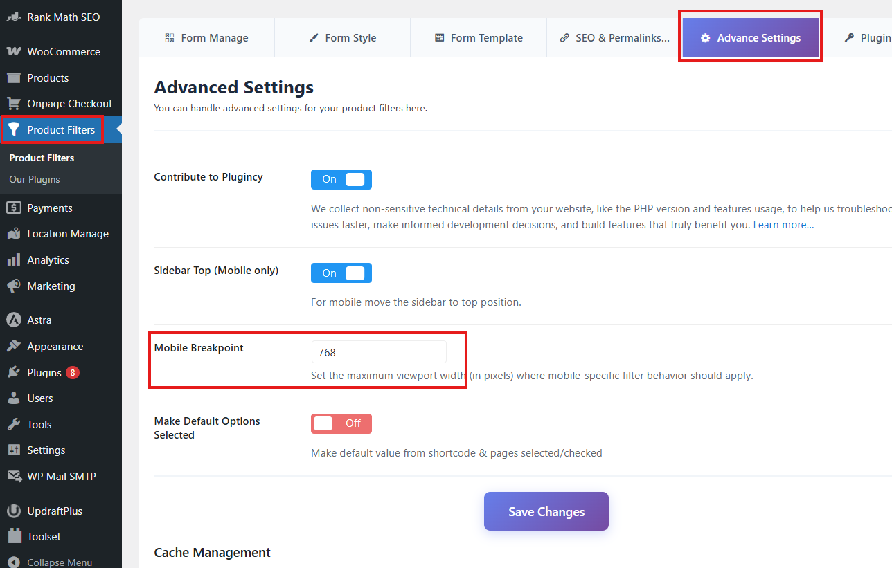
The default mobile breakpoint is:
768
This means the mobile sidebar behavior applies when the screen width is 768px or smaller.
How the Mobile Breakpoint Affects Filter Layout
The mobile breakpoint tells the plugin when to treat the layout as mobile.
For example:
Mobile Breakpoint: 768
With this setting, the sidebar-on-top behavior applies on devices or browser widths up to 768px.
If the screen width is larger than 768px, the desktop layout remains active.
When Should You Change the Mobile Breakpoint?
You may need to change the breakpoint if your theme switches to mobile or tablet layout at a different screen width.
For example, some themes change layout at 1024px instead of 768px.
In that case, you can set:
Mobile Breakpoint: 1024
This allows the sidebar-on-top behavior to apply on tablets as well as mobile phones.
Recommended Settings
For most WooCommerce stores, use:
Sidebar Top (Mobile only): Enabled
Mobile Breakpoint: 768
For themes that switch to mobile layout on tablets, use:
Sidebar Top (Mobile only): Enabled
Mobile Breakpoint: 1024
For themes with built-in mobile filter drawers or off-canvas filters, use:
Sidebar Top (Mobile only): Disabled
When Should You Disable Sidebar Top?
You may disable Sidebar Top (Mobile only) if:
- Your theme already moves the sidebar above products on mobile.
- Your theme uses an off-canvas filter panel.
- Your page builder controls the mobile layout.
- Your filter widget is already placed above the product list.
- The sidebar position conflicts with your custom design.
Only one system should control the mobile filter position. If your theme already handles this layout, disabling the plugin option may prevent conflicts.
Compatibility with Custom Layouts
Custom themes and page builders may use different sidebar structures. If the sidebar does not move as expected, check whether your filter widget is placed inside the correct WooCommerce sidebar or product archive layout.
The setting works best when the filter widget is placed in the normal WooCommerce sidebar area.
For custom layouts, you may need to adjust your theme structure or use the page builder’s responsive controls instead.
Troubleshooting
Sidebar does not appear above products on mobile
Check that Sidebar Top (Mobile only) is enabled.
Then confirm your screen width is equal to or smaller than the configured Mobile Breakpoint.
Sidebar moves above products on tablet, but you only want it on phones
Lower the breakpoint value.
Example:
Mobile Breakpoint: 768
Sidebar stays beside products on tablet, but you want it above products
Increase the breakpoint value.
Example:
Mobile Breakpoint: 1024
Sidebar layout conflicts with an off-canvas filter
Disable Sidebar Top (Mobile only) and use your theme’s off-canvas filter layout instead.
Best Practices
Keep Sidebar Top (Mobile only) enabled for standard WooCommerce sidebar layouts.
Use the default breakpoint unless your theme uses a different responsive breakpoint.
After changing the breakpoint, test your shop page, category pages, tag pages, and other product archive pages on desktop, tablet, and mobile.
Summary
The Sidebar Top (Mobile only) option moves the filter sidebar above the product list on mobile screens.
The Mobile Breakpoint controls when this mobile behavior starts.
Default setting:
Mobile Breakpoint: 768
This means the mobile sidebar layout applies at 768px screen width or smaller.