Branding & Styling Settings lets you control how the location popup, buttons, and other frontend elements look on your website. Use these options to match your store’s colors, fonts, and overall design.
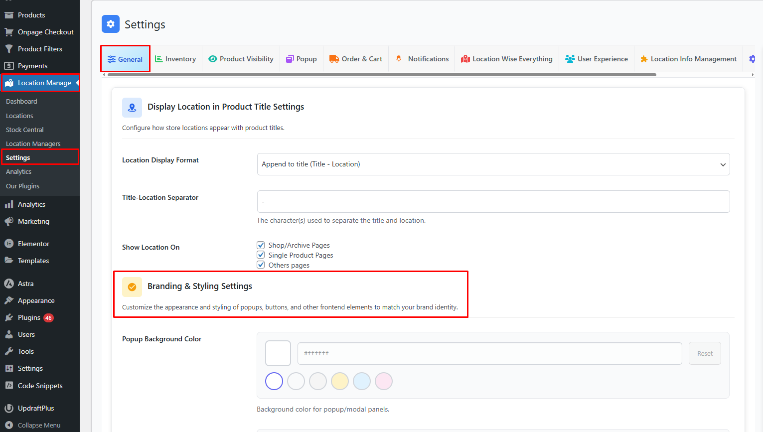
How to Access
- From your WordPress dashboard, go to Location Manage → Settings.
- In the settings panel, open the General Tab.
- Find Branding and Styling Settings.
Popup Styling
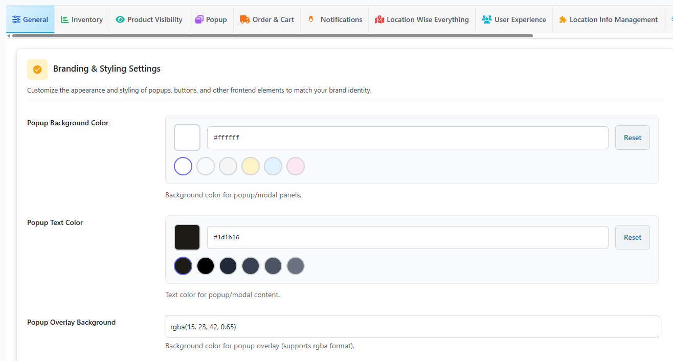
Popup Background Color
The background color of the popup or modal panel. Keep it light for clean readability, or use a darker color for a modern look.
Popup Text Color
Text color inside the popup, including headings and descriptions. Always keep a strong contrast between the background and the text so users can read easily.
Popup Overlay Background
The dark transparent layer behind the popup.
Notes:
- Supports
rgbaformat, which allows transparency. - Higher last value (like 0.8) makes the overlay darker.
- A lower value (like 0.4) makes it lighter.
Button and Primary Theme Colors
Primary Color
Main interactive color used for:
- Buttons
- Gradients
- Primary clickable elements
This replaces the button background color.
Secondary Color
This color is used for:
- Button hover color
- Secondary gradients
- Supporting UI elements
This replaces the button hover background color.
Button Text Color
Text color inside buttons. If your primary color is light, use dark button text. If your primary color is dark, use light button text.
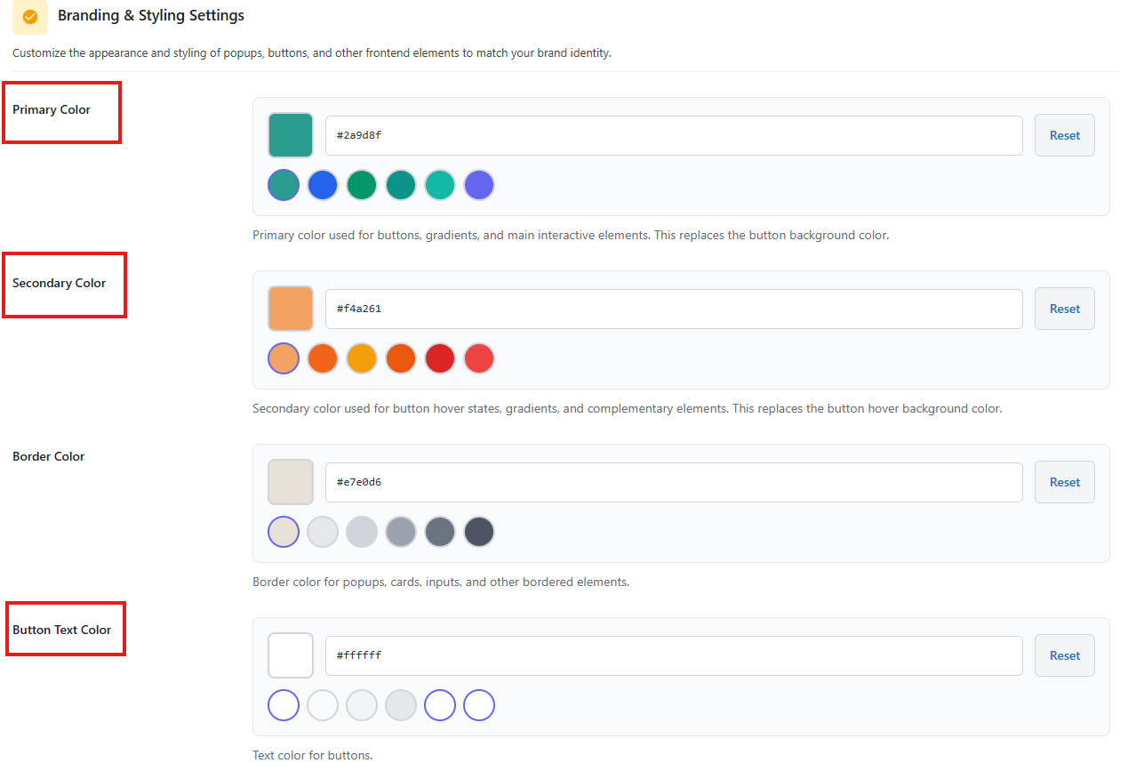
Borders and Structure
Border Color
Border color for:
- Popup panels
- Cards
- Inputs
- Any bordered UI element
Use a soft border color so the design looks clean without being too sharp.
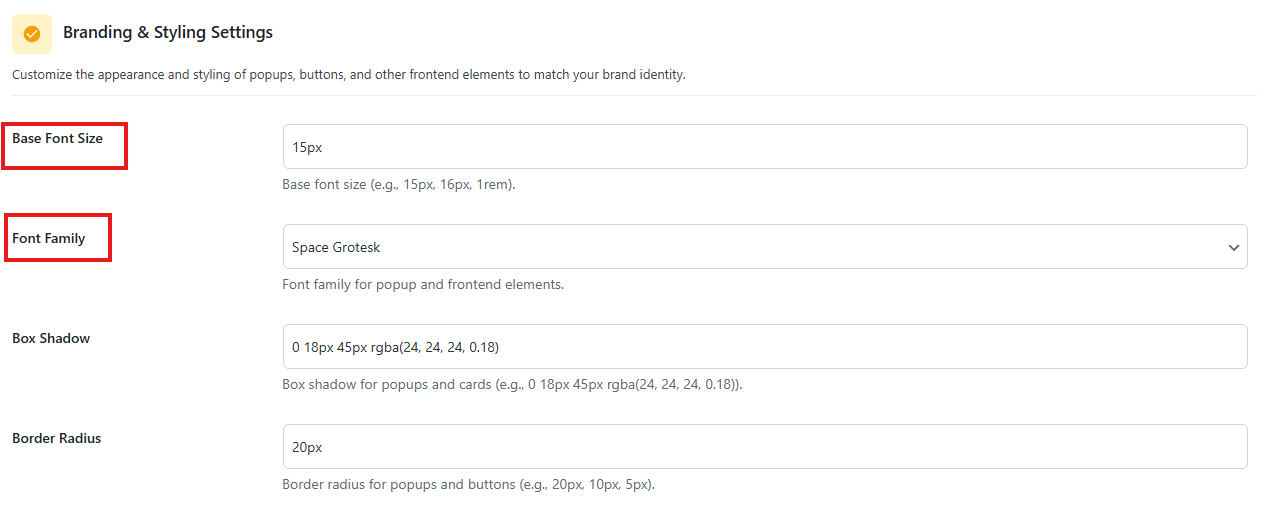
Border Radius
Roundness of:
- Popups
- Buttons
- Cards
Box Shadow
Shadow under popups and cards to create a floating look. If your design already has strong shadows, keep this value lighter.
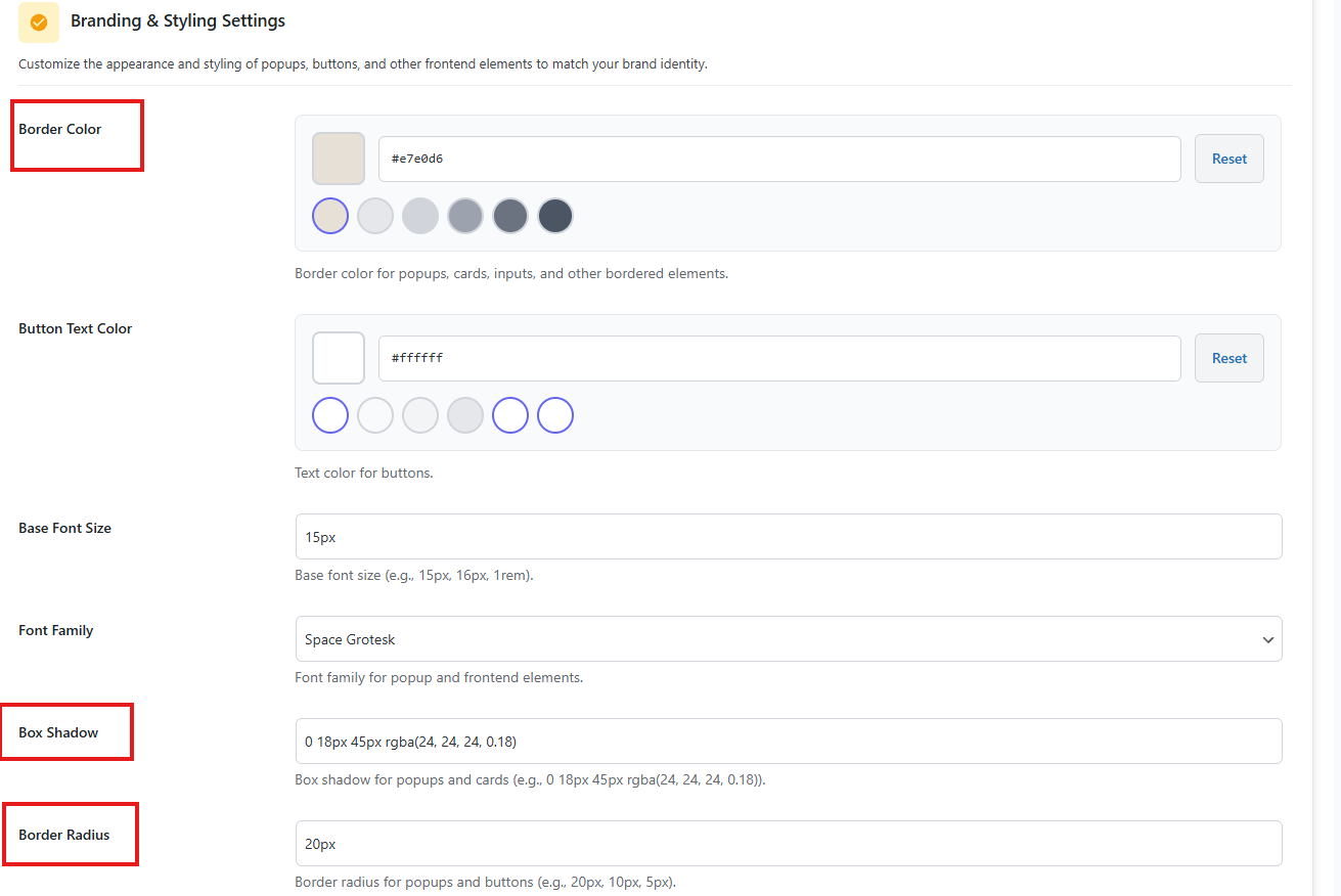
Typography
Base Font Size
Default font size used in popup and frontend elements.
Font Family
Font used for popup and related frontend elements. Choose a font that matches your theme and is easy to read.
After the changes, click Save Changes to save the values. Branding & Styling Settings lets you control popup colors, overlay transparency, button colors, borders, shadows, and fonts. Update these fields to match your store’s design, use Reset when needed, and always keep good contrast so text and buttons stay easy to read.